


Holly Holden, Visual Designer at User Interviews, shares how their SaaS company in the UXR space changed things up, how they used user research in their rebranding, and more.
Can you introduce us to User Interviews and its initial brand identity?
User Interviews is the fastest and easiest way for user researchers to recruit participants for research or build and manage their own panel. Our tools make sourcing, screening, scheduling, messaging, incentive payouts, and all aspects of research recruiting simpler.
Our brand is a big reflection of our customer base. Researchers are fairly academic people. Very right-brained, but at the same time, they can be quirky, geeky, and fun. We wanted our brand to cater to the personalities and the mindset the researchers are coming from, but also be competitive in the SaaS space.
User Interviews’ old logo
We don't want to look too buttoned-up, too academic journal, too unapproachable. We want to be familiar for our researchers because a lot of them are using all sorts of different tools to conduct their research. They're working in Google Docs, they're conducting interviews through Zoom, they have their own project management systems. We want our brand to fit in with that stack as well.
We're a good mix of familiar tech face and cutting-edge. We’re fast. We’re top of the industry. But we also want to show that we have a softer side as well. We’re also thought leaders in this space.
If you look at our old logo, it looks like a standard, run-of-the-mill sans serif typeface, all lower case. But on our website, we use a more serif-y, academic, almost whimsical type of font for some of the headers. Our illustrations get a bit more fun, too. We like to strike that balance.
What prompted this rebranding? How did that conversation start?
The original User Interviews brand, logo, and website were put together by various people on the team, and some outside agencies at some points. But there wasn’t a whole lot of rhyme nor reason to it previously, but it looked fine.
It was passable. But again, this was leftover from the days of when UI was just in the single digits with people being scrappy and working with what they could.
As the company grew and hit a Series A in 2021, they wanted to make a lot of changes at the company and get a lot of things in tip-top shape, including the brand.
We did it in two parts. We did the logo first. When that was set, we then started to build out the rest of the brand with the color palette, the images, and all of that stuff to make way for the website’s redesign. We premiered the new look in October.
The original logo itself was just the company name written in Montserrat, I think. It wasn’t even really a logo. It was like somebody typed it up in Figma at some point and it just became a logo file.
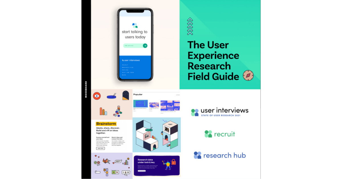
User Interviews designer, Holly Holden’s mood board for the rebranding.
When we initially started conversations with people internally, our leadership team had excellent insight into how the company had evolved over time and what that meant for the brand. So while they had fewer opinions on fonts and colors, they had great qualitative insights into the emotion of the brand.
I talked to everyone in our leadership, the VP of Product, the CEO, the COO–people who, even though they’re not logo design-types, have a working knowledge of what the company has been through.
Can you walk us through the rebranding process? Were there any challenges you encountered?
In our early stages of conceptualizing the logo, we looked at how we can be more academic, be a little bit prestigious for our researcher community, but also have this techie edge look to us.
In order to arrive at that happy medium, we had to explore the extremes first. With the more academic side, we were looking for inspiration from graduate schools, fancy Manhattan preschools, academic journals, companies who have a more academic bent but are in the tech space, too.
We also looked at a lot of illustrations and concepts like logo icon designs. A lot of people gravitated toward that, but had to be pulled back a little bit as they might be too extreme.
We kept going back to seeing if we’ll fit in the researcher stack of these familiar names that they’re already working with. At the end of the day, we’re a SaaS company and we needed to say that with the brand as well.
You’ve got people in the academic camp, you’ve got people in the tech camp. Bringing everybody together was certainly a challenge.
I think what seemed to unite most people was our font combinations: the sans serif in the logo and then the serif on the site. People really liked that balance. It sounds really simple, but I really think it helped unify the two fronts.
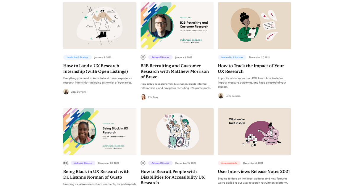
User Interviews’ website features serif and sans serif fonts.
It can be hard at times to get stakeholder buy-in during the first conceptual rounds. You almost have to play therapist, asking them things like, “Tell me more about how this teal is making you feel a certain way.”
We’d love to know more about your new logo. How was it conceptualized and finalized? What does it say about your brand?
I think we went through maybe, seven or eight rounds of logo design. We cast a really wide net and then we narrowed it down. The icon we use now was actually part of one of the very early iterations, but in order to find what’s going to work for your company, you have to explore a lot of different options.
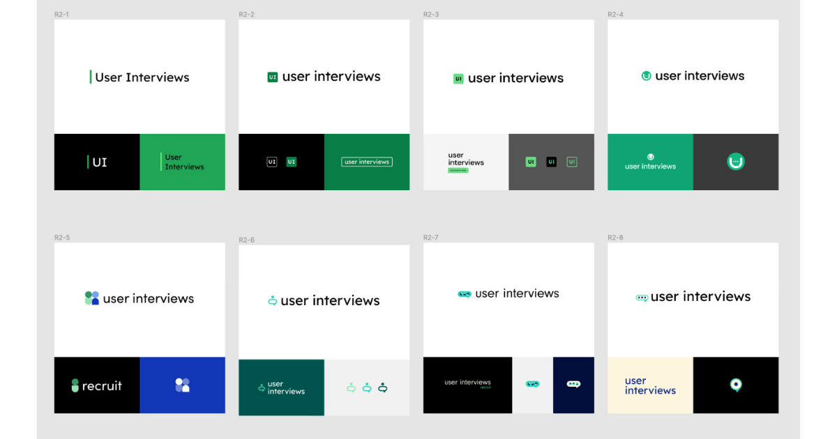
Developing User Interviews’ new logo.
But after a few rounds, into the fourth or fifth round when we’re showing people the nearly finalized logo, their questions and concerns become more granular such as, “how would this logo look stacked a certain way?”
You have to keep constantly shifting your mindset in order to get the feedback you need. But when you enter into more specific rounds, you can be quick when getting feedback. You can send out a Slack poll and say that it’s down to three final fonts and you need a yes vote of confidence from people of what is their favorite. It becomes a little bit faster.
Once the logo is done, it almost feels like the work is done, but that’s actually just the beginning. It’s only one part of your brand.
You have to think about how the other elements will work into a website. What kind of organizational structure am I going to use on the site? How is it going to look like on a footer, or a mobile app?
You always have to be a few steps ahead.
Your new brand identity has a distinct color palette. Can you tell us more about how they were chosen?
We knew we wanted to keep green in some capacity. The green that UI used to have was not the most accessible color ever. So whites on that green failed a contrast test. Most of the site was white over that green, so we had to change that. But otherwise, we had free rein to do whatever we wanted with the colors.
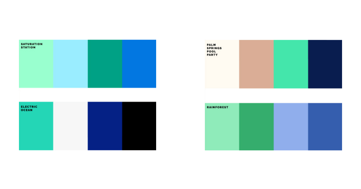
Early color options for User Interviews.
We ended up narrowing down to a color palette that has the navy and emerald green that we have now. We also have a teal sand color and an off-white.
We had another option that included a terracotta color, which I thought would be good for contrast and would be a favorite. But it turns out, after we asked 30 of our customers, everybody hated the terracotta! They didn’t hide how they felt about it.
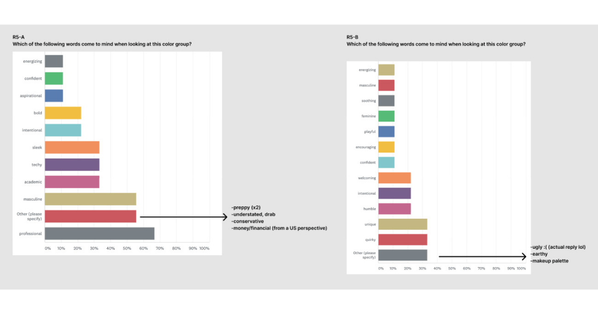
User Interviews asked users about the color palette.
That also told us that the other color palette that we ended up going with was more sophisticated but still approachable. Meanwhile, internally, some thought that the palette we ended up going with was a little too ‘bank’ or ‘corporate,’ but that wasn’t how our customers felt at all.
I think user research is a great thing that you can fold into rebranding something. I’m glad we asked people because it was an extra benefit to have our customers say, “I’m all in on the color palette. I’m all in on the rebrand.”
There are also other design elements like illustrations that you now use. How were those conceptualized, and why did you choose that art style?
Illustrations are actually from a pack we licensed through Icons8. We found a style that we really liked off of that site. We change the colors to fit what our needs are.
Everybody in UI is pretty practical. When those sorts of things started to come up, we asked ourselves if we were ready to hire somebody. I was asked how I wanted to handle it. Do we want to download something? Do we want to evolve it over time potentially to be more customized to us?
What we went with was the illustration library to move the process along. We got to launch the site, we were able to get the brand out there.
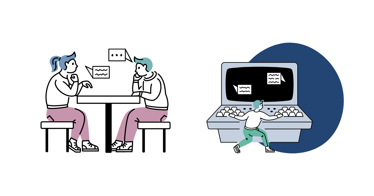
Some illustrations used by User Interviews
The illustrations added some whimsical elements to the brand. We’ve got character figures with their bodies that seem to be in motion. The objects they’re working with are also a lot larger or a lot smaller than what they normally would be in real life. It gives you this fantastical element that adds a little bit of fun.
Research is a field of study that’s a little bit more academic. It can be very quantitative and numbers or analysis heavy, so to bring some levity into that with more funky illustrations was the idea.
What has been the feedback so far internally? How about feedback from your users?
Internally, it was great, because I think so many people were just excited to see the rebrand happen. As I mentioned before, a lot of the leadership, the co-founders of UI, they've been with the company for so long that I think for them, seeing the marketing department evolved to a point where a designer is coming in and taking this process on, was a win enough for them.
It was fun because you never know who's gonna have the strongest opinions about something like color or typography until they're really coming out and saying how they feel, even though they might work in a totally different department than marketing.
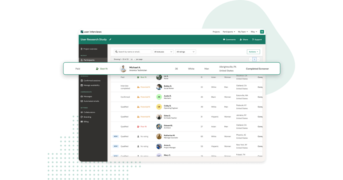
User Interviews’ new reskinned UI
Then from our customers, we get so many comments. Even to this day, months later, after we've not only rebranded and updated our marketing website, but also reskinned our product as well, we still get comments from researchers saying it looks great.
When we did first launch, a lot of people at UI sent out all sorts of fanfare about it on LinkedIn. It was really cool to see other researchers or people who worked at other tech companies saying the rebrand looks so good. It felt really legit. People bought in from day one.
What are your takeaways from this experience? Is there something you wish you knew before you started the rebranding process?
I would say talk to your audience or your users at some point during the process, the earlier the better. You don't need to open the door wide open for exactly what people think you should be doing.
But as you're conceptualizing or starting to narrow things down, talk to the users. They use the product every day. They were drawn to your product initially and are invested in keeping it afloat.
This is especially true if you’ve got super users and people who are just excited in your product, or you have a community. You’d be surprised by how many people are willing to come out and give their honest and open feedback.

