

Mike Foster is Creative Director at global brand design agency Straight Forward Design, which he founded in 2007. Straight Forward Design creates powerful connections between brands and people that drive growth. Mike believes successful brands must be found, understood, loved, and lived.
Can you tell us how this project came about? How did that conversation start with Squirrel Brand?
Founded in Roxbury, Massachusetts in 1888, Squirrel has become one of America’s most iconic and well-loved nut brands, seen everywhere from Rear Admiral Richard E. Byrd’s pocket as he explored the Antarctic, to Hollywood stars’ dressing rooms. Amidst the challenging business conditions of the pandemic, John B. Sanfilippo & Son (JBSS) wanted to reimagine the Squirrel brand packaging, giving it a reason to exist in a crowded marketplace and in its wider portfolio of brands.
They wanted to reinvent the Squirrel brand while celebrating its unique legacy and heritage, ensuring it would appeal to “Gen Next” and the food-obsessed. They wanted the new brand packaging to drive taste appeal, hero-ing Squirrel’s exquisite flavors, ingredients, and creation methods. Straight Forward Design was invited to support JBSS in realizing their ambitions for the brand.
How did the rebranding process go? Can you tell us more about it? Where did you start?
The main objective was to re-imagine this premium nut brand and drive brand awareness and expand to target new audiences while expanding channel sales. The category is crowded and noisy. The ambition was to give the brand some white space to enable it to thrive.
To achieve all of this, the nut was put back into the center of the story.
The new Squirrel brand packaging draws on an impressive history, borrowing from its rich back catalogue of iconography and ephemera and updating it for a modern audience.
It also takes inspiration from fashion for its architectural principles, with signature, diffusion collections, and high-end couture taste sensations demonstrated across the new packaging.
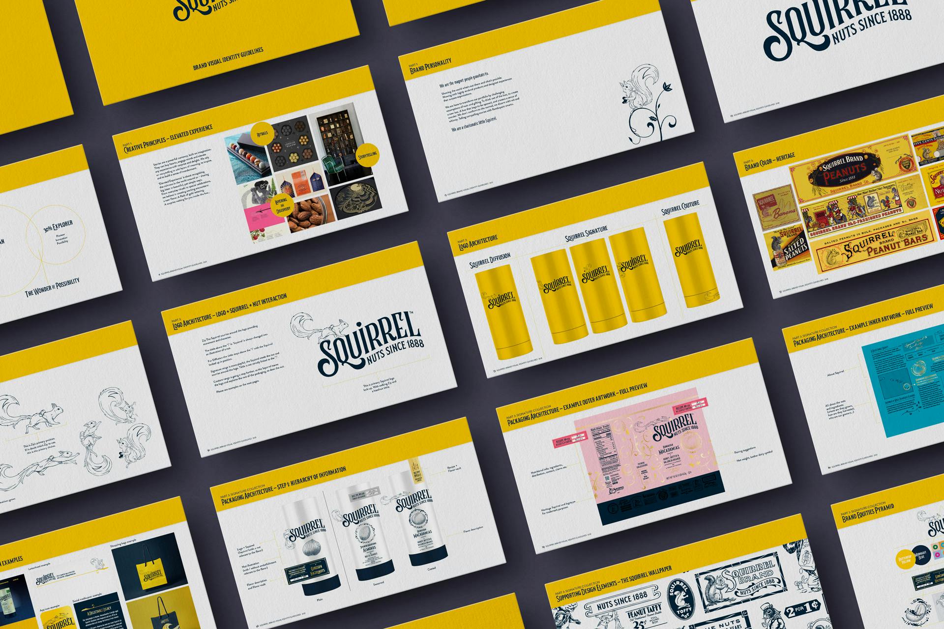
Squirrel brand guidelines
Were there surprising challenges you encountered along the way?
The challenge was to create a brand that gets consumers to reevaluate what they think. Nuts are challenging in terms of preconceived ideas and they're not an obvious gift product. A key consideration was to ensure the brand became a real contender against other gifts like wine, flowers, and chocolates.
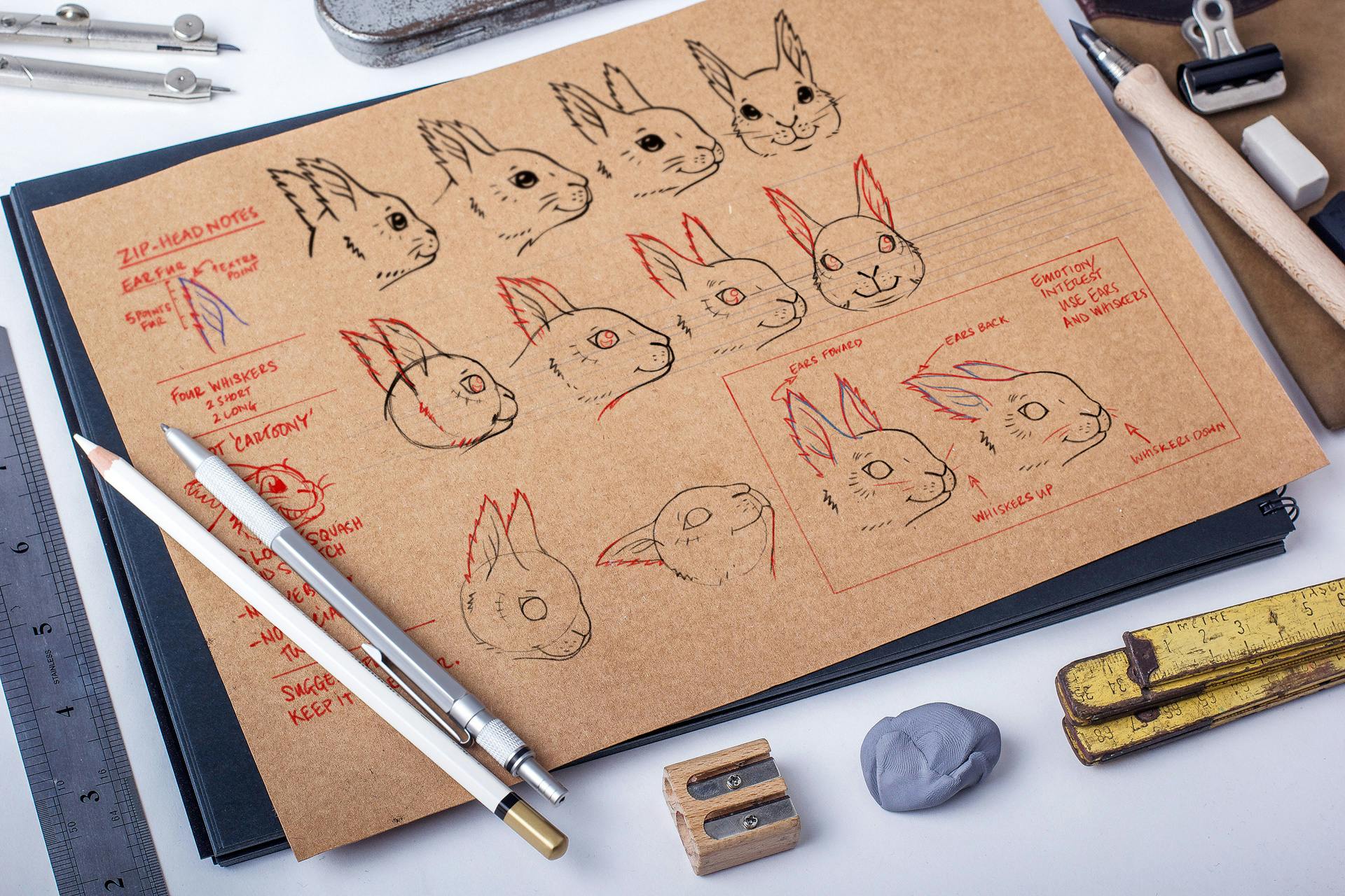
Squirrel 'Zip' sketches
The logo was a big change. Can you tell us the story behind it? How was it conceptualized?
The brand already had a great name and an impressive history of ephemera, so it was possible to confidentially borrow from its rich back catalog pulling forward iconography. The new positioning was brought to life by updating the squirrel character and introducing a name, Zip. The name comes from a piece of confectionery introduced in 1926 called zippers and alludes to how dynamic the character is zipping around the packaging. Plus, they join an impressive list of non-binary fictional characters.
The original squirrel was drawn a long time ago and has been scanned, beaten, and vectorized with all the care and love of the drawing lost. Although the re-imagined brand is built upon the heritage of the illustration style, it was important to allow movement and to bring the curiosity of the brand to life through the squirrel roaming freely around the packaging. Therefore, this charming character is free to roam around the new, Art Deco-inspired logo, never in the same place twice, and always on the move. The new visual identity includes a rich library of illustrations.
The packaging was also updated. How was that developed?
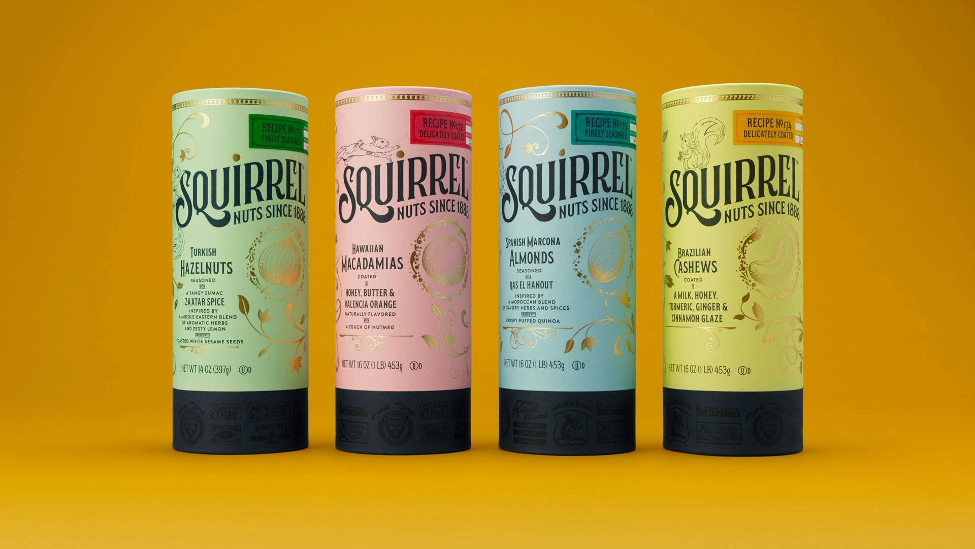
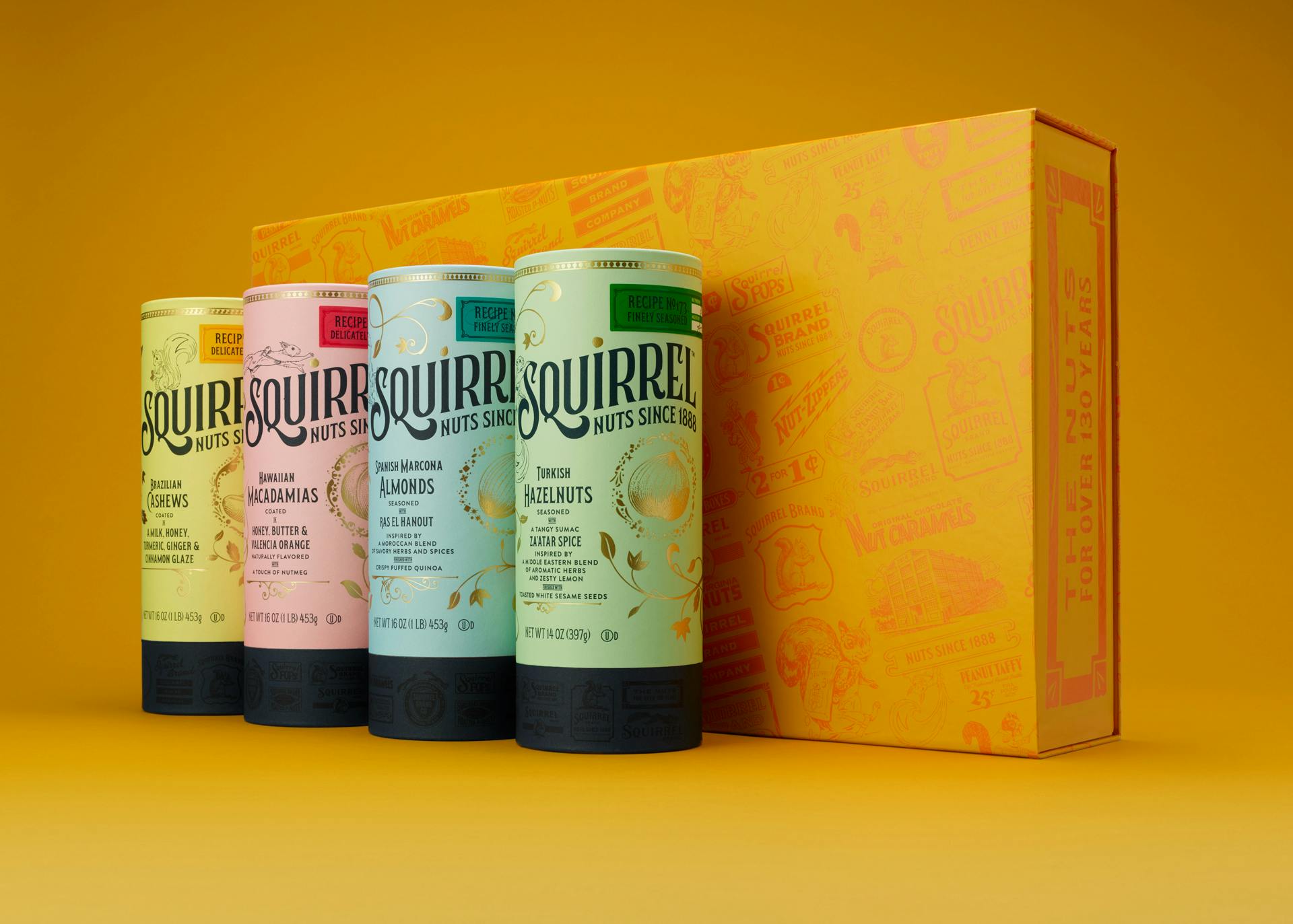
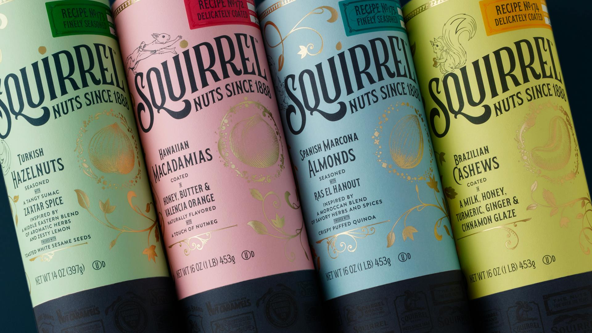
Squirrel’s new packaging is designed to offer the customer a premium experience from the shelf through to eating, incorporating the brand’s origin story, the nuts, and their ingredients, and an explorer’s map to guide the consumer through the brand experience.
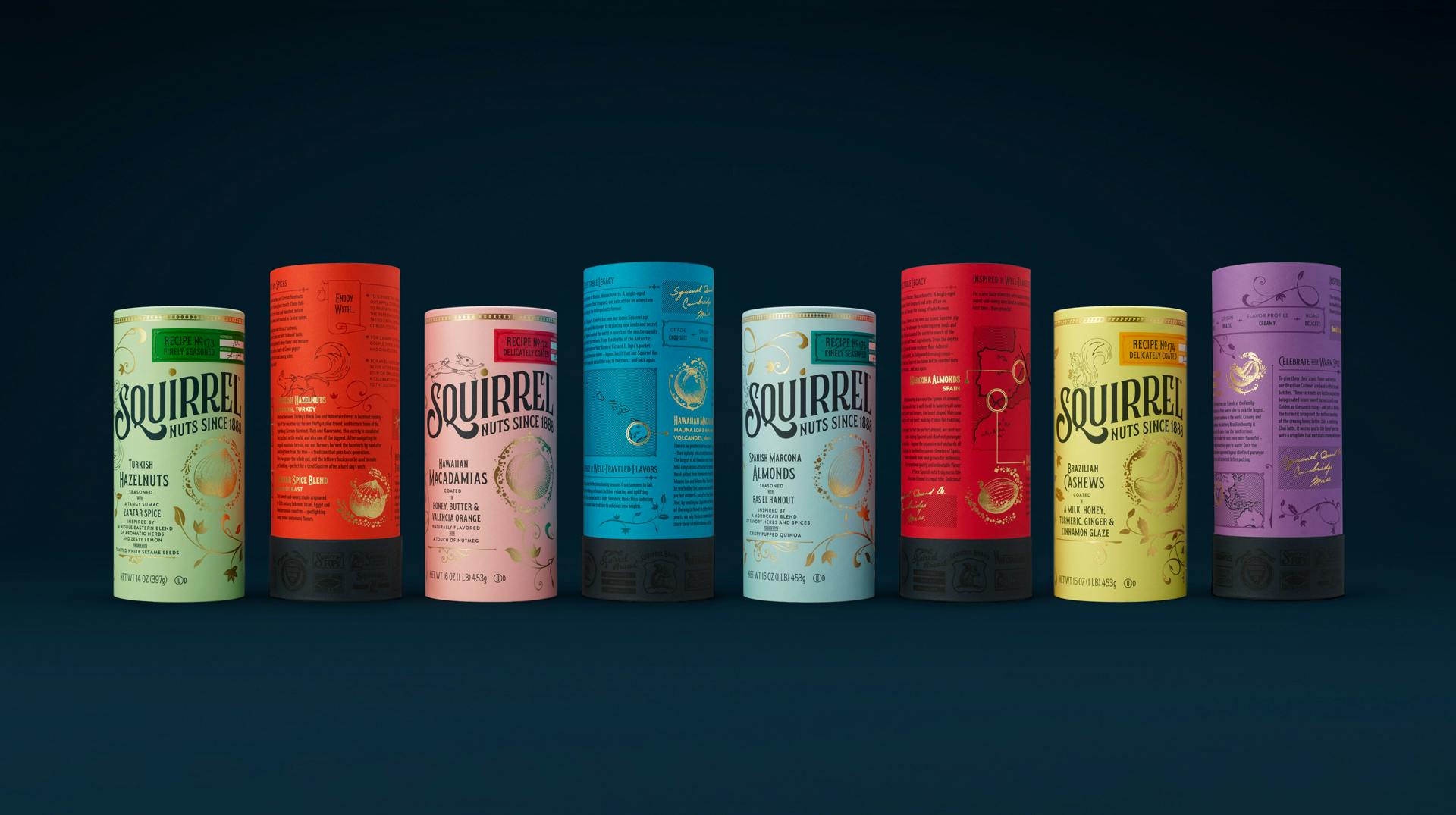
The unpackaging is an elaborate experience that has layers of reveal, and no two packs are the same.
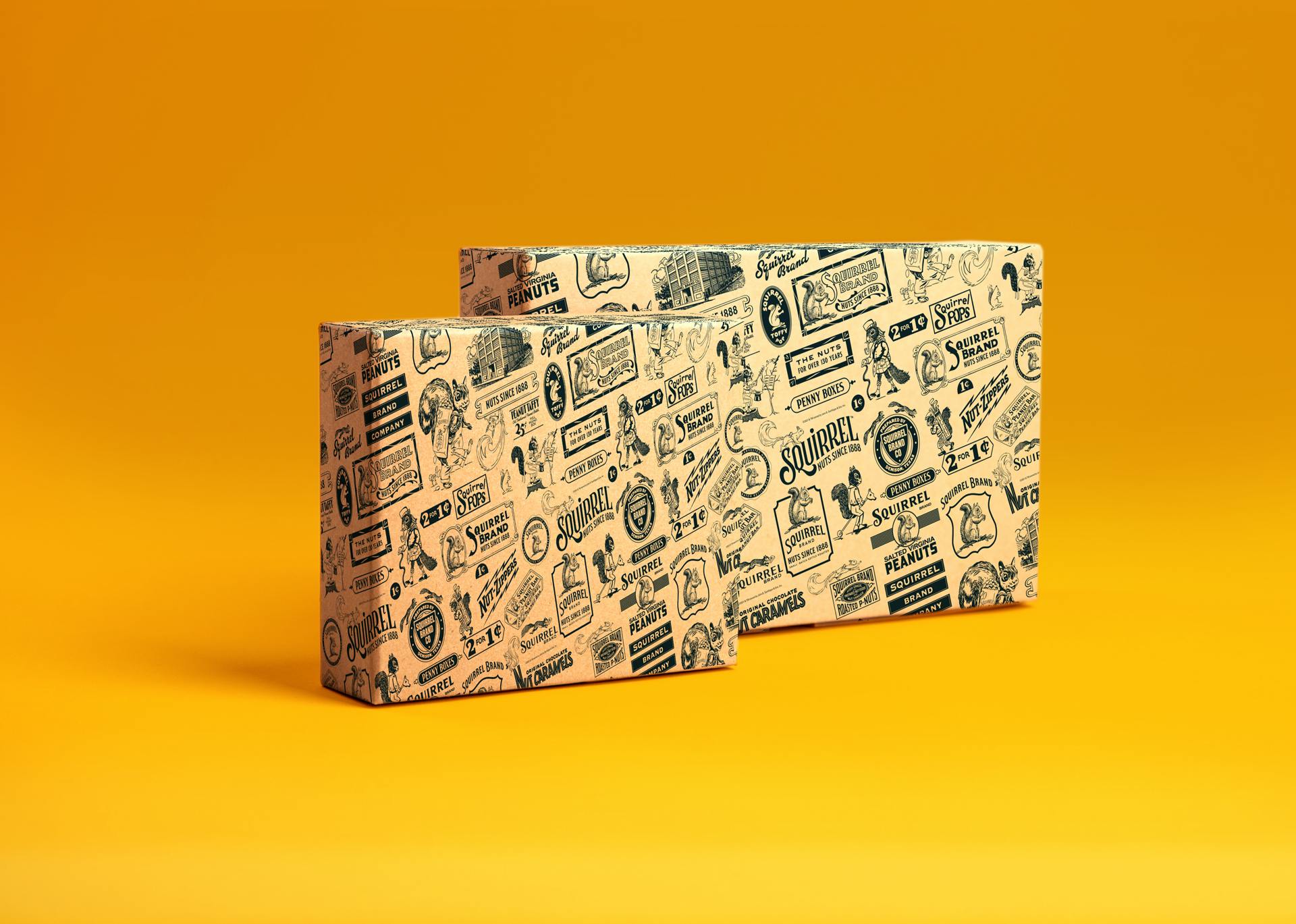
An elaborately designed outer cylinder, beautifully accentuated with hot foiled gold houses an inner sleeve which is embellished with the brand story; the origin history of the hero nuts and seasonings; inspirations for the recipe and flavor combinations; flavor profiles and extended pairing suggestions with bespoke map illustrations. An inner bag is sealed to ensure the product is fresh and it's a reference to the Squirrel’s history where ‘a paper bag of nuts’ would be enjoyed at the fair. All this is carefully wrapped in the Squirrel wallpaper which is a tactile paper uniquely illustrated with historical elements of the brand as an additional wink to its heritage.
How about the typography and the color palette? How did you land on the ones now used for Squirrel’s new brand?
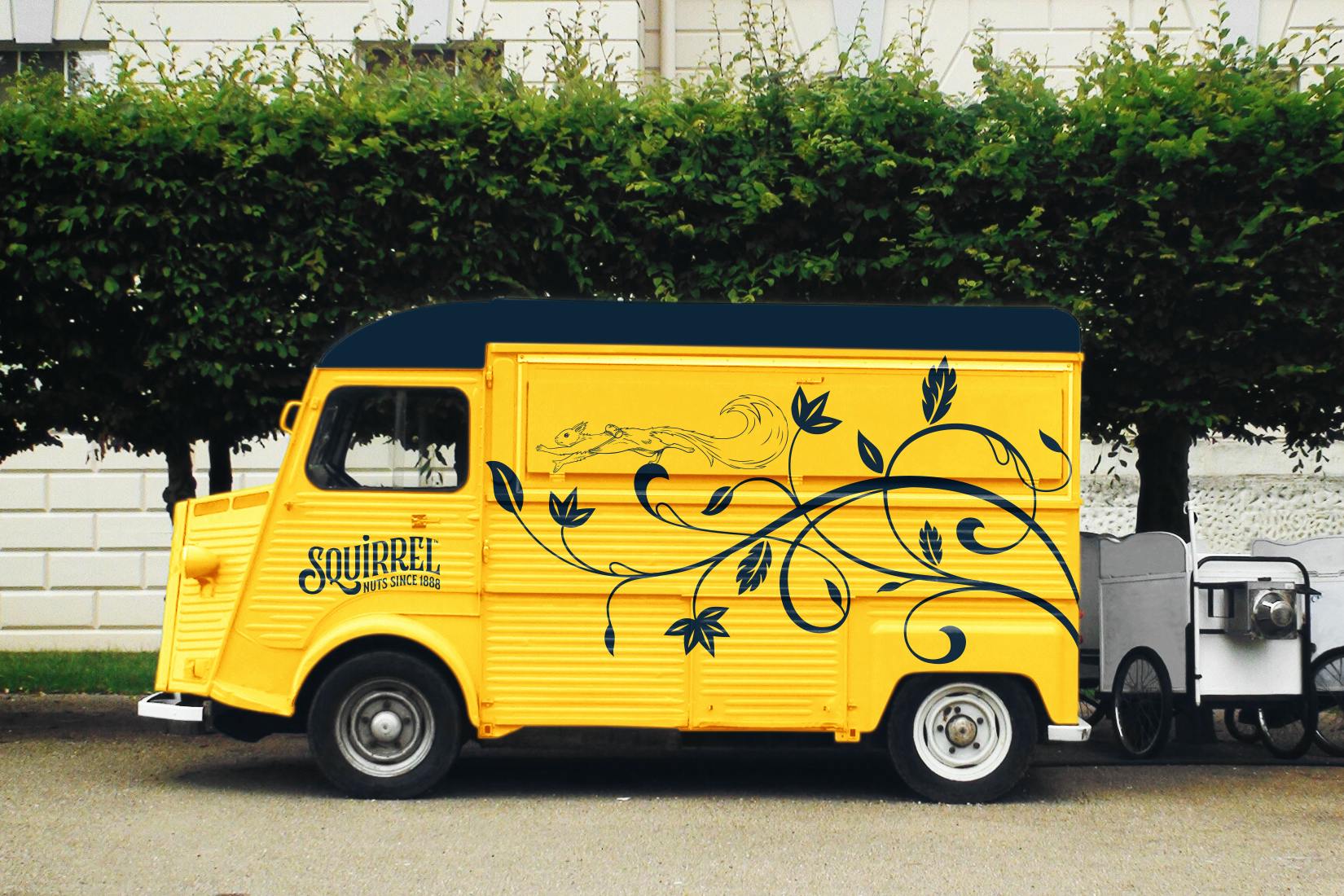
The brand colors – dark blue and bright yellow – both come from the brand’s history. Before Squirrel turned all black, it was vibrant and full of color. The dark blue and yellow played a large role, so we wanted to return to that.
For the packaging, we wanted to show a new premium; something that’s not just black and gold. We wanted to create a delightful color palette that would subtly allude to the flavors on the outside packaging and then there’s a punch of color on the inside, both decorated with gold foil.
For the typography, we researched type styles that were popular in the late 19th Century when Squirrel was established. The typography is inspired by the brand’s history with a modern twist.
