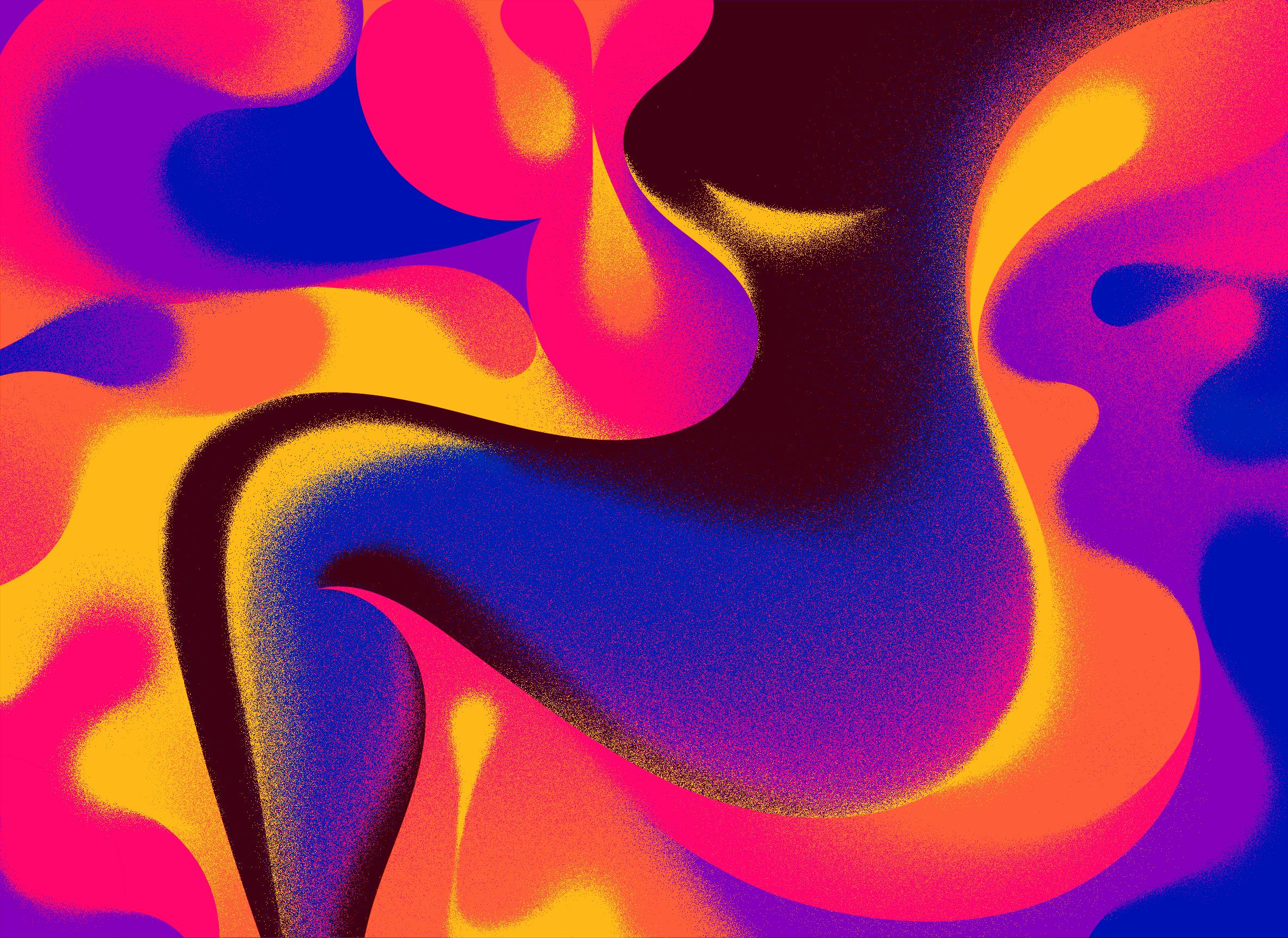

Simone Noronha is a New York-based illustrator. She enjoys telling subtle stories, weaving narratives into her imagery using saturated palettes and the moody lighting that has become her signature style.
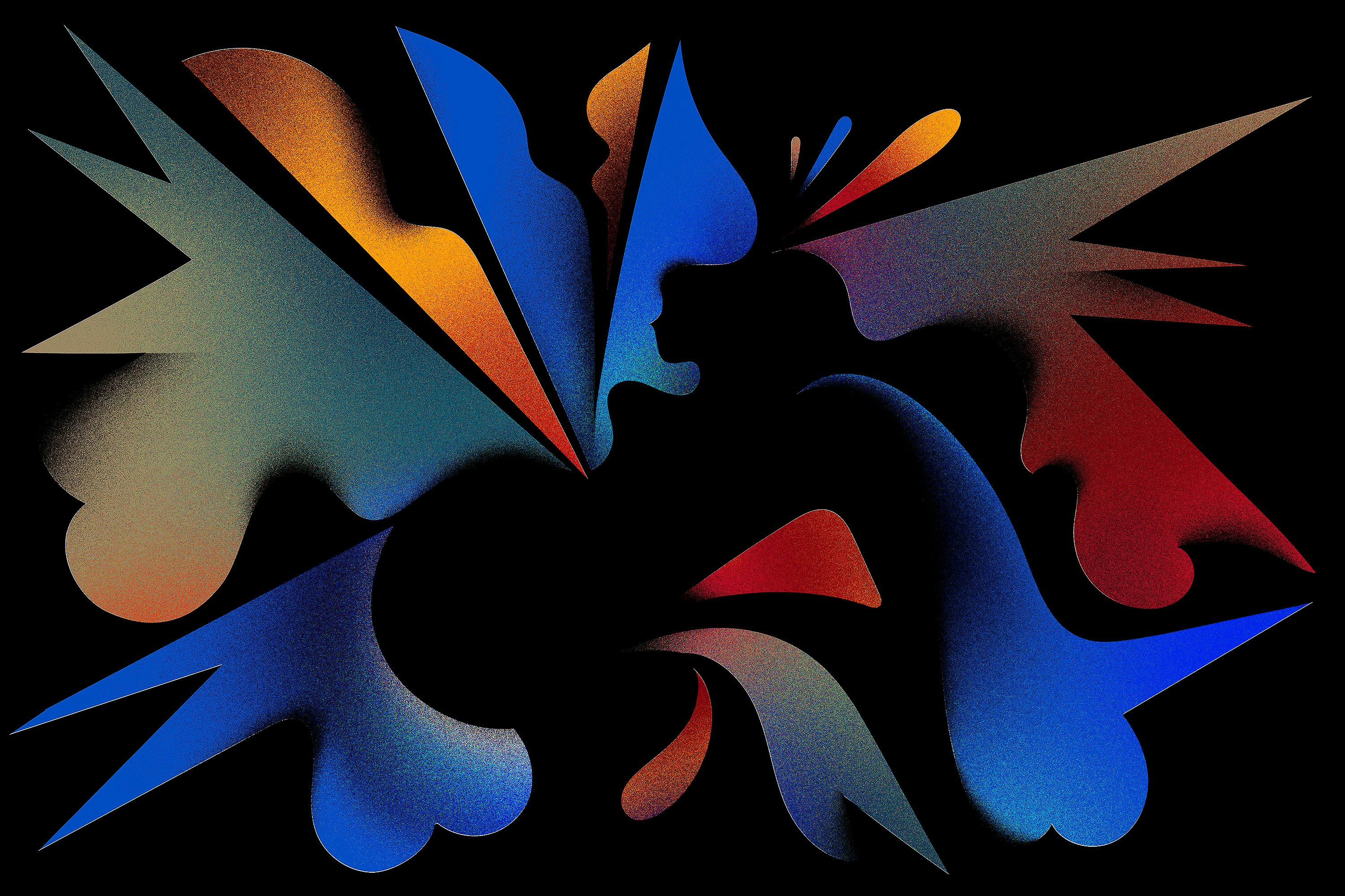
You’ve described your style as “fluid, bold, and sharp." How did you find this signature style?
It's been a matter of practice, making work and trying many things over the years that helped me figure out the way I work.

Walk us through your design process. Do you have a process that you follow religiously, or does it change depending on what you’re working on or who you’re working with?
Yes, I have a fairly standard process to all jobs that I’ve built steadily over the years, learning from every assignment I’ve taken on.
I always start with sketching thumbnails and writing to help solidify concepts. From there, once a sketch is picked I’ll develop it with higher fidelity sketching and rough color blocking to help establish the mood. Once all the tiny decisions are made I work pretty quickly on the final execution.
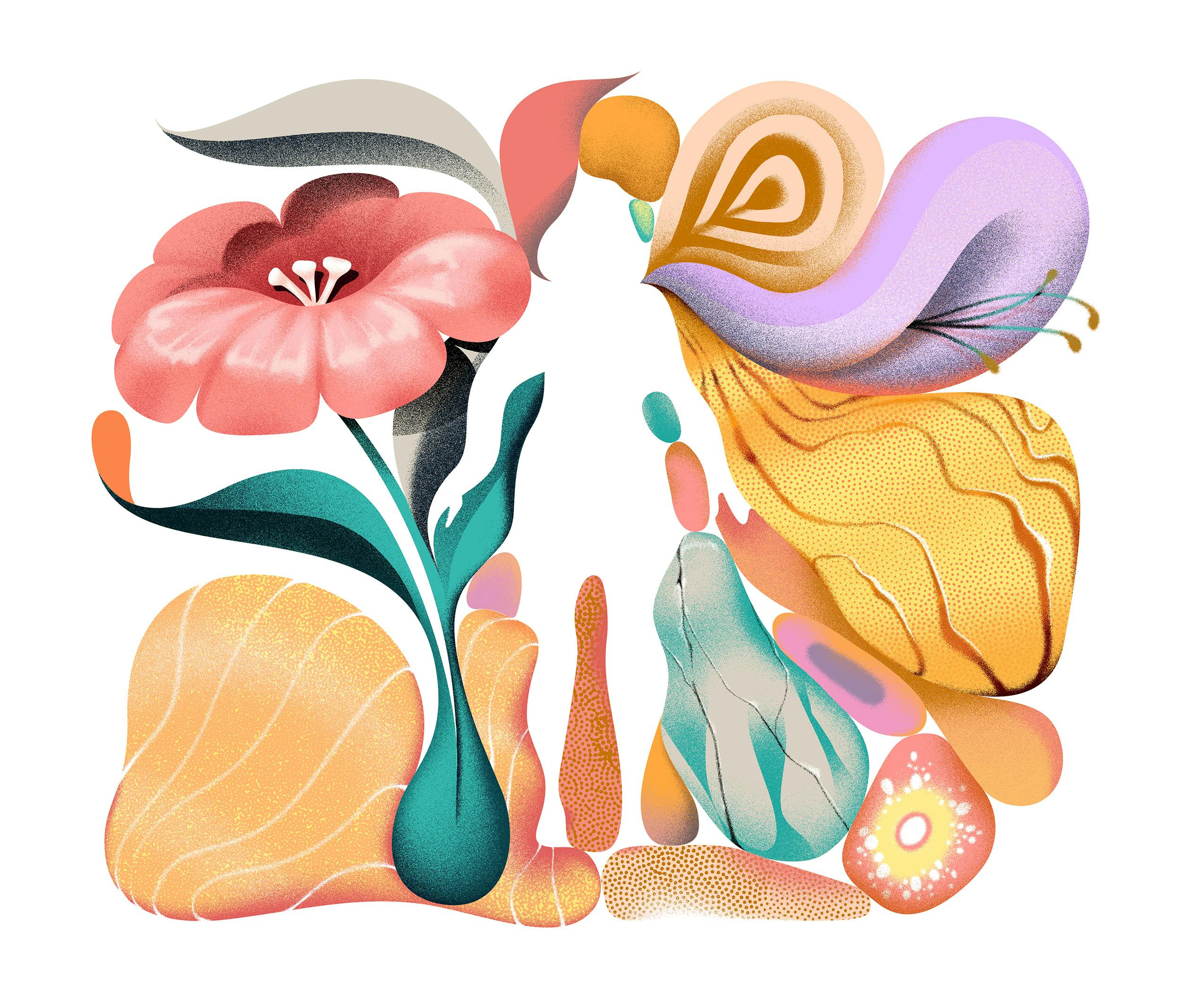
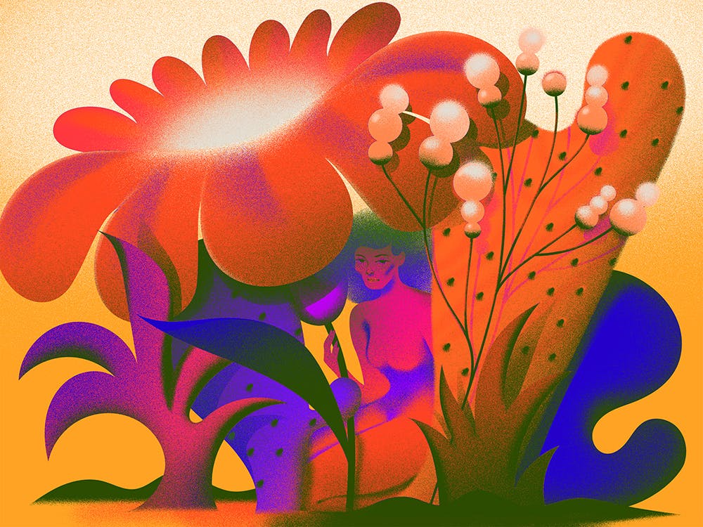
You’ve worked with big brands like Google, YouTube, and Apple. When it comes to design work, does working with these big brands come with unique challenges? Can you share any with us?
At the end of the day clients are just people wanting to make nice work together. I haven’t noticed much difference when being commissioned by tech or big bands versus editorial, except maybe the pay.
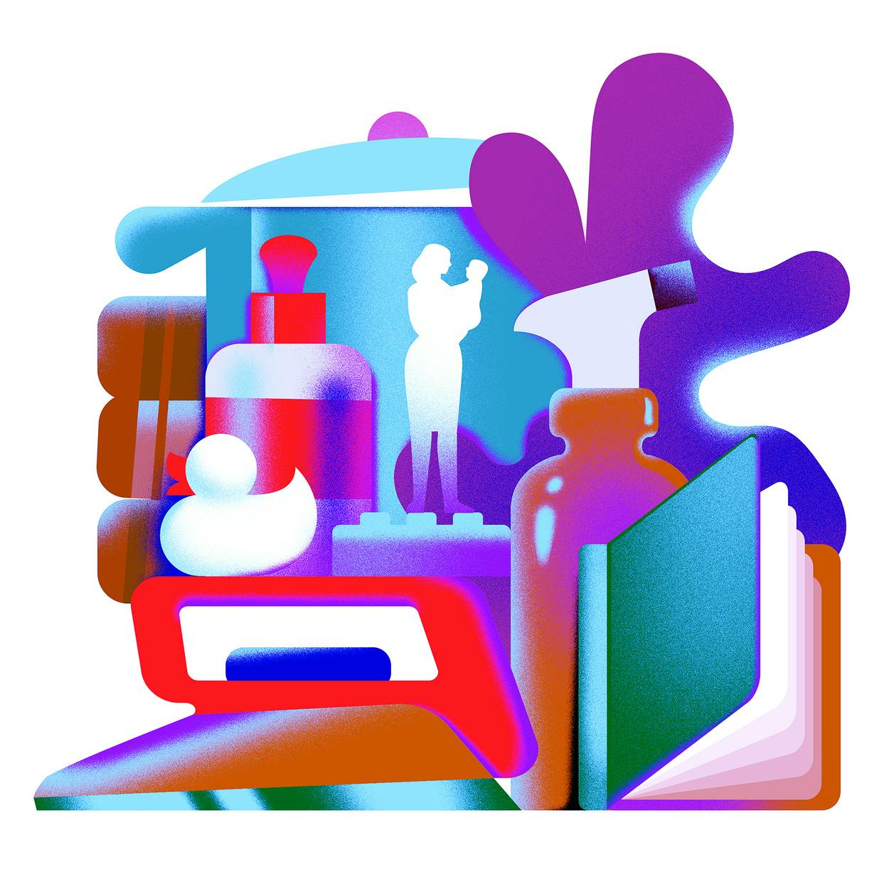
Simone Noronha parenting illustration
As a freelance Illustrator and Art Director, what sort of projects are you drawn to?
It’s always wonderful when I’m approached for my style but also given the freedom to explore different ways it can be conceptually applied to a project. This requires trust on both sides and enough time and budget as well.
The illustration you did with NBC news particularly caught our eye. Can you tell us more about that piece, how it was conceptualized?
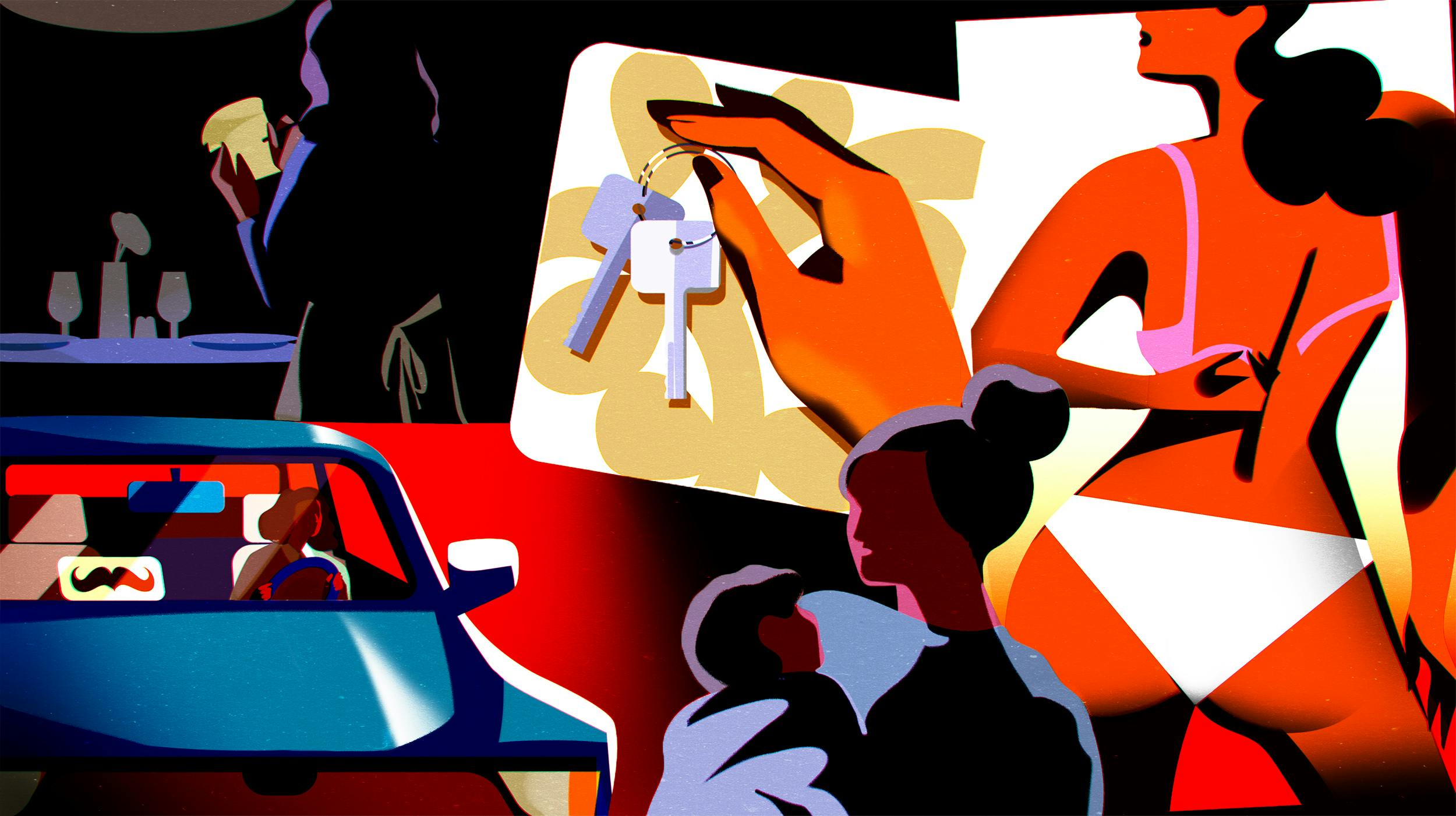
Simone Noronha NBC News Art
For this NBC News piece I was commissioned by Art Director Chelsea Stahl, we worked closely as the turn around for the final art was 24 hours.
The news article discussed a growing trend of working mothers being forced to leave the formal workforce due to Covid and unrealistic schedules for more informal routes, like Airbnb, OnlyFans and Lyft to support their families. I shared a few different sketches that emphasized different points in the article and we landed on the sketch that pitted the formal work industry against riskier sources of income.
The concept was based around exposing this system where the cards are stacked against these working mothers, so I illustrated these new routes as modular card pieces trying to patch together a very broken system.
What projects are you currently working on that you can share with us?
I’m working on a few different projects that span between editorial and packaging at the moment. Some pretty exciting stuff and I hope I can share more soon.
