


Kieran Harrod has been successfully creating logos for over 20 years. He takes great personal pride in developing distinctive, high-quality, exclusive branding concepts. He works with passionate integrity, crafting compelling logos and imagery, inspired by the unique story of your business or organization.
Can you tell us how this project came about? How did that conversation start with Saint John's Walthamstow?
The value of word-of-mouth is always huge as a freelancer and it was word-of-mouth that enabled the initial conversation with the team at Saint John’s. I’ve been doing work alongside Trinity Church, Aberdeen for many years and a congregation member from Aberdeen had moved to London and was attending Saint John’s. He suggested my name.
How did the rebranding process go? Can you tell us more about it? Where did you start?
As with every branding project, it starts with a series of conversations. My goal at the beginning of a project is to try and understand the client, whoever that may be, to discover the passions, what makes them tick, why they do what they do.
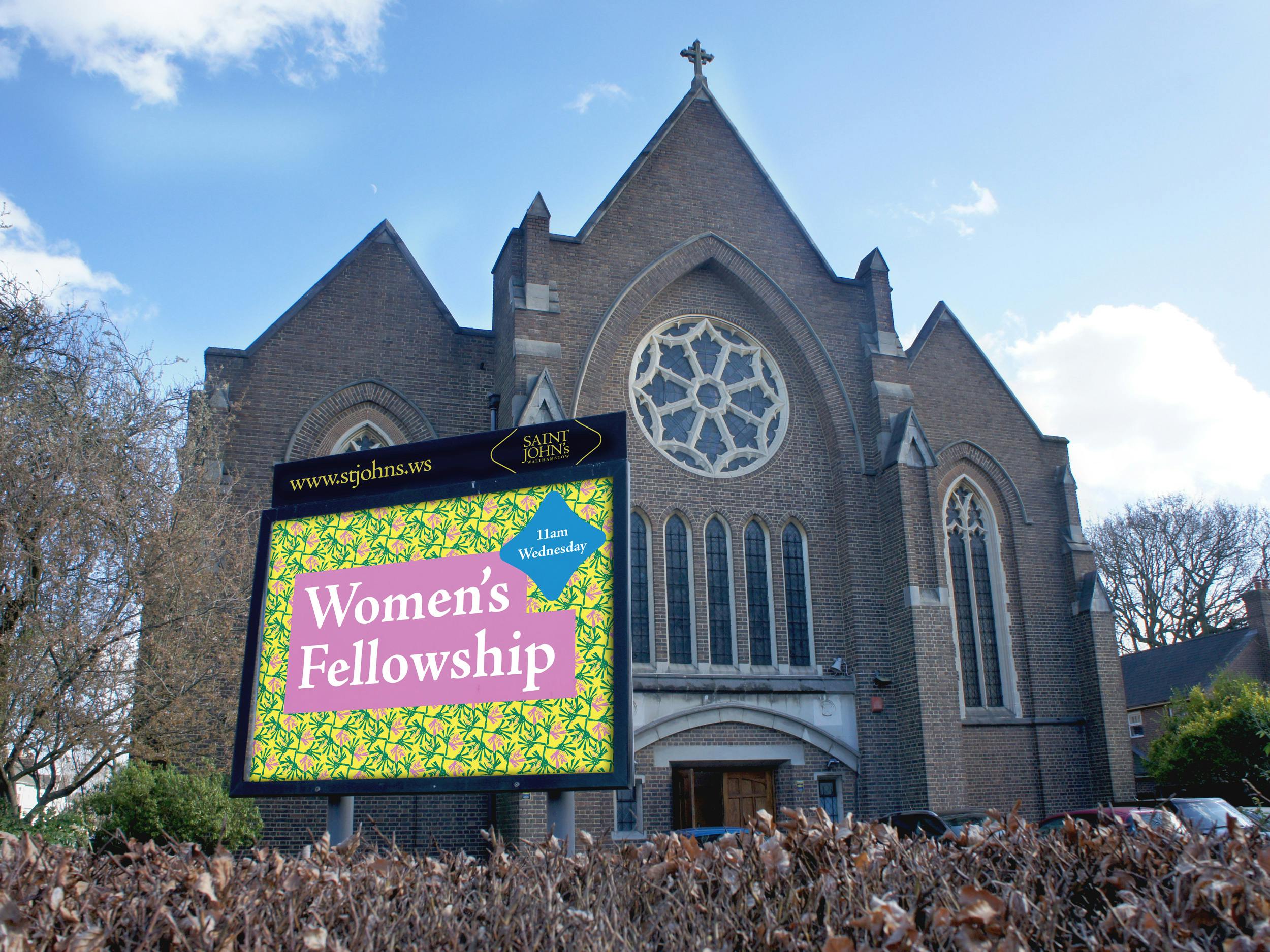
Saint John's Walthamstow Church Sign
No matter if the client is small or large, I try to understand the processes they use, who their clients are, get an insight into their employees and discover their vision for the enterprise and what the visual branding can do to not only support but become a fulcrum to enable that vision.
With Saint John’s, like any community organization, the people involved are vital to the work they are involved in. I wanted an insight into the people at the church and those the church served. I visited Walthamstow a couple of times to explore the area, meet with the team at Saint John’s and attend a couple of services. This plus the knowledge of the folks at Saint John’s, many of whom live in the community and had been in the church for decades, enabled me to build a picture of what Saint John’s was and what it was looking to achieve going forward.
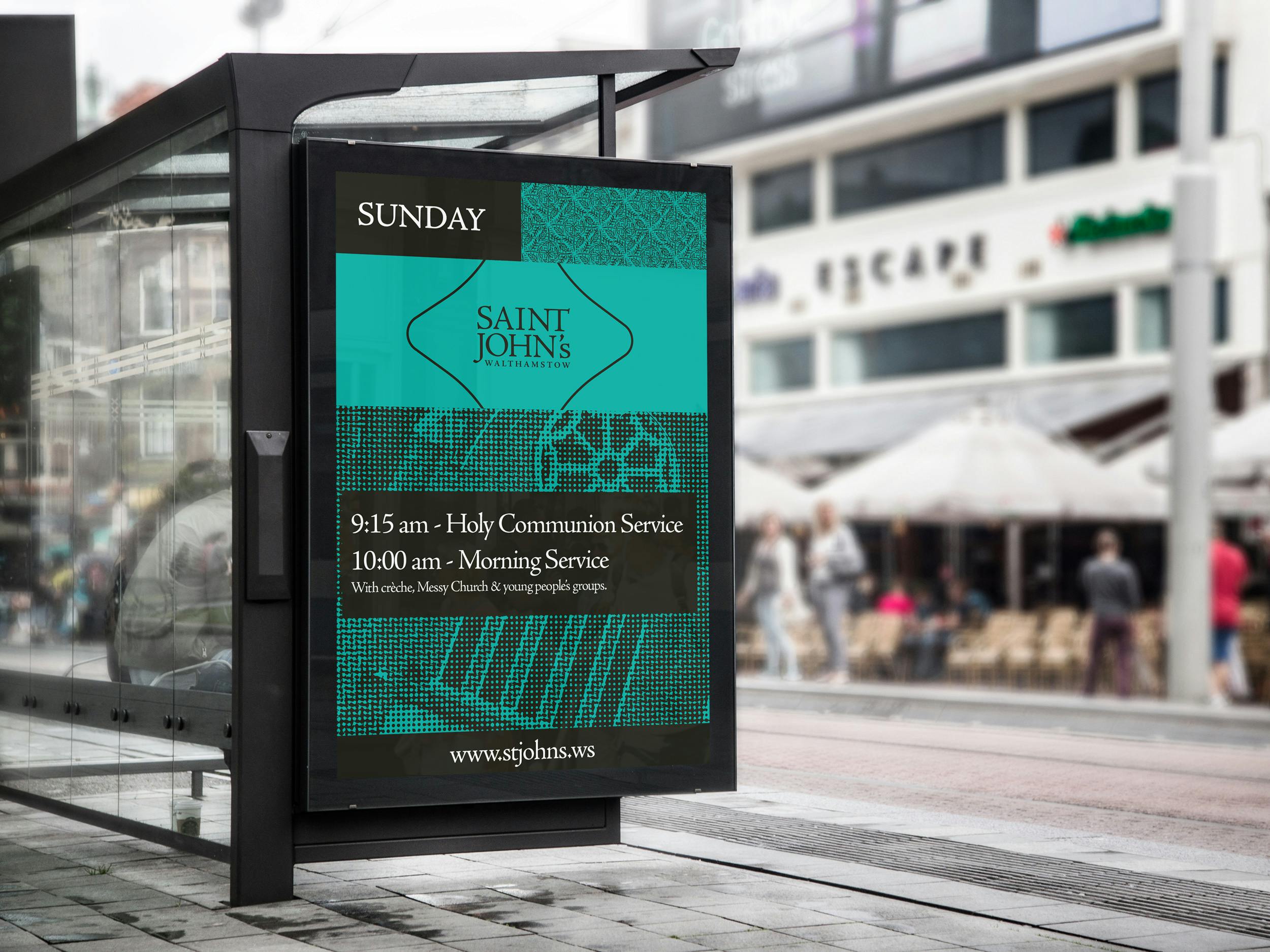
Saint John's Walthamstow Bus Stop Sign
Were there surprising challenges you encountered along the way?
My second visit to Saint John’s was in March 2020. Then, as I suspect readers may be aware, Covid happened. I was already set with a few of the ideas and concepts at this point and the visit was to undertake some collaborative work with the church members, so things didn’t completely stall, but everyone's priorities changed. This was especially true of the church, which became heavily involved with supporting its local community during the lockdown.
The Saint John’s team themselves were amazing, open to ideas and suggestions, but willing to push back where perhaps I’d taken them too far. It was great to have the sort of relationship where we could wrestle over ideas.
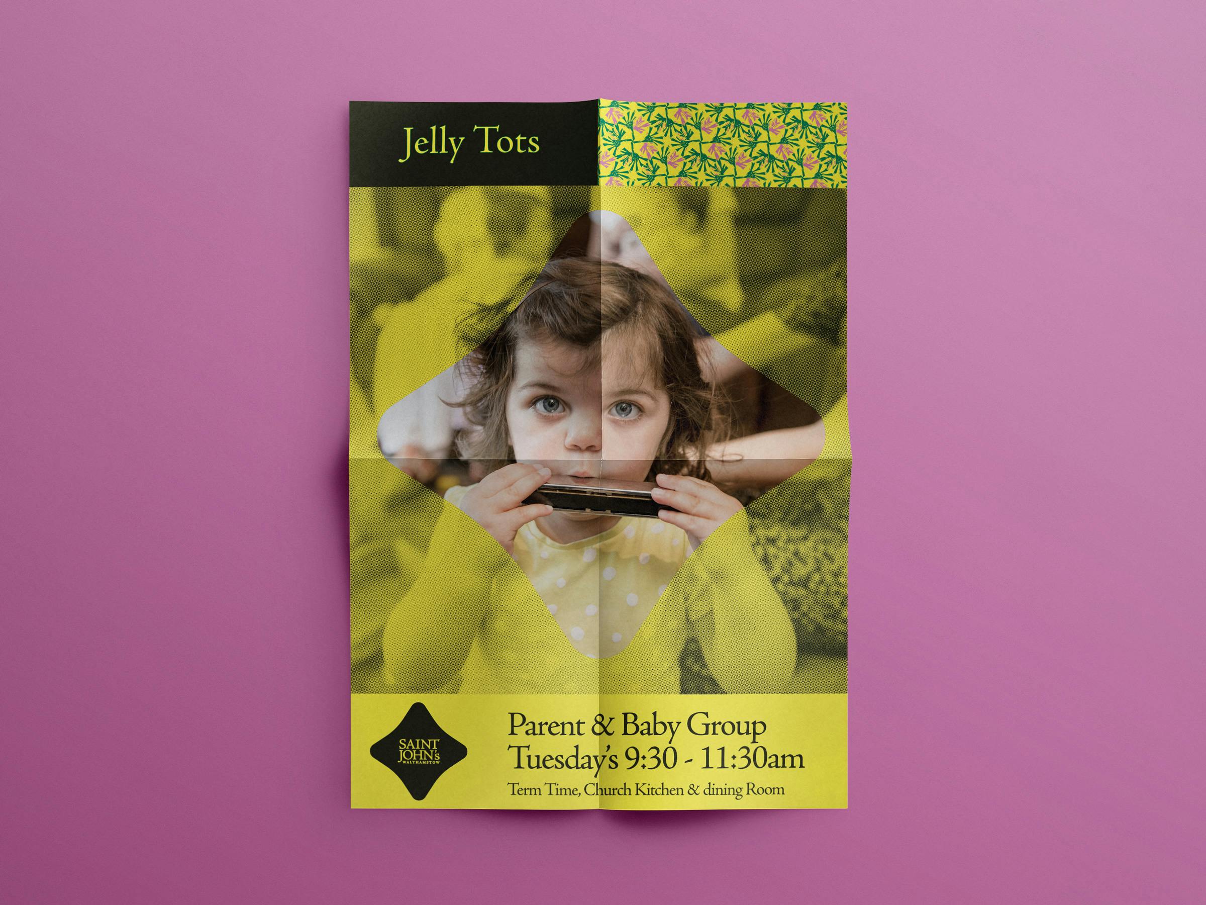
Saint John's Walthamstow Church Flyer
Can you tell us the story behind the logo? How was it conceptualized?
Walthamstow is a place that oozes with history, lots of that is creative. Contemporary artist Grayson Perry calls it home and until recently had a studio in the borough. Nineties boy band East 17 took their name from the Walthamstow postcode of their home town and Arts and Crafts visionary William Morris lived locally and his former family home now hosts the William Morris Gallery.
It was to Morris that I looked when considering the typography. Morris set up the Kelmscott Press, who produced some exceptional work on books such as the Kelmscott Chaucer edition of the poets’ complete works (which often gets named just after the Guttenberg Bible as one of the all-time outstanding typographical achievements). The Kelmscott Press created Golden Type, a font based on the work of engraver and printer Nicolas Jenson in Venice around 1470.
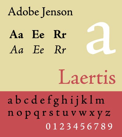
Saint John's Walthamstow Church wordmark
The main wordmark is set in a slightly modified Jenson Pro from Adobe, with added NT ligature and a few letter adjustments to make the overall design more coherent.
The holding quatrefoil shape comes from elements in the architecture of the rose window at the front of the church. The rose window is a very visible element on the building, but churches aren’t about buildings really, they’re about people. So for additional branding elements, I was keen to explore the community aspect more.
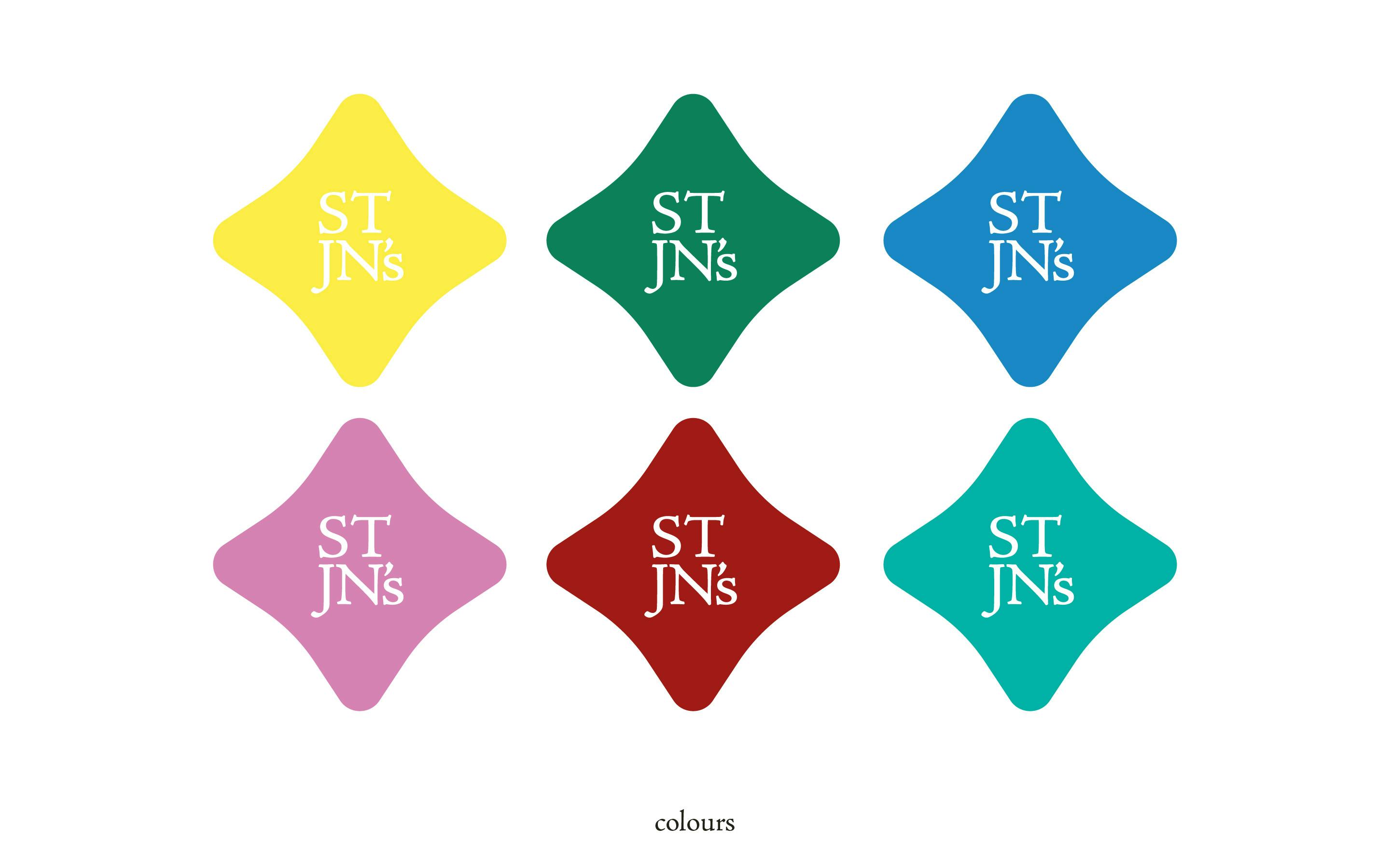
Saint John's Walthamstow Church Colors
What about the color palette? How did you land on the new colors?
Modern Walthamstow is a story of a few phases, beginning with urban development in the late 19th Century. Around the parish that Saint John’s serves this is especially marked by the social housing project headed by the Warner Housing company which built many high-quality properties for the working class at the turn of the 1900s.
Post-war, many damaged areas and housing were replaced by low-rise towers. These contrast with the Warner-style housing stock in both density and build quality. Walthamstow Stadium, once a major greyhound circuit has since closed and been developed for housing, but the frontage remains with its illuminated signage.
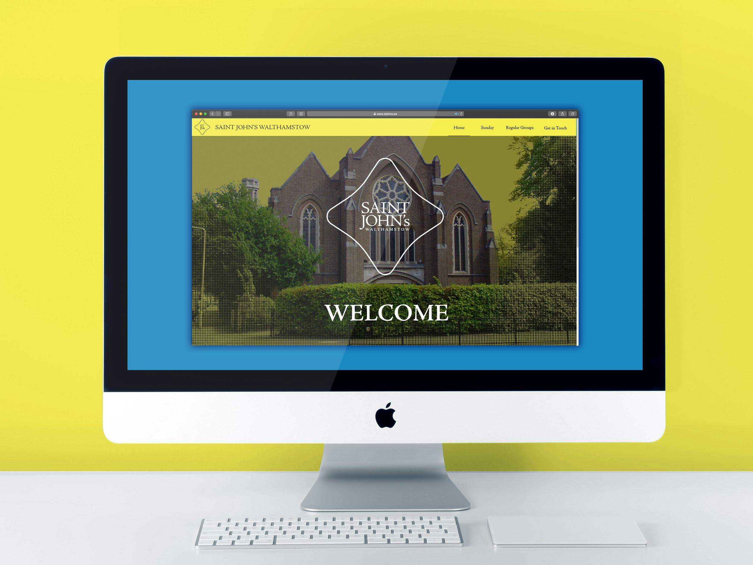
Saint John's Walthamstow Church welcome page
Since the 2012 Olympics, Walthamstow has undergone a rapid period of gentrification, bringing a lively arts scene as well as creating something of a class divide between new wealthier residents and the traditional working-class locals. Venues such as the neon “Gods own Junk Yard” set within a small industrial estate, alongside breweries and bars summarize the ambitions of the changing community.
I attempted to capture some of these elements of the area in the colors, from the Brilliant Green, the official paint color of the Warner homes, to the neon pinks and blues of Walthamstow Stadium and Gods Own Junkyard.
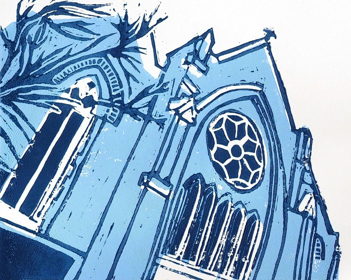
Saint John's Walthamstow Church lino print
The new visual identity also features patterns. How were they designed and what do they say about the brand?
Once I understood the history Morris brought to the area, I couldn’t help but explore how I could mine this heritage within the brand.
I also wanted to get the church community involved in some way and these two desires coalesced into a community project.
One Sunday after church and alongside some lunch, I led a lino printing project with members of the church. Together we developed a series of repeatable pattern squares with a William Morris theme. This wasn’t something I’d really done before but everyone involved, folks of all ages and skills, created some amazing designs that I was able to digitize and tweak before folding it into the brand.
I was super excited to be able to include these handmade elements into the overall brand. Creating a brand for the community that wasn’t just inspired by the community but actually created by their own hands!
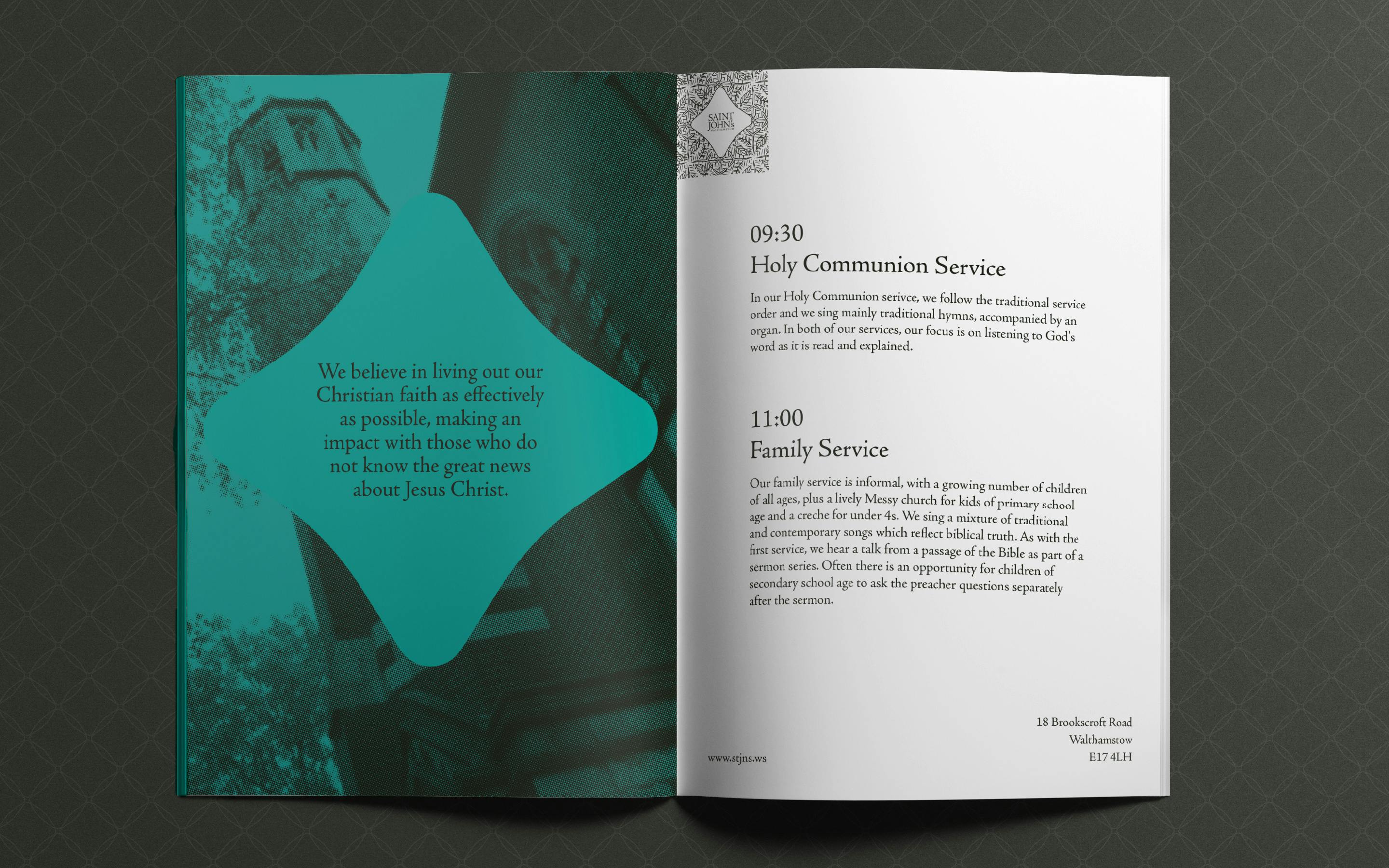
Saint John's Walthamstow Church brochure
Lastly, do you have any advice or pro-tips for designers embarking on branding projects like this?
With church designs, it is perhaps often tempting to take a shortcut to make the brand “relevant” by leaning on current trends. Recently many churches have, in my opinion, embraced the “blandification” of their visual look that says “we are modern”, but as a result, they have missed what’s really important in the church -- the people who are the church and the community they serve.


