


Zoë Boudreau is an Art Director/Designer at Boudreau Designs specializing in clever concept-driven designs. She currently works in Toronto focusing on identity systems, advertising, and art direction. When not working, she's probably eating cheese.

Rooks animation concept
Can you tell us how this project came about? How did that conversation start with Rooks?
Anthony Kalliris and Wayne Lam, the co-founders, came to me after working with a previous designer for their new logo. They were struggling to find a mark that felt right for them, so it was decided I would take over the project and give it a shot. It was important to create a brand that stuck out from the category as their business wasn’t like others. They were one of the few bookkeepers that were fully online. Having a disruptive brand was integral to their business strategy.
How did the rebranding process go? Can you tell us more about it? Where did you start?
When you first think of a rook, bookkeeping probably isn’t the first thing that comes to mind. Therefore, having a book in the logo was important. There were a lot of book icon variants presented to Anthony and Wayne, but we were all really excited when I presented this logo. Conceptually it stood out from the bunch.
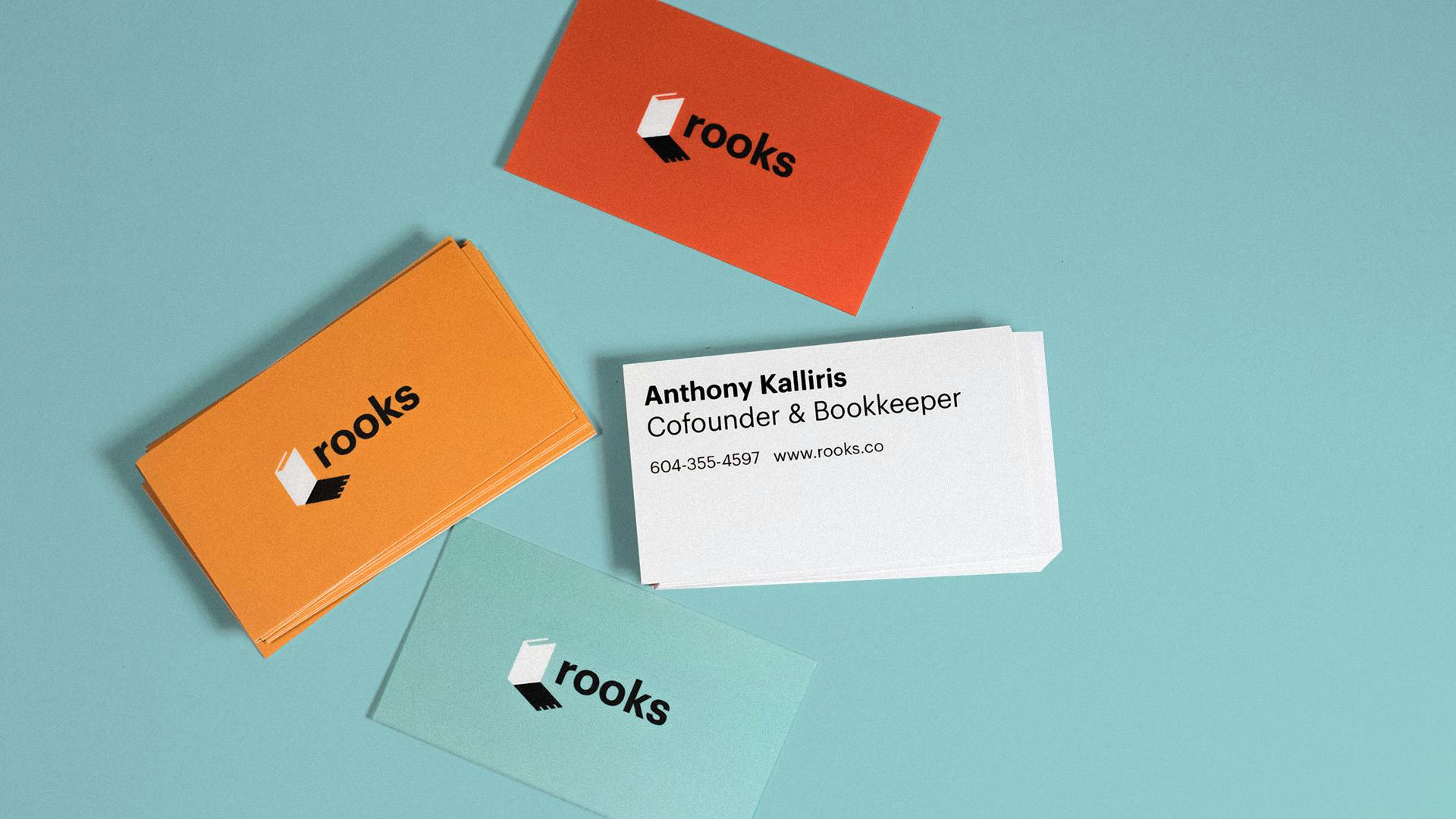
Rooks business cards
Were there surprising challenges you encountered along the way?
Rooks was born during the pandemic and it was tough. We were pretty stressed from the overall state of the world and were transitioning to a new style of working. That was pretty surprising!
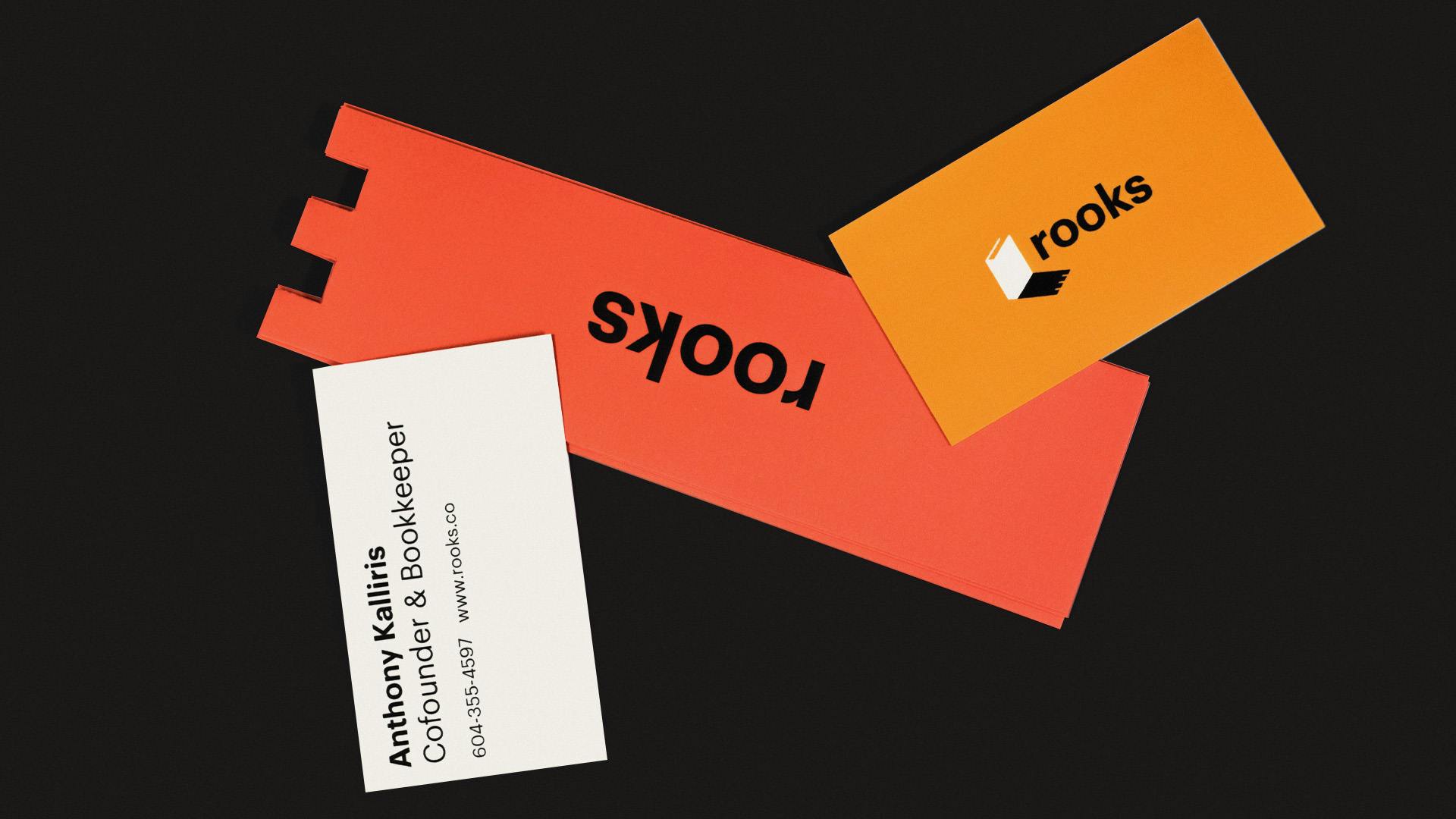
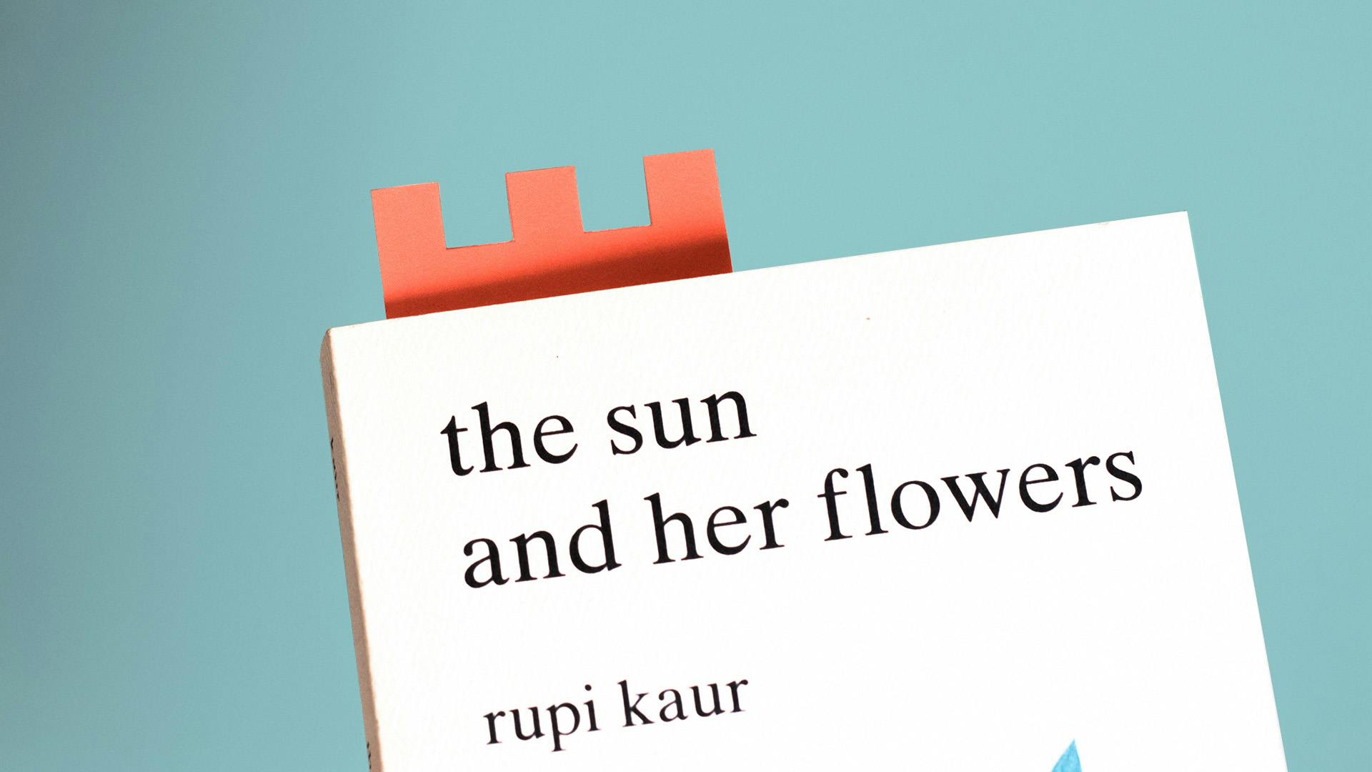
Rooks bookmark
A big change was to the logo. Can you tell us how it was conceptualized?
Rooks Bookkeeping's name symbolizes a chess piece praised for its reliability and speed. The biggest challenge with their previous logo was that it lacked context by only showcasing a rook piece. We needed to insert bookkeeping into it somehow. Their new logo merges the idea of bookkeeping with their name. The synonymous bookkeeping symbol, a book, stands tall as it casts a shadow on the rook chess piece demonstrating strength and wit, much like their fast and innovative processes.
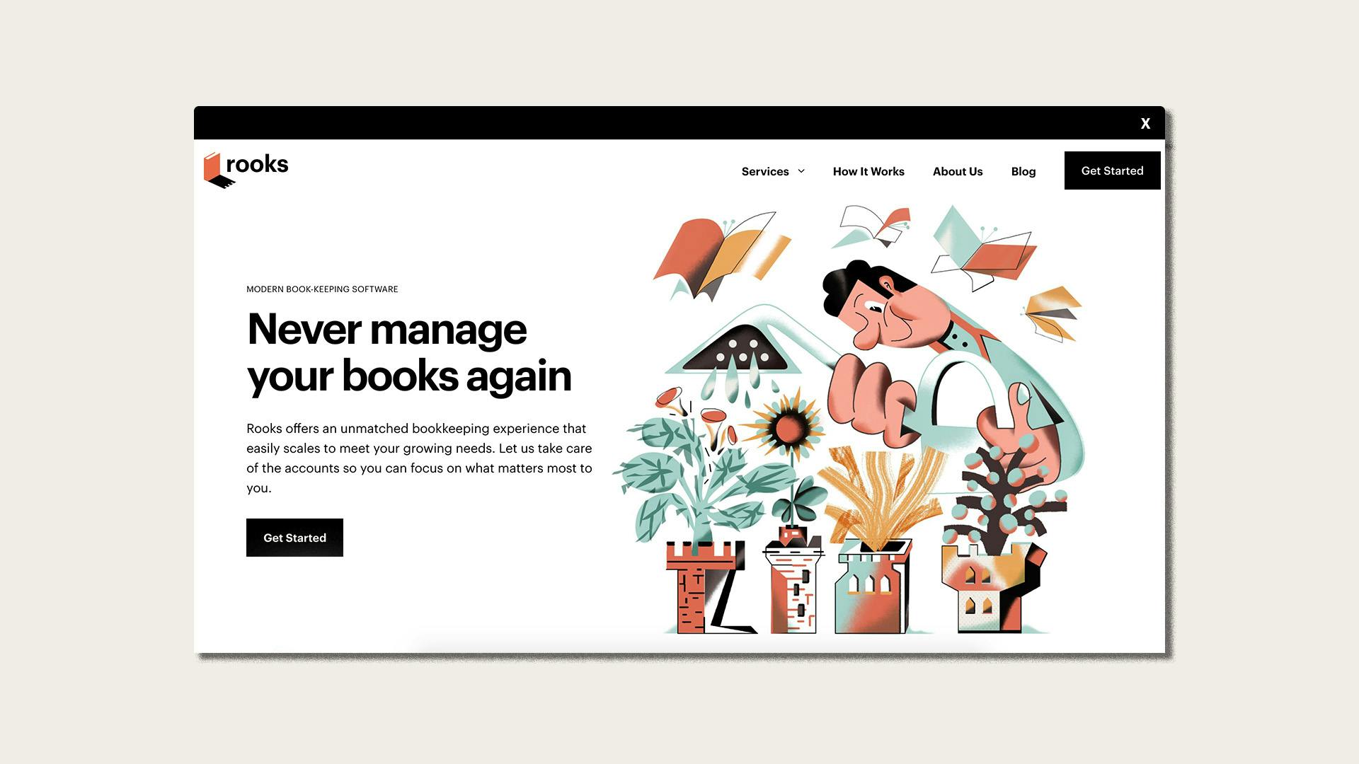
Rooks website
The rebranding also includes illustrations and artwork. Can you tell us more about how they were created?
We reviewed a few illustration styles but Karol Banach really stood out to us. His style was so different and conceptually driven that it felt like an organic fit. He was great to work with and brought some really great ideas to the table which took the brand to a whole other level.
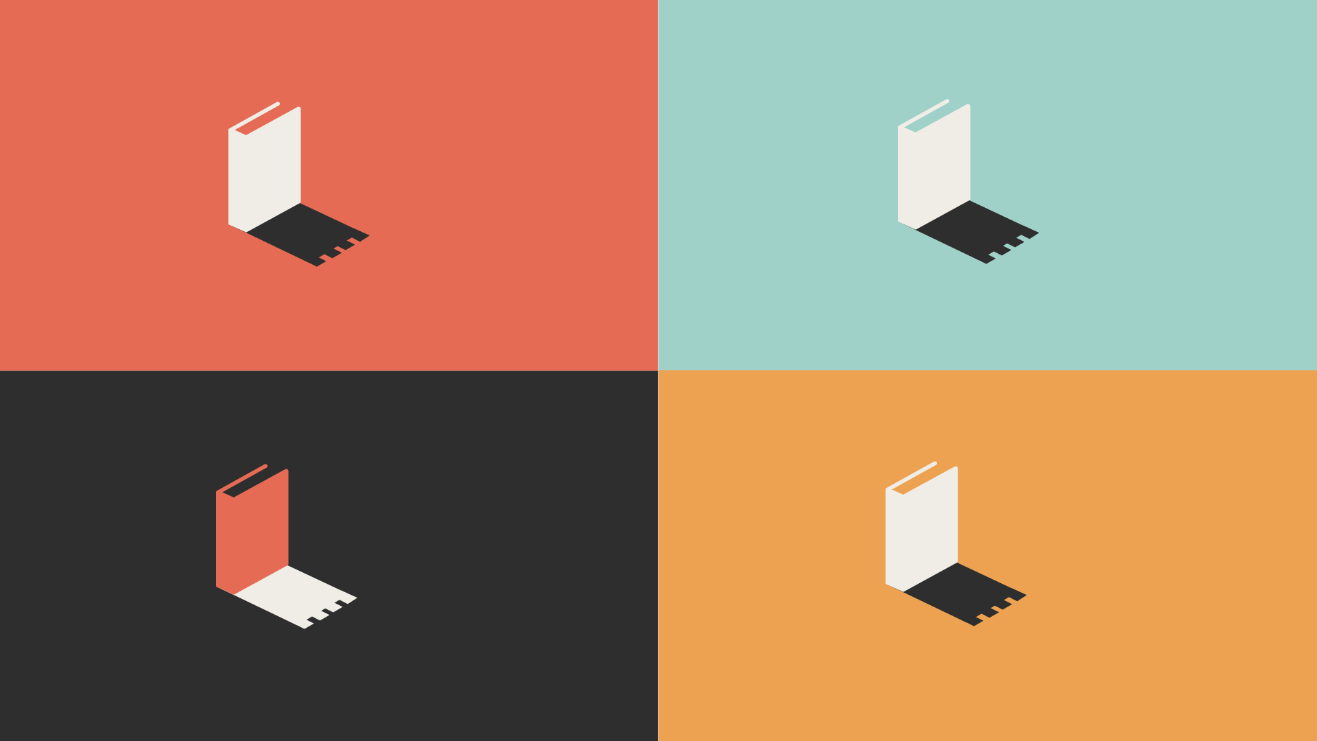
Rooks color palette
The color palette was also changed for this rebranding. How did you land on these colors?
We wanted to go with something a bit different and fun to stand out from competitors. We also wanted to make sure we gave Karol, the illustrator, a good range of colors to play with.
Rooks branding
Lastly, do you have any advice or tips for designers embarking on branding projects like this?
Be hungry to learn. Be a nice person. Push it further.

