

As principal at Steve Wolf Designs, Steve uses his design experience to support brands of all sizes in telling their stories through timeless visuals and strategic thinking. Steve’s philosophy of continuity, resilience and simplicity result in elegant and sophisticated works aimed to stand the test of time. As a true artisan, when not in front of his computer, Steve can be found painting in his garage, seeking inspiration in antique shops, or traveling the globe.
Tell us about Steve Wolf Designs.
Steve Wolf Designs is a graphic design studio specializing in branding, branded illustration systems, and packaging. Our goal is to create meaningful and timeless design for our clients and their audience. We believe that great work comes from building great relationships. We work one on one with our clients and collaborate with them every step of the way.
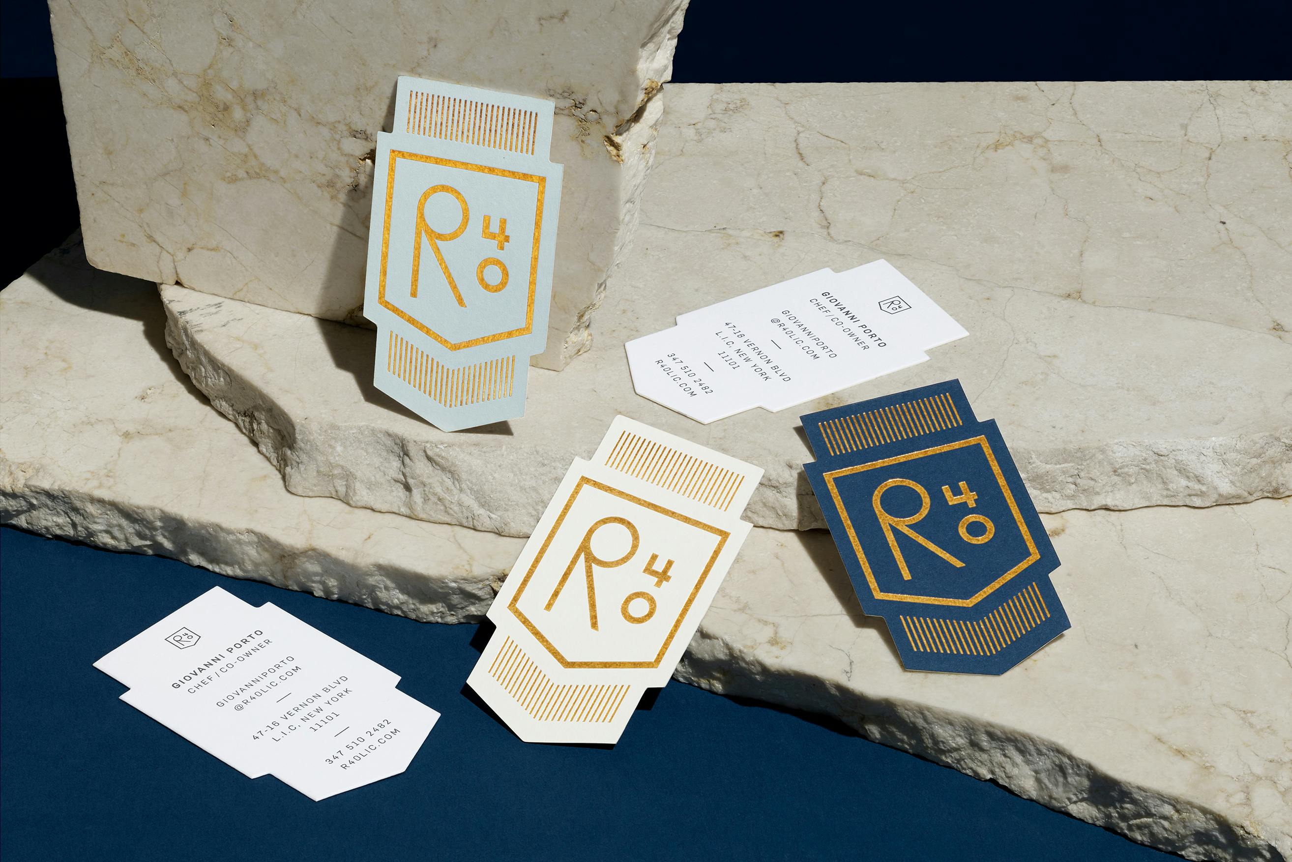
Walk us through your brand design for R40. How was it conceptualized?
The name of the restaurant is actually named after the roadway that runs through the length of Argentina. Chef Gio experienced this route on a trip here and was inspired to create his own dishes from the culinary experiences he had during this time. R40 offers a rotating menu of shareable plates, a backyard space, an underground wine cellar with more than 70 varieties and cocktails in the heart of Long Island City in Queens, NYC.
The logo itself was inspired by the road signs found along the R40 highway. We took this inspiration and added a modern twist to the execution of the logo.
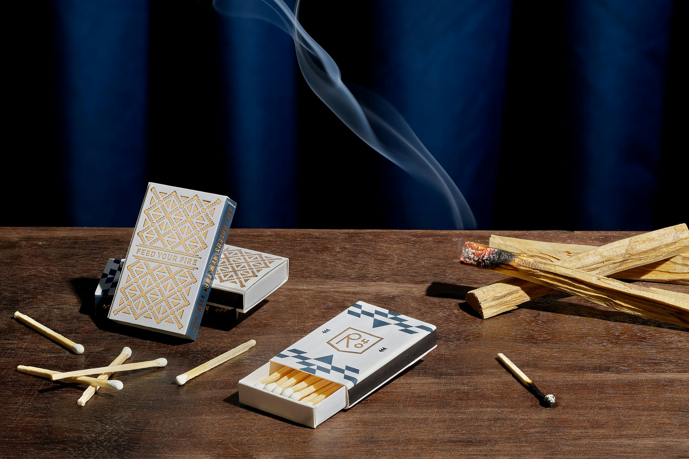
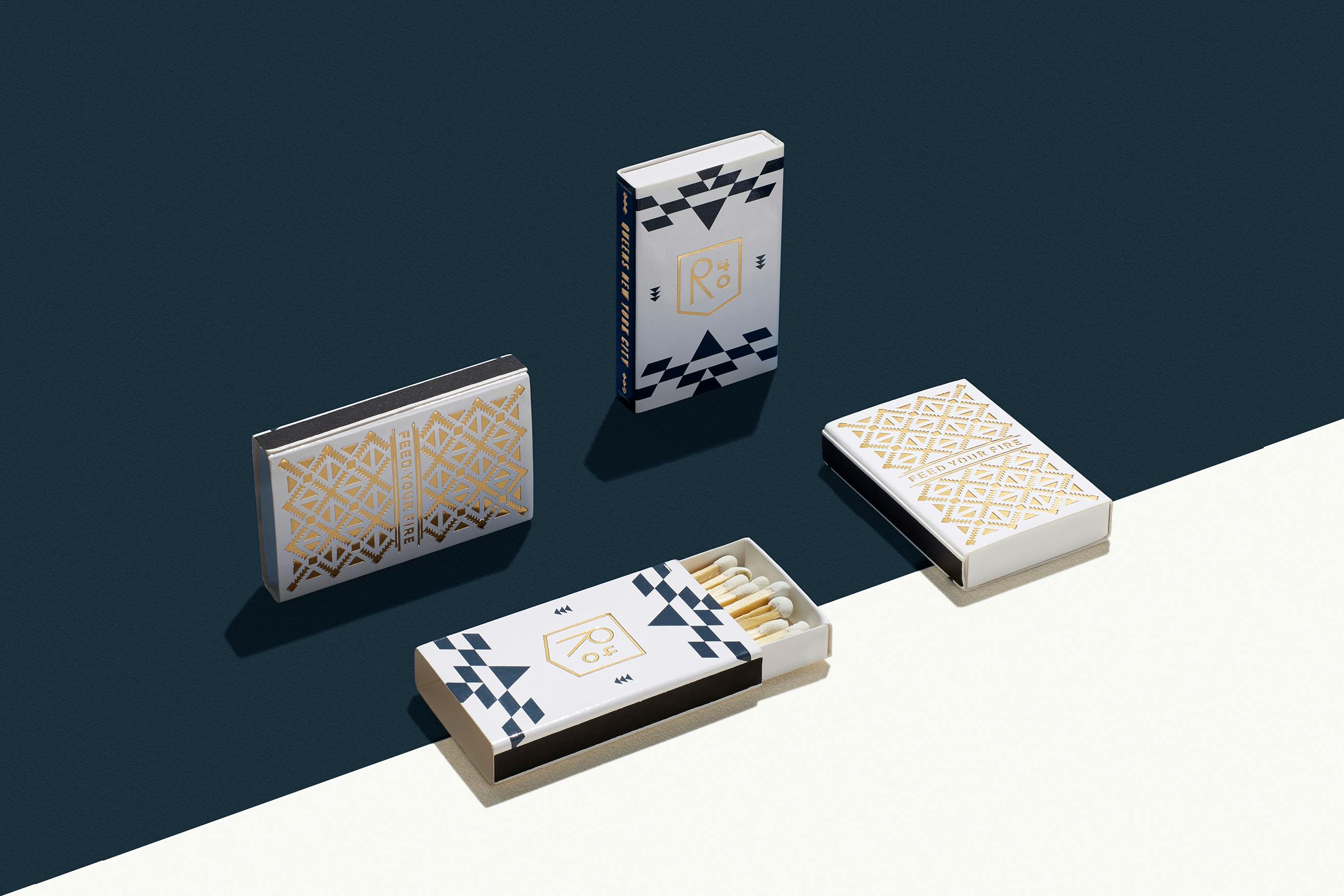
R40 matchboxes are sssmokin'
We’d love to know more about the branding process. How did it go? Who were the key players in this project? Was it all smooth sailing? Were there surprising challenges that you encountered along the way?
Overall, it was a pretty smooth process. There were some investors involved in this project so it was important for them to sign off on the design work as well which took a few more back and forth conversations. The key decision-makers were all smart and they trusted the design work I presented to them which is always a blessing when it comes to this business. This is one of my favorite projects to date –– and having been able to experience this restaurant in person, it is truly an amazing experience if you get the chance to visit.
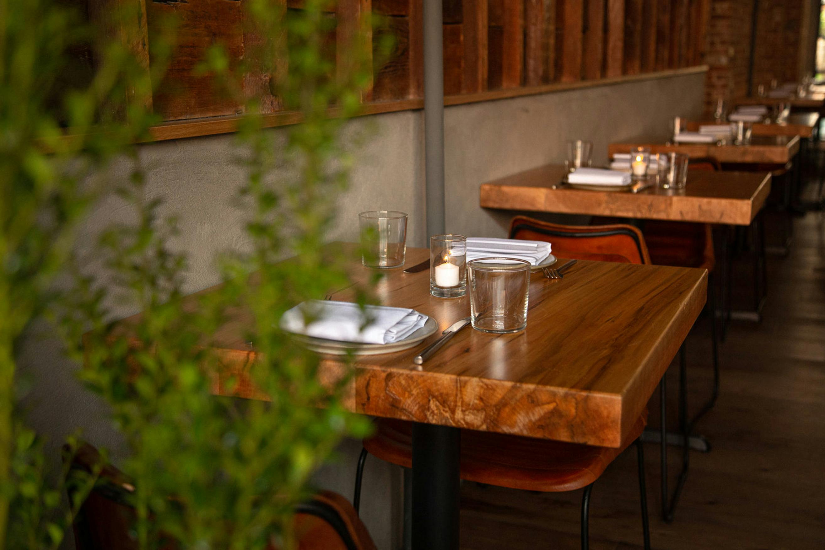
A look inside Long Island City's R40 Restaurant
How did you land on this color palette?
The color palette was inspired by Argentina’s flag which proudly represents the theme found throughout the restaurant and food. The bright blue, dark navy, and bronze colors also feel premium which blends the cultural inspiration with the physical design found in the restaurant itself.
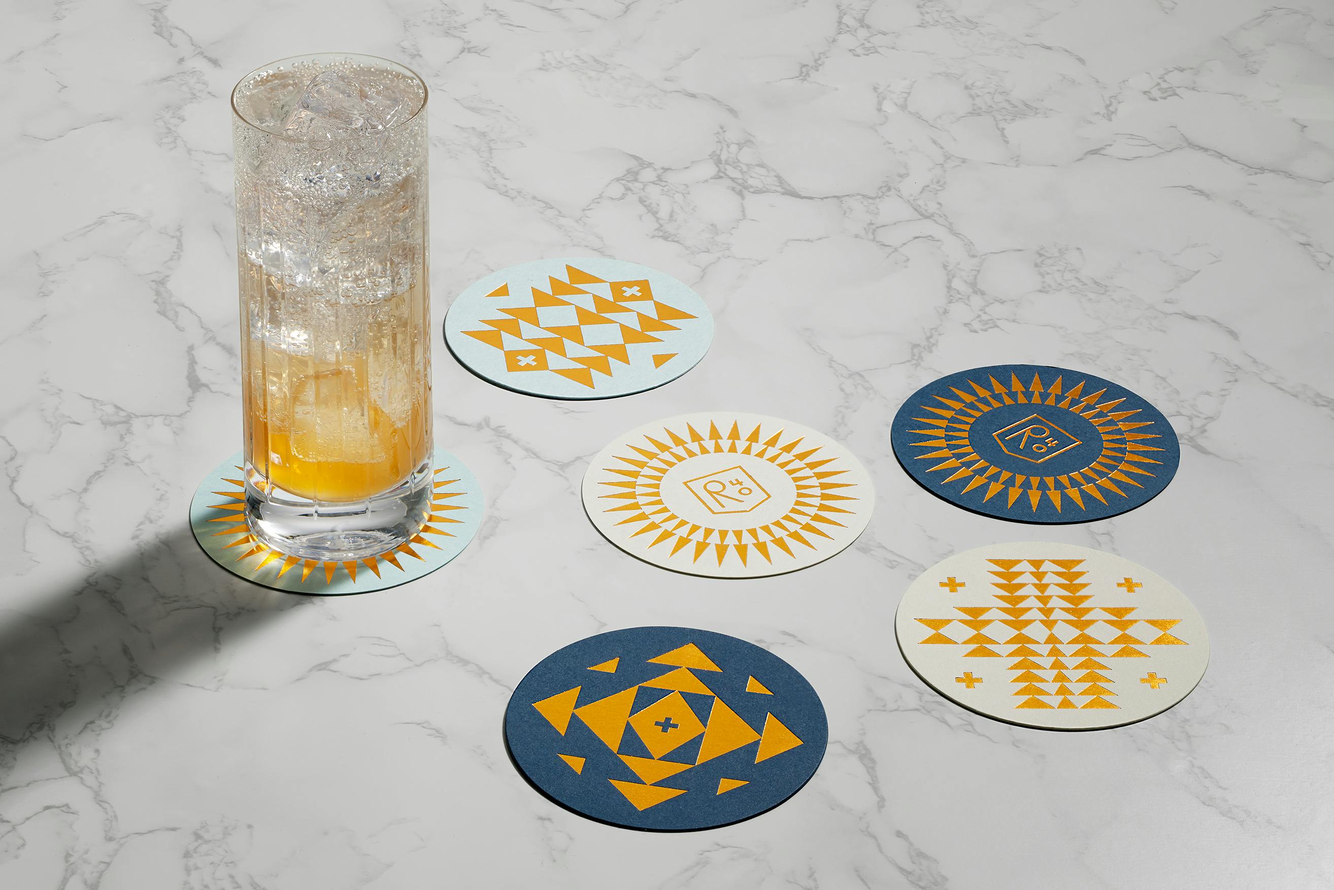
Classy coasters
There’s an Art Deco aesthetic to your work for R40. Was that intentional?
A little bit yes, but it was not the main intention of this project by any means. NYC has a long history with this style so there was a small opportunity to incorporate this aesthetic in a subtle way.
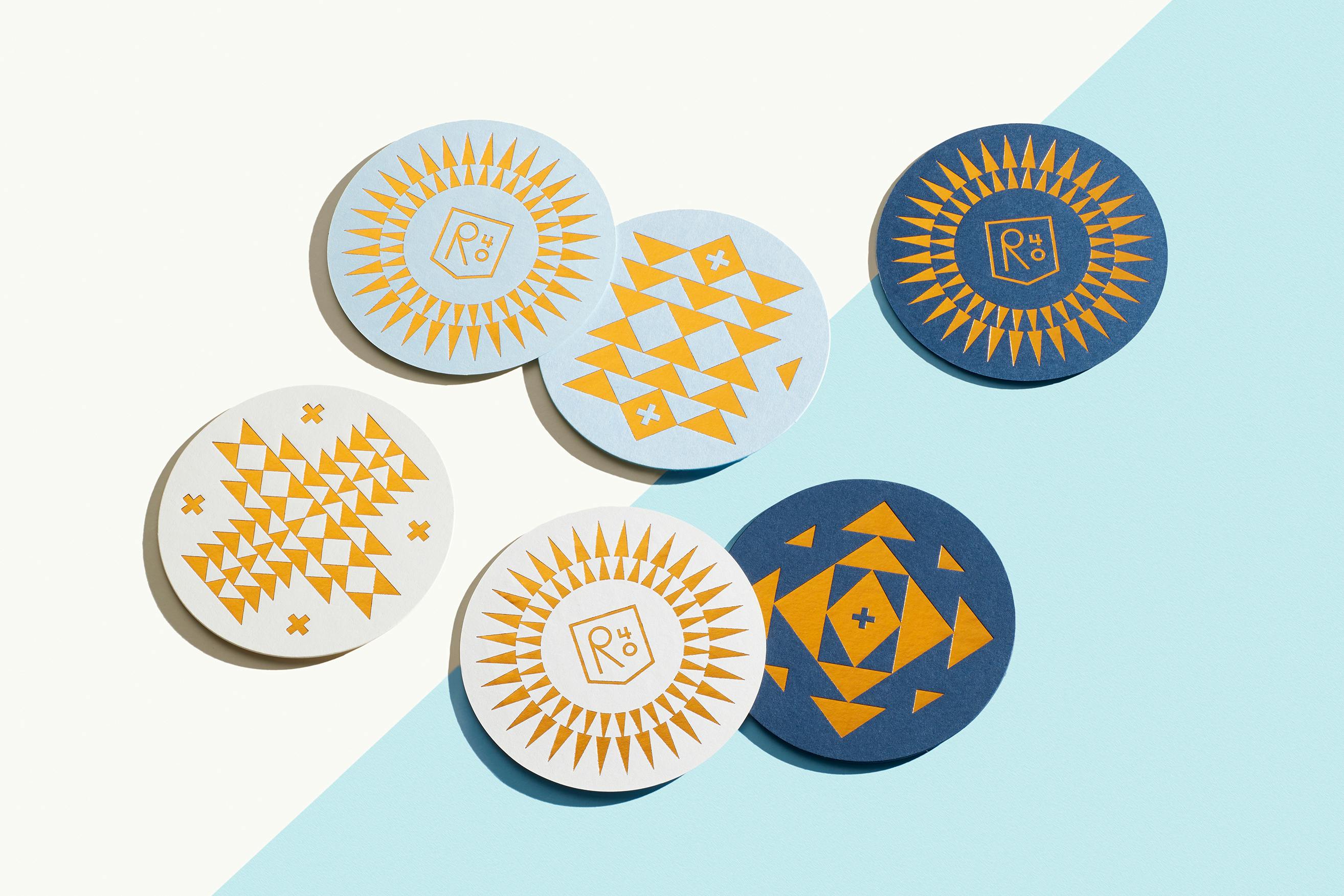
Could you tell us about the patterns on the branding, particularly the repeated triangles and daggers that almost look like spears?
The geometric shapes found in the design work were inspired by South American rug and tile design. The use of triangles is very prevalent in Argentina so it was a no-brainer to try to include this in the branding. It is the piece that really brings the brand to life.
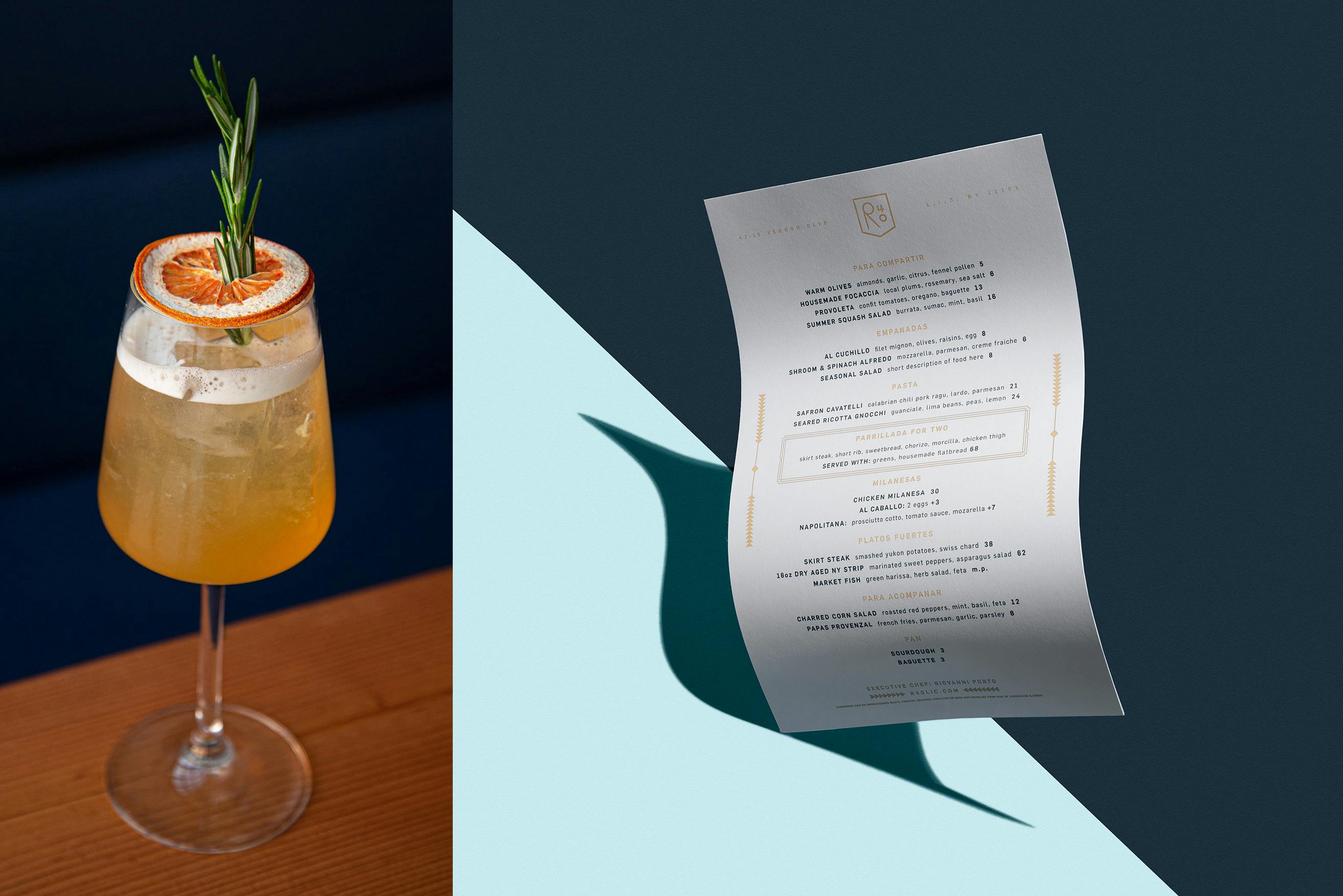
A peek at the R40 menu
What would you say is your main takeaway from this project? Is there something you wish you knew before you started, or any advice for designers or companies embarking on rebranding projects themselves?
One of the key parts of this project that really helped was understanding our clients' vision before we started designing. Our client (Chef Gio), had a very specific vision for this restaurant so it was important that we understood what he wanted so that we could solve the problem at hand. This was our main task to complete and how we could bring this all to life through beautiful visuals.
One piece of advice for designers working on branding projects is to understand your process and to guide your clients through this process. This helps the client feel at ease and streamlines everything so that the whole experience runs more efficiently. Branding is much more than just making a logo, it is creating the whole experience that customers and consumers will interact with and how everything works together.
What’re you excited to be working on next?
I am also currently working on more art-related projects as well as paintings. This will hopefully be implemented onto physical goods as well as more screen prints.

