

Interview with Riham Fahed, Brand and Creative Director at Potloc
Can you provide an introduction to the brand and a brief history of its development?
Potloc was founded 10 years ago in Montreal, Canada, with the goal of providing market research insights.
The name Potloc represents the idea that everyone brings something unique to the table. From their point of view, from the culture to share with everyone which is the essence of surveys The name has been there, from the beginning, it never changed. However the brands went through different iterations.
Image courtesy of Potloc.
Potloc is a survey platform serving leading consulting firms and private equity worldwide, with offices in Paris, Montreal, and New York. The company was founded by Rodolphe Barrére and Louis Delaoustre , who started it while studying at HEC Montreal in 2014.
What sparked Potloc to rebrand?
When I joined the marketing team last year as the Brand and Creative Director I spent a few months understanding the business by talking to employees, leaders, founders, and clients, focusing on the marketing pain points.
At the time, the company was already shifting, especially with our focus on consulting and private equity firms. We realized our product was a perfect fit for them, which led to refocusing on our Ideal Customer Profile (ICP). We were also opening our New York office and serving more US clients, so everything had to align with this new vision.
Rebranding impacts how people know you and perceive you. I didn’t want to rush in—I took the time to listen and understand before making any decisions.
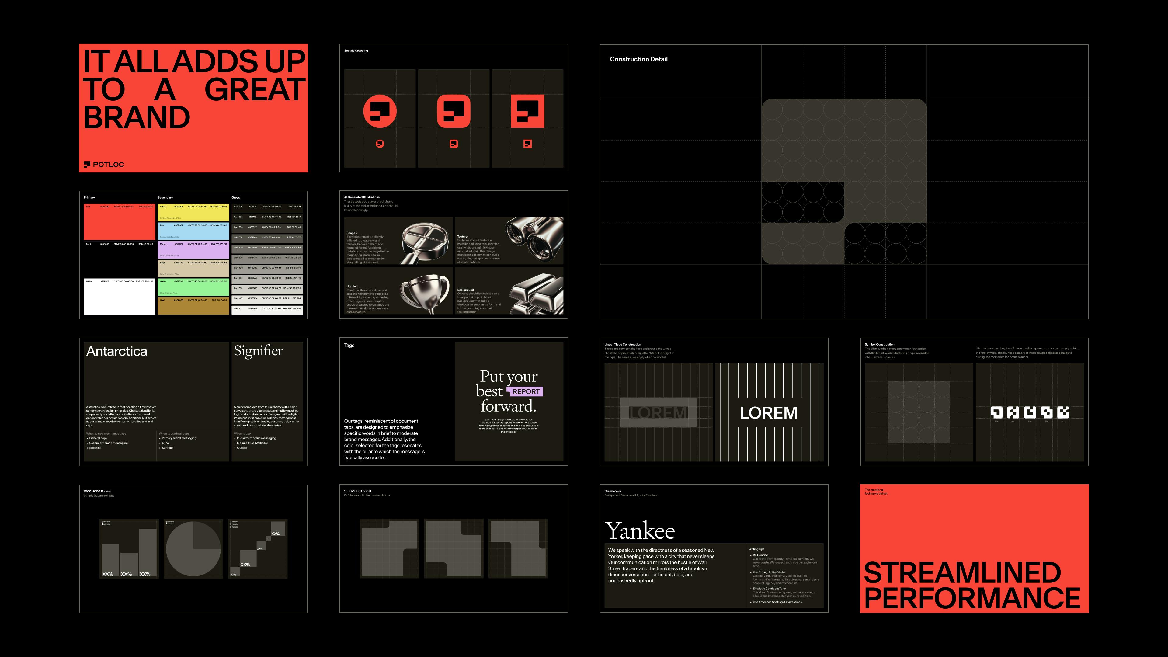
Image courtesy of Potloc.
We started with baby steps, since startups usually have big attachments between the founders and the brands, especially if they were involved in creating it.
As I spoke with people, no one mentioned issues with the brand directly, but they brought up problems like messaging, colors, and the overall look not matching where we wanted to go.
That’s when we started the conversation about rebranding. After collecting feedback from the team, we realized that keeping the old brand and making slight changes would be more limiting. So, we decided to start fresh from the ground up.

Image courtesy of Potloc.
Was the decision to focus on consulting and private equity firms driven from the top?
We’d been working with consulting and private equity clients for a while, and the more we worked with them, the more we realized our product, which is surveys, was a perfect fit for their needs.
After every survey, we’d send an NPS (Net Promoter Score) to measure their satisfaction, and consistently, they gave us very high ratings. This feedback wasn’t based on one single factor but a mix of reasons, which made it clear that these clients were an ideal match for our product.
As we saw this alignment, we decided to focus solely on serving them. This shift allowed us to create a product that perfectly fit their needs, rather than trying to cater to multiple personas.
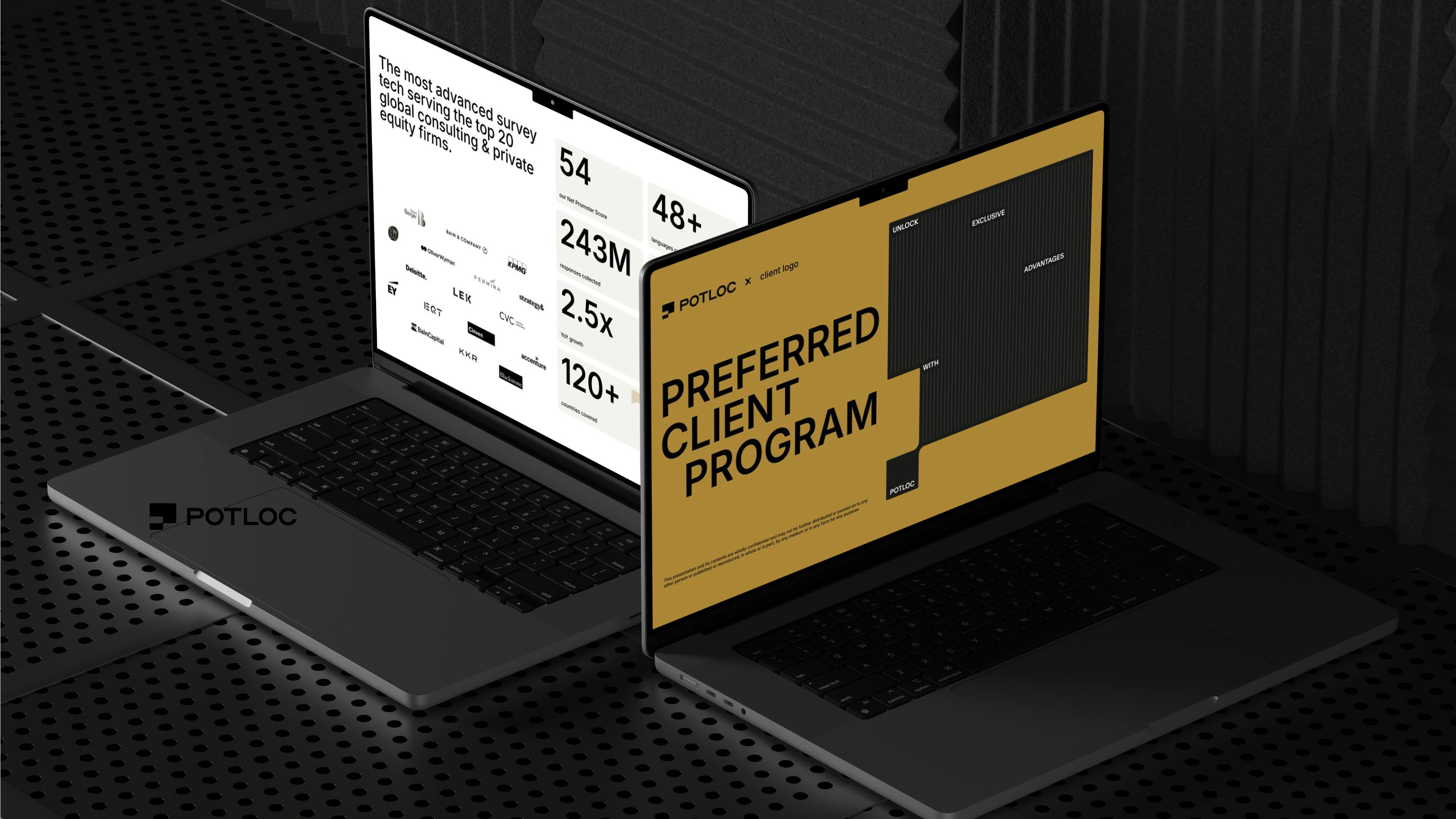
Image courtesy of Potloc.
The founders took the time to sell it to the investors and to the whole company, because it involved reinventing the business as well as the company to streamline the business and focus on one persona. But it was a visionary move that ultimately helped us focus.
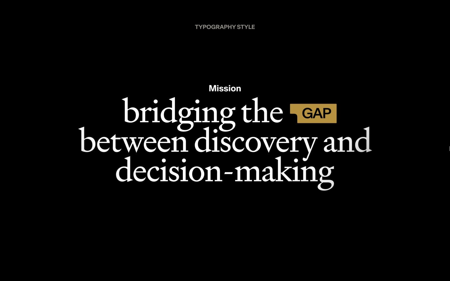
The rebranding went far beyond just changing the logo or colors. It involved repositioning the entire company, which took months to rework our go-to-market (GTM) and create a detailed five-page brand brief that we built collaboratively with decision-makers and employees before even starting the design process.

Image courtesy of Potloc.
Can you walk us through the collaboration with Deux Huit Huit for the new brand? How does it reflect the company's story and meaning?
After spending 18 years on the agency side I wanted to work on the client side, to build and maintain a brand, not just create something and move on.
We had a small in-house team, but I knew we needed external help for this massive rebranding project. I wanted an agency that felt like part of our team—creative, strategic, and collaborative with experience in branding and web.
We met with a few agencies, but Deux Huit Huit stood out. Their team understood our vision from the start, and their proximity to our office made collaboration fun.
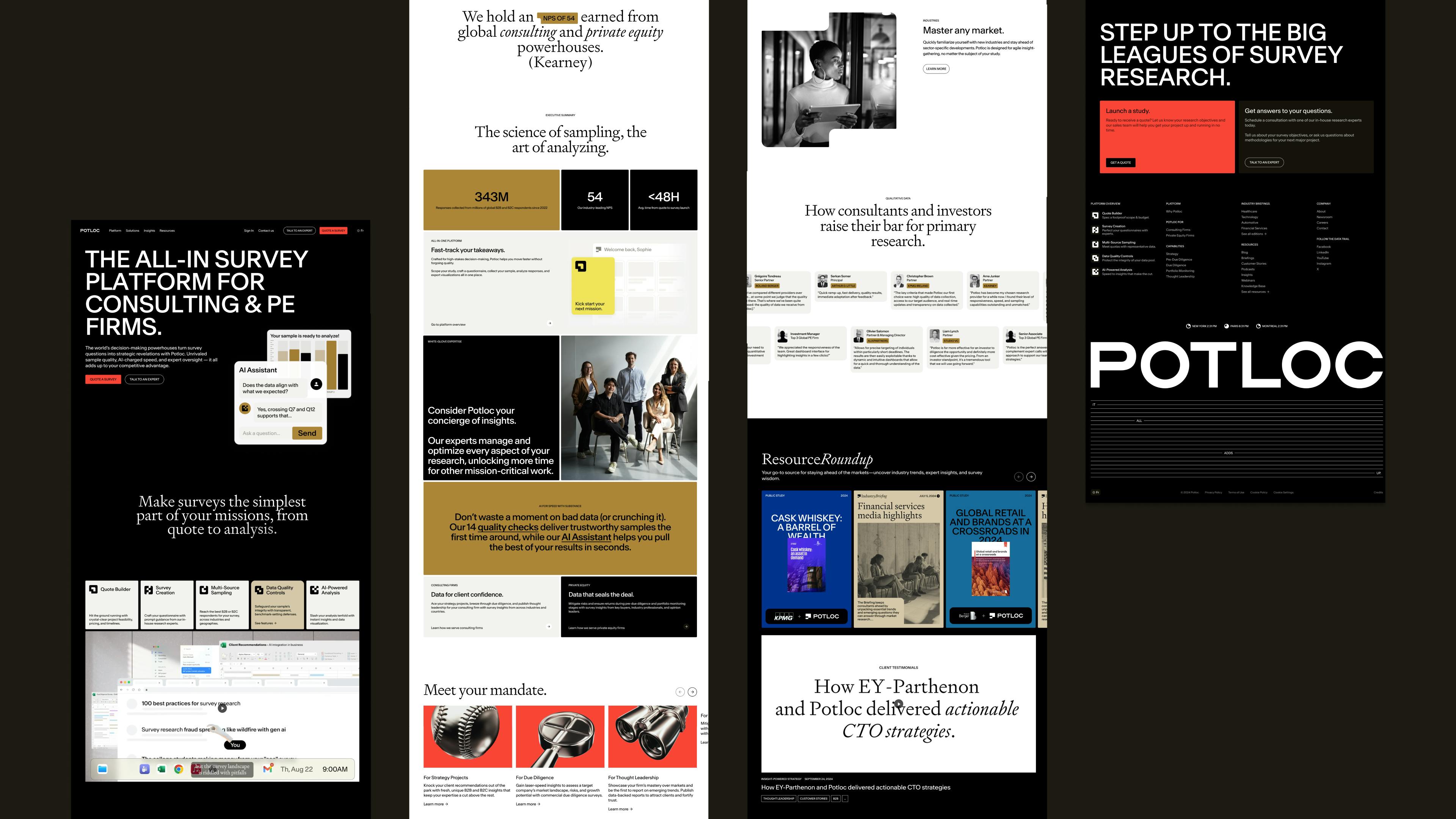
Image courtesy of Potloc.
We started in early 2024 and, despite the tight six-month timeline, the collaboration process was smooth. They’d present ideas, we’d give feedback, and we’d build on each other’s input, especially when it came to the logo.

For the logo, we wanted something dynamic that reflected the ever-changing nature of the data we provide.
It includes subtle elements like a question mark for asking survey questions and quotation marks for quoting responses. It’s not just a "P" for Potloc, but a logo that can stand alone or be part of a broader visual identity.
We also worked with a video marketing agency Burnwe on both the Platform Explainer and the brand video. That was great collaboration after the main rebranding was done.
What was the reason and meaning behind choosing red and gold as the primary colors?
The main goal of the rebrand was to position us as a tech company that aligns with the excellence seeking nature of our clients. In the tech space, most brands use blue logos and colorful palettes, and we wanted to decluster ourselves.
That’s why we chose red—it wasn’t random. Red conveys a sense of urgency, which reflects the speed in the services we provide.
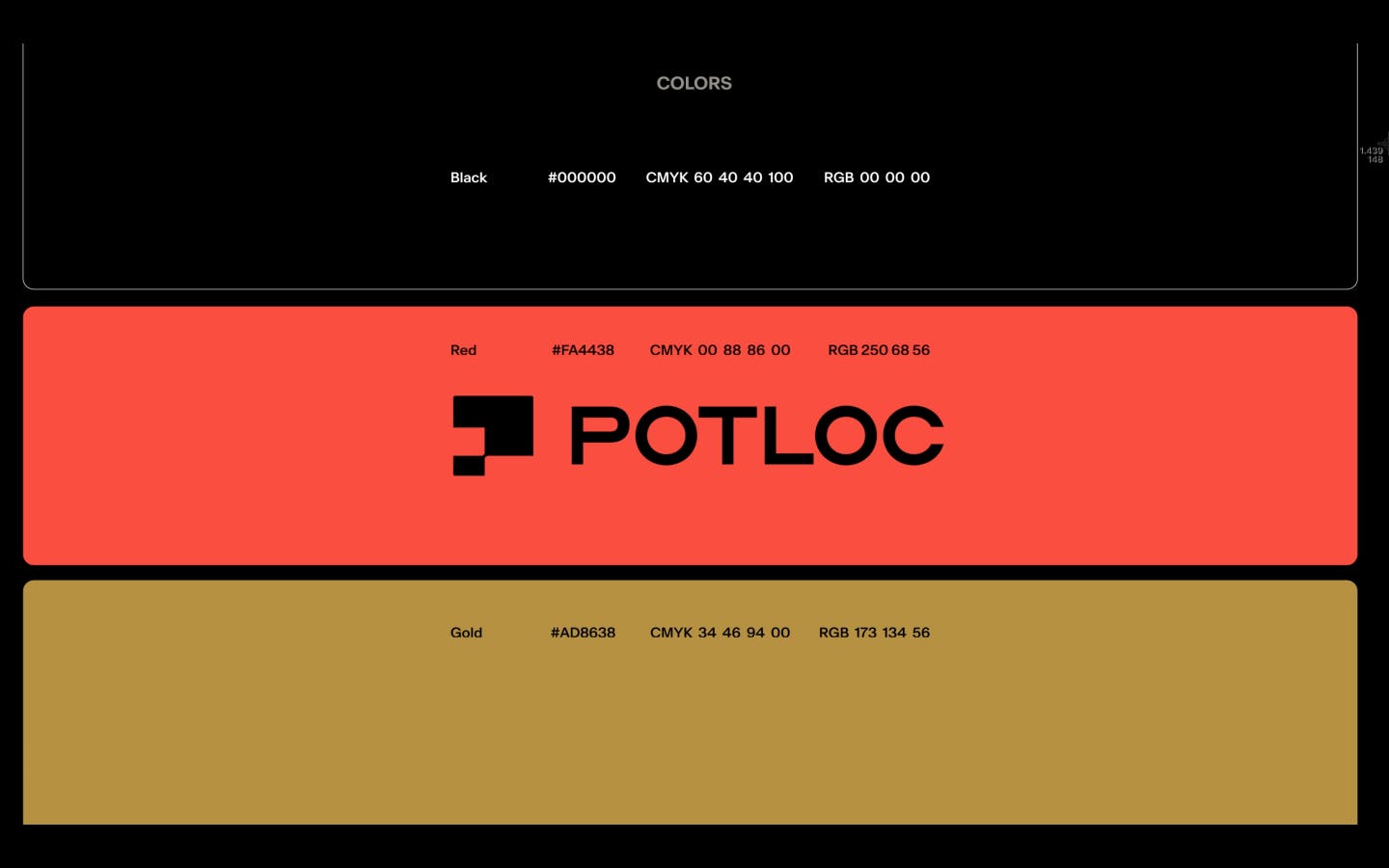
Image courtesy of Potloc.
We also paired it with gold and balanced it with black and white to give the brand a sleek yet high performing feel, tying back to our brand essence of “streamlined performance.” This reflects the active, ambitious, and hardworking nature of our personas or muse as we call them since they inspire everything we do from the platform to the business.
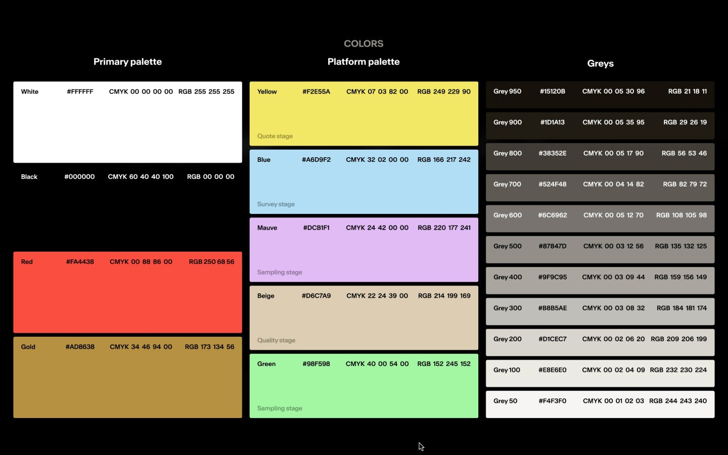
Image courtesy of Potloc.
Can you share more about the creation of the symbols and what inspired the company to choose them?
With the business refocus, we reinvented the platform, moving from a dashboard that visualized insights to a full end-to-end survey platform.
The five symbols reflect the five stages of the survey process, from getting a quote to summarizing insights with AI. We even created a video to show consultants how they can use the platform from start to finish.

Image courtesy of Potloc.
These shapes evolved from the logo mark, and there are five colors strictly used for the product. The colors correspond to different stages of the platform, making it clear as users move from one step to the next. You'll see how the logos and colors are used within the platform to guide the experience.
What is the significance of the new tagline "It All Adds Up" in Potloc's rebranding?
Our tagline, "It All Adds Up," comes from the idea that, while we play a small part in our clients' projects, it's a vital part. The quality of insights we provide directly impacts the success of their projects.
We believe that every insight, trend, opinion, and question answered contributes to the overall success of our clients. That’s why we created this tagline, along with an animation that shows how we fit into their world, influence their success, and support it.

Image courtesy of Potloc.
Can you share with us the challenges Potloc faced during the rebranding process?
There are always challenges with rebranding, but this project was one of the smoothest I’ve worked on because we took time to plan. We made sure everyone had clear roles and set expectations upfront, which made the collaboration successful.
One of the biggest challenges was the tight timeline—we had just six months to complete everything, so we couldn’t afford to overthink small design decisions. We had to make quick calls and keep the momentum going.
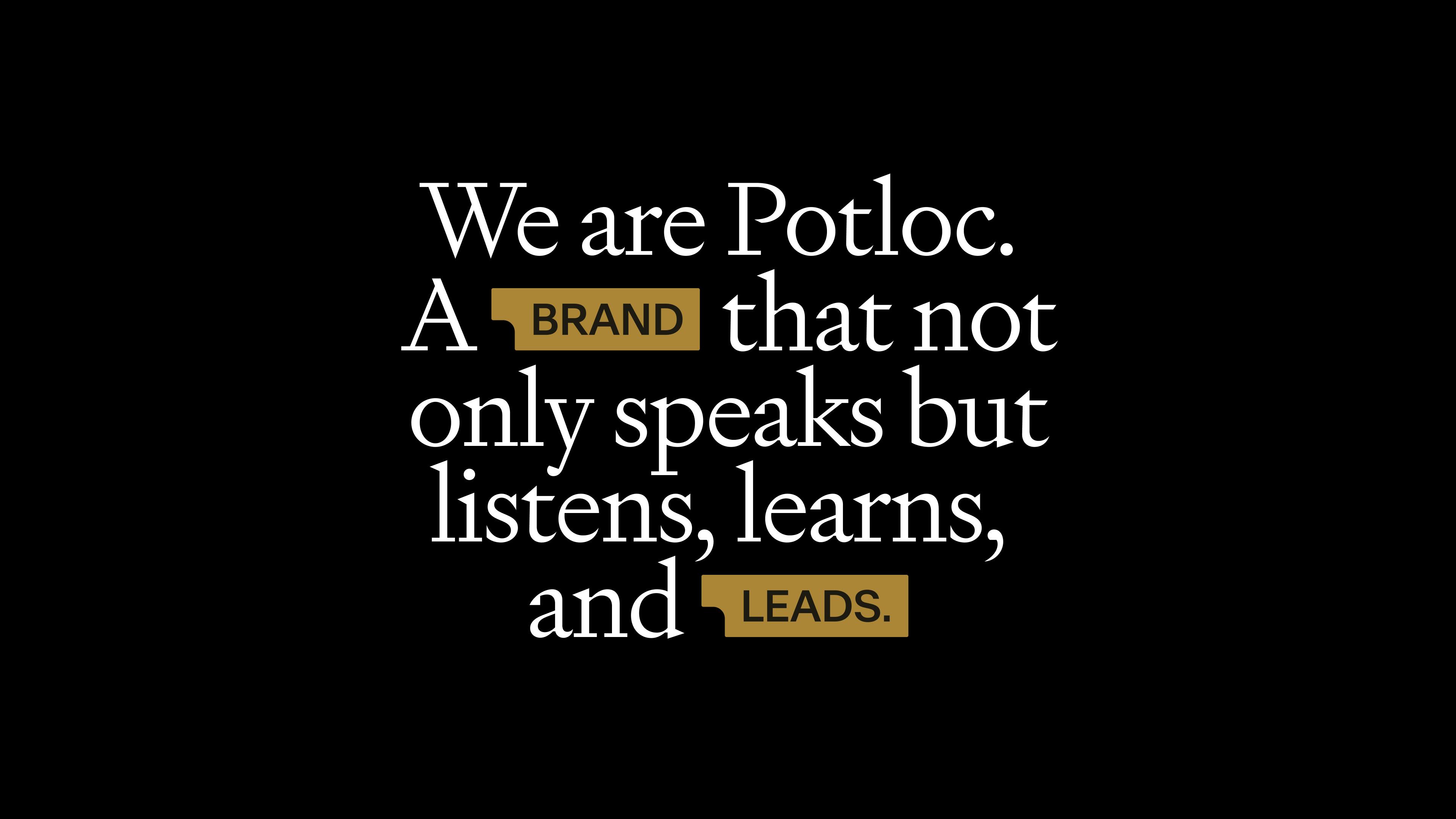
Image courtesy of Potloc.
Everyone stayed motivated, and we didn’t lose steam, which can happen when a project drags on. In those cases, people just want to finish, but here, everyone remained focused on what we wanted to achieve.
Managing expectations was crucial too. We built trust with the founders and leaders, involving them in key decisions. They trusted us with the details, and that trust kept everything running smoothly.
How did you approach shaping your role at Potloc, and do you have advice for others looking to adapt their roles?
I was approached for a brand manager role, but during the interview process I quickly realized they needed both a brand person to strategize and a creative director to deliver by building an in-house team and working with agencies.
I often tell designers to not get too stuck on job descriptions—rather focus on shaping their role within a company. Every person brings a unique perspective, and it’s important to choose people for their vision and drive, not just their experience.
I believe every person brings something new to the table. If someone else had been hired, they might have done this project differently. But that’s why it’s so important to find your own place within the company and contribute based on your strengths.
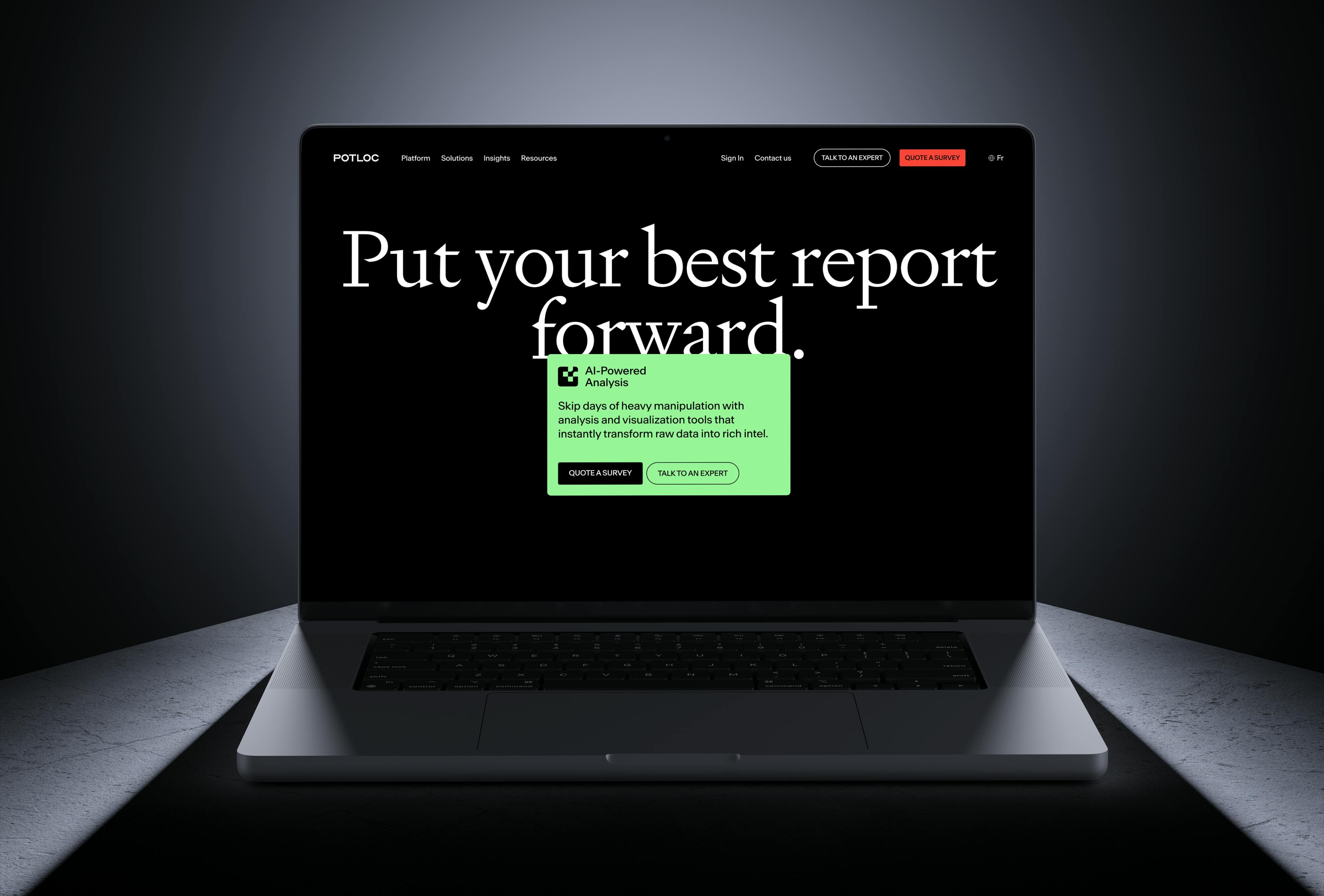
Image courtesy of Potloc.