
Interview with Matt Stein, Head of Brand and Creative Strategy at Philo
Can you introduce yourself and provide a brief history and development of Philo?
Philo, originally launched as Tivli, began as a platform for college students to stream cable TV in their dorms. As we evolved, we shifted from being a campus tool to a consumer-facing streaming service in 2017.
Named after Philo Farnsworth, the inventor of television. Today, Philo offers over 70 entertainment channels from networks like AMC, Discovery, and Paramount, along with a vast on-demand library and unlimited DVR — all without contracts or hidden fees.
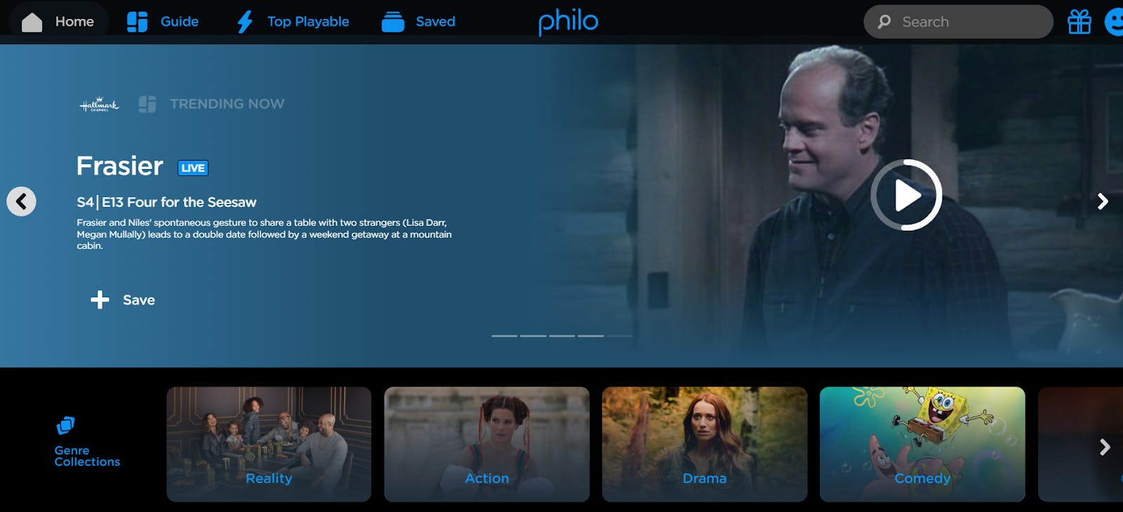
Philo Old Identity
Our mission is simple: provide an affordable and transparent way to watch TV. We believe TV access shouldn’t be costly, so we focus on keeping prices low and offering flexibility. Users can choose add-ons, enjoy our free service, or customize their viewing experience without the pressure of long-term commitments.
As the Head of Brand and Creative, my role is to oversee all aspects of brand positioning and messaging. I manage the content we create to communicate Philo’s identity to consumers, and I work closely with our social team and internal design team.

Image Courtesy by Philo
What motivates Philo to going rebrand?
Our decision to rebrand Philo came from a couple of key motivations. First, we like to renew our visual identity every few years to keep things fresh and polished. It had been a while since we last did a deep rebrand, and this moment felt right, especially with all of the changes happening in the media landscape.
For us, it wasn’t just about updating the visuals. We’ve grown from simply offering live TV to becoming more of a platform. Now, we provide a range of content —our core subscription, free, ad-supported channels, and even SVOD inclusions in our core service like AMC+.

Image Courtesy by Philo
We wanted the brand to reflect this growth and tell a bigger story about who we are. We’ve always focused on the functional benefits of Philo, but this time,
We wanted to highlight why we do what we do—showing that we’re consumer-centric and passionate about simplifying TV.
The TV world has become fragmented and cluttered, with countless apps and options making it harder for people to find what they want to watch. We felt this was the perfect time to show that we’re here to make it easier, more straightforward.

Image Courtesy by Philo
Our rebrand reflects that commitment to simplicity, with a design that’s minimalist and elegant, but also warm and inviting. We want Philo to feel like a place that you’re connected to emotionally—a service you can rely on, that doesn’t overwhelm you, but instead brings joy and comfort in a world that’s full of entertainment noise.
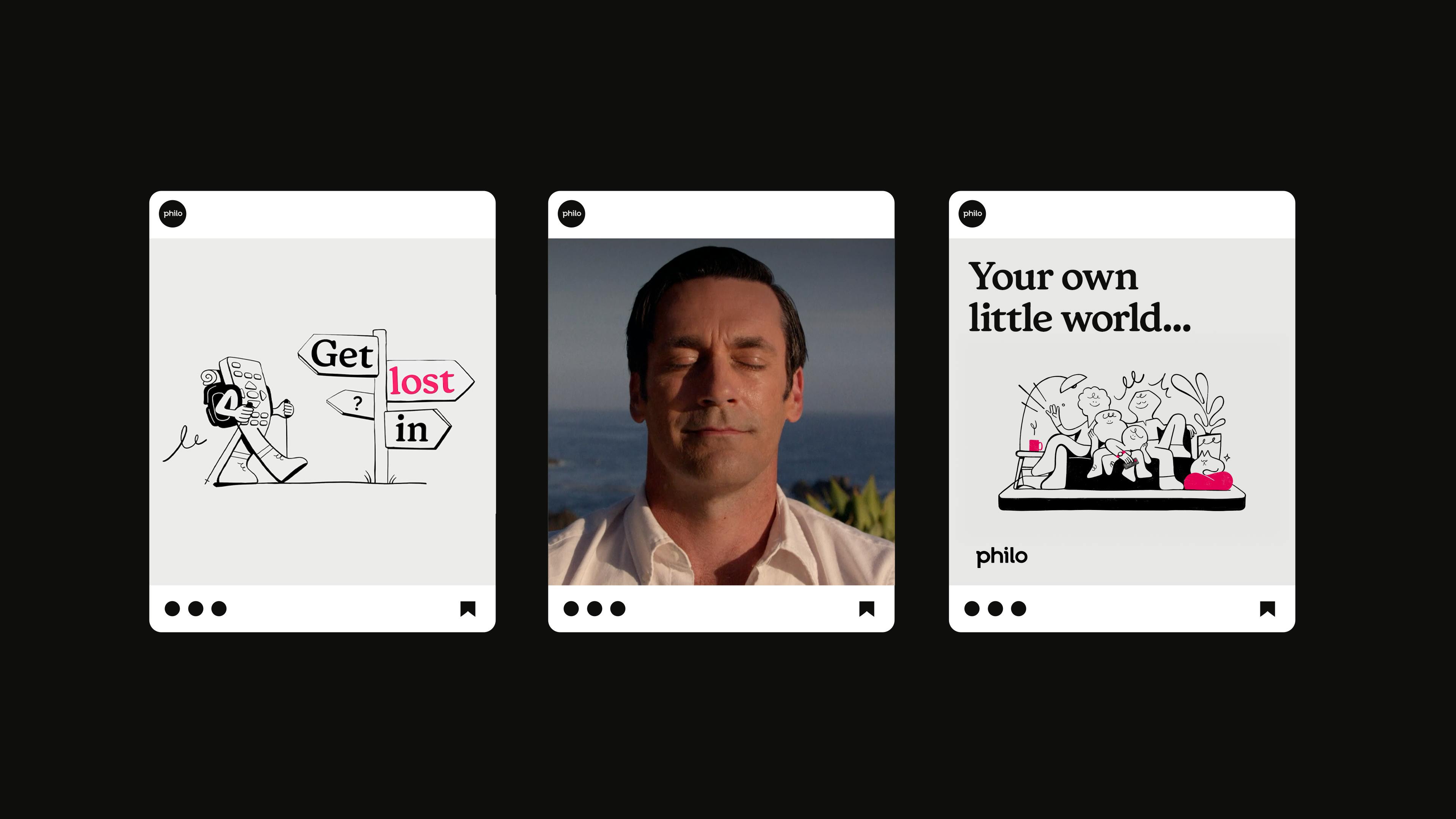
Image Courtesy by Philo
Could you please share with us the process of choosing the logo for Philo?
The process of choosing the new logo for Philo was incredibly rewarding. We’re lucky to have an amazing internal design team that’s both talented and thoughtful. We spent a lot of time reflecting on who we are as a brand and what we represent.
Ultimately, we realized that Philo functions as a tool—practical and unobtrusive, meant to enhance the viewer’s experience without overshadowing the content.

Image Courtesy by Philo
Our approach centered on bold simplicity and understated elegance. We wanted the logo to embody that philosophy, using a black-and-white color palette to keep the focus on the content.
The logo itself is rooted in geometric simplicity, representing stability and approachability, while also incorporating a subtle touch of whimsy. That touch comes through in the playful kerning and the gentle curvature of the letters.
We wanted the logo to feel both sturdy and joyful, like there’s warmth and personality behind it, all while staying minimal and clean.

Image Courtesy by Philo
How did the hand-drawn illustrations become part of Philo’s rebrand, and how do they reflect the brand’s personality?
We knew we needed something distinct that would help Philo stand out from the crowd, especially since we’re not the network creating the shows but rather the platform bringing them to viewers.
Our challenge was to put our own stamp on the brand without overshadowing the content. That’s where the hand-drawn illustrations came in—they’re imperfect, whimsical, and human, which aligns with who we are.

Image Courtesy by Philo
We’ve always positioned Philo as a group of TV fans just like our viewers. The streaming space is filled with massive companies, but we wanted Philo to feel more personal and approachable.
The hand-drawn style reflects that humanity, making the brand feel less corporate and more relatable. One key character, inspired by the shape of a thumb—the tool you use to navigate your TV—represents an every-person figure that capture our audience without tying it to a specific gender, ethnicity, or age.

Image Courtesy by Philo
This figure became a central part of our identity, popping up everywhere from user avatars to internal branding. It’s memorable, which is important in today’s crowded entertainment space. We’re competing with everything from streaming services to social media and gaming platforms, so creating a visual motif that’s unique and charming helps us connect more deeply with viewers.
How did Philo and Sibling Rivalry collaborate on the rebranding, and were there any challenges or moments where the process felt stuck?
Sibling Rivalry was the agency we hired to execute the rebrand and creative campaign, and it was a truly collaborative partnership.
We started by going through an extensive RFP process, presenting them with a detailed brief. Our internal team already had a vision in place—we had developed the new logo, hand-drawn characters, and line squiggles—and we shared that framework with Sibling Rivalry.
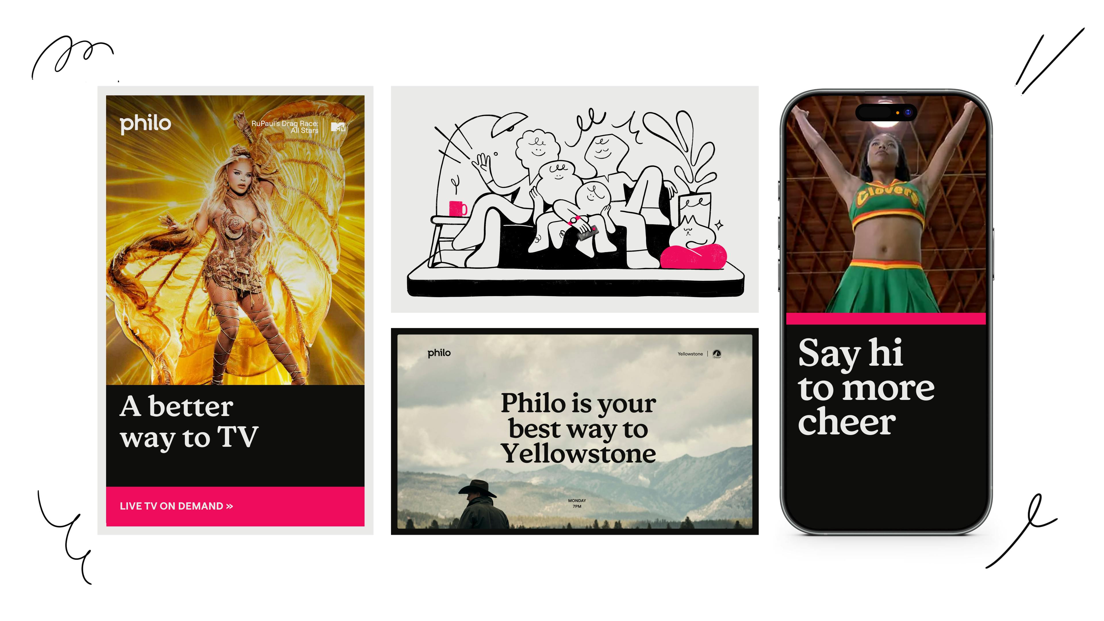
Image Courtesy by Philo
Throughout the process, our teams worked hand-in-hand. We’d share product design elements, which they used to develop transitions, toolkits, and creative spots. Once they completed their strategy, they pitched several campaign concepts centered around “A better way to watch, a better way to TV,” and we selected the direction that felt right.
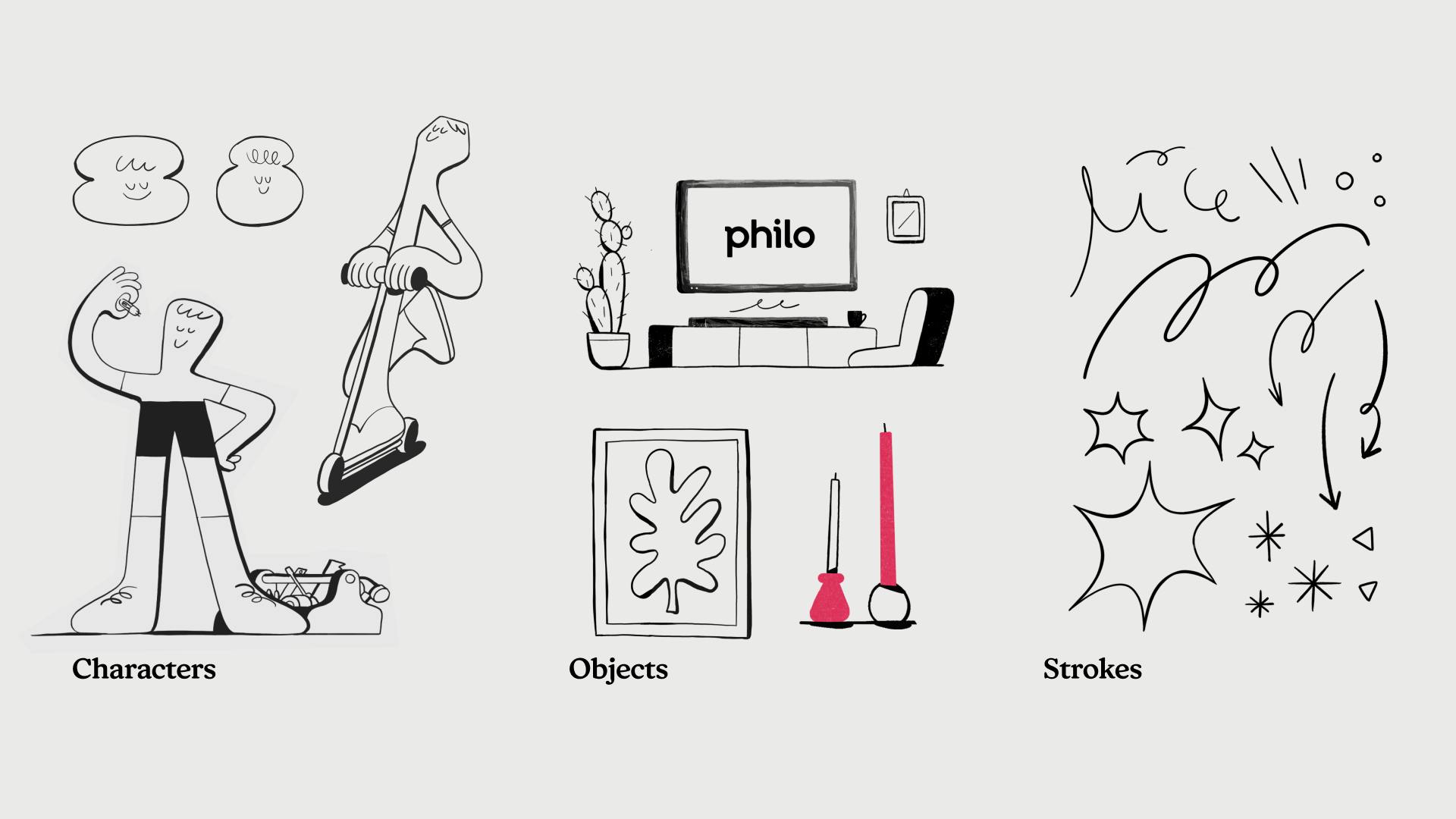
Image Courtesy by Philo
We closely collaborated on the script, animation, and music, with Sibling Rivalry bringing in animators and commissioning a music agency. The entire process was highly communicative, with fast approval turnaround, ensuring everything aligned with our vision.
A big focus was on maintaining open communication from the start. I worked directly with Eric Goldrich, their executive producer, and we stayed in sync through regular feedback loops. Our CEO was also involved, avoiding the usual issue of last-minute feedback from higher-ups.
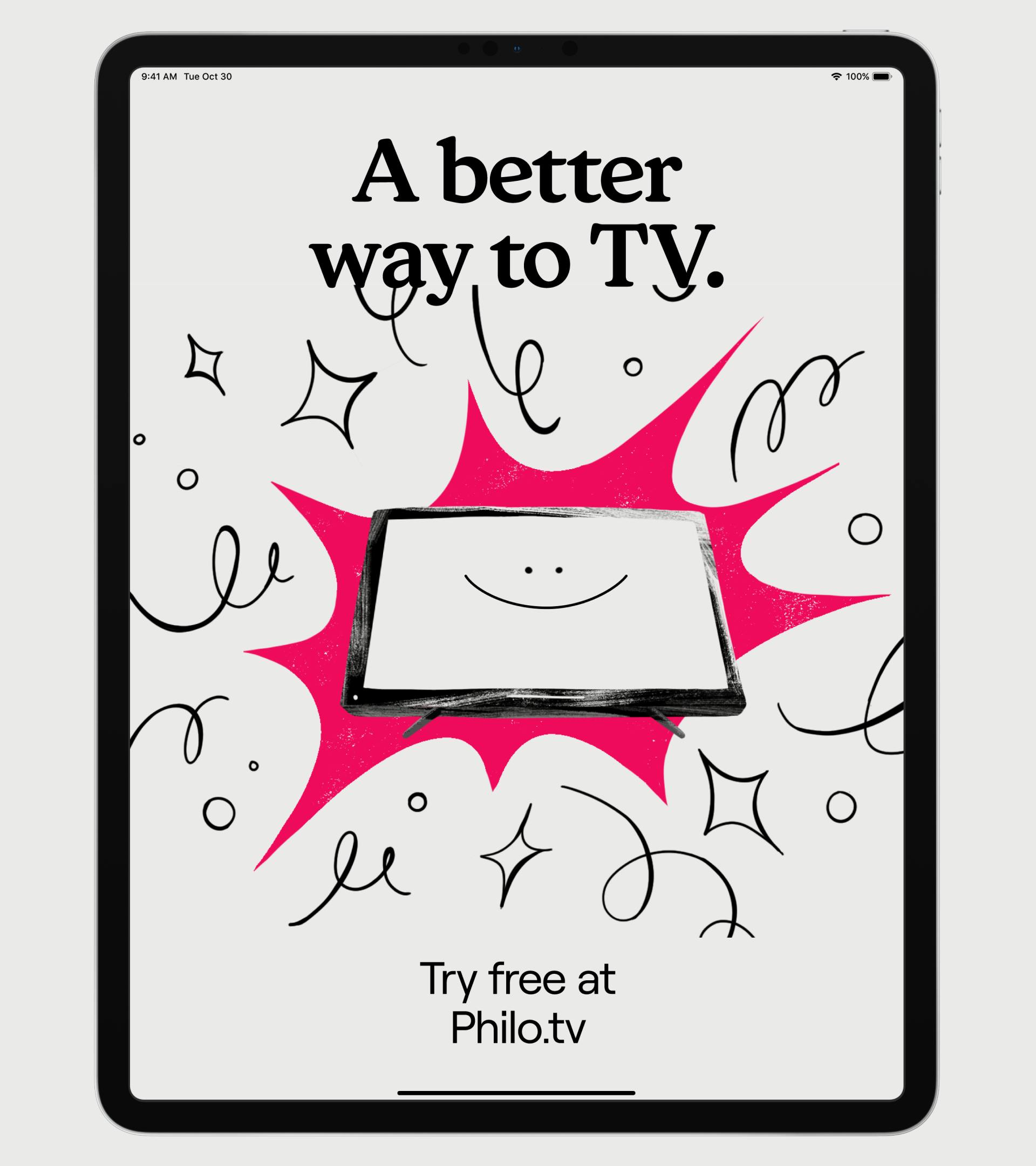
Image Courtesy by Philo
The only minor challenge was getting approval for using specific footage from content partners, but that process went smoothly, thanks to a pre-approved content pool. Overall, the project was a seamless collaboration.
Are you the primary decision-maker throughout the rebranding process?
In the end, the big decisions stop with me, especially in terms of the creative process. I’ve worked with our CMO for seven years, and we have a great shorthand, and I have the space to move forward with decisions to keep the process moving smoothly.
Similarly, our CEO was deeply involved, and I knew the elements he cared about, so I was able to move forward confidently, knowing our decisions were pre-vetted and wouldn’t face any last-minute changes.

Image Courtesy by Philo
Creative work is subjective, so I’ve learned over time that you need to pick your battles. There’s always room for flexibility on some things—like color choices—but when it comes to story beats or voiceover delivery, I’ll fight for what I believe in.
My role isn’t to have the final word on everything but to filter decisions through the lens of what our audience wants, not just my personal taste. I also rely heavily on our design team, who are young, thoughtful, and incredibly talented.

It’s important to me that everyone feels heard during this process, which has allowed us to create a warm, collaborative environment where people feel empowered to speak up and contribute their ideas.
In an industry with many streaming services, how does Philo’s new identity set it apart from competitors like Hulu or Sling? What aspects of the rebrand specifically aim to reflect this differentiation?
At Philo, our core focus is on entertainment channels, which sets us apart from competitors like Hulu and Sling. We deliberately avoid carrying news or sports channels—like ESPN or FOX News—because those are the most expensive to offer, and those costs ultimately get passed on to the consumer.
By focusing solely on entertainment, we’re able to keep our price point lower, making Philo a more affordable option for viewers who don’t need those extras.
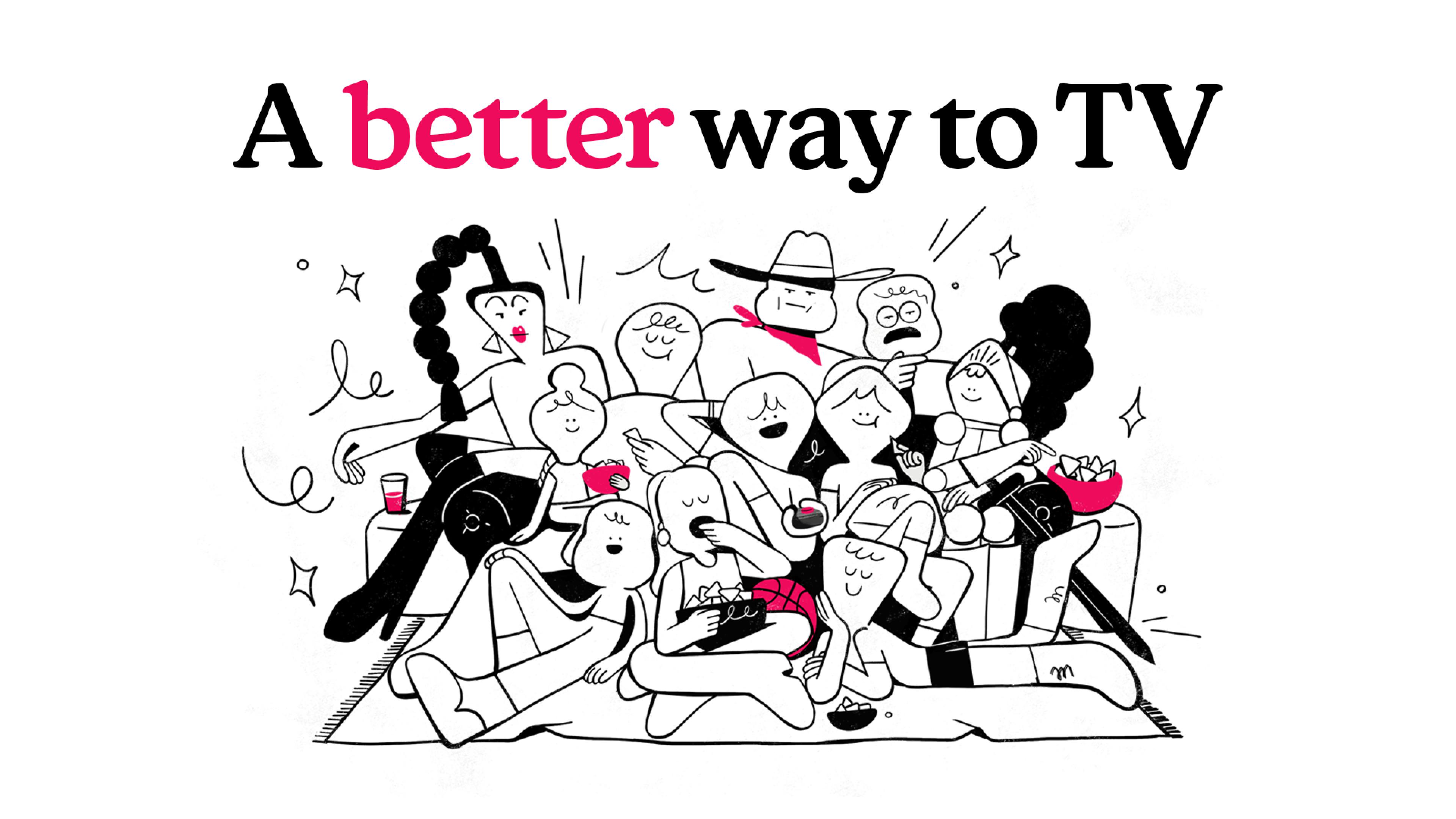
Image Courtesy by Philo
Philosophically, we’re all about putting the audience first. While other services highlight content or price, we emphasize the overall experience —
Making sure people love the way they watch just as much as what they watch.
Our rebrand reflects this, showcasing the humanity behind our product.
We know viewers often get frustrated with their content providers, but we want Philo to feel different, where people feel good about their relationship with us. That focus on customer experience is what really sets us apart.

Image Courtesy by Philo
Can you share with us the meaning behind the tagline “ A better way to TV”?
We really love the tagline "A better way to TV" because it speaks to the whole journey of watching television. It’s not just about TV as a noun, but thinking of TV as a destination.
The idea is that Philo provides a smoother path, from choosing a service to actually getting to your show, without all the usual frustrations.
We’ve always seen ourselves as the pipeline to content, and we want to make that process as easy and enjoyable as possible.
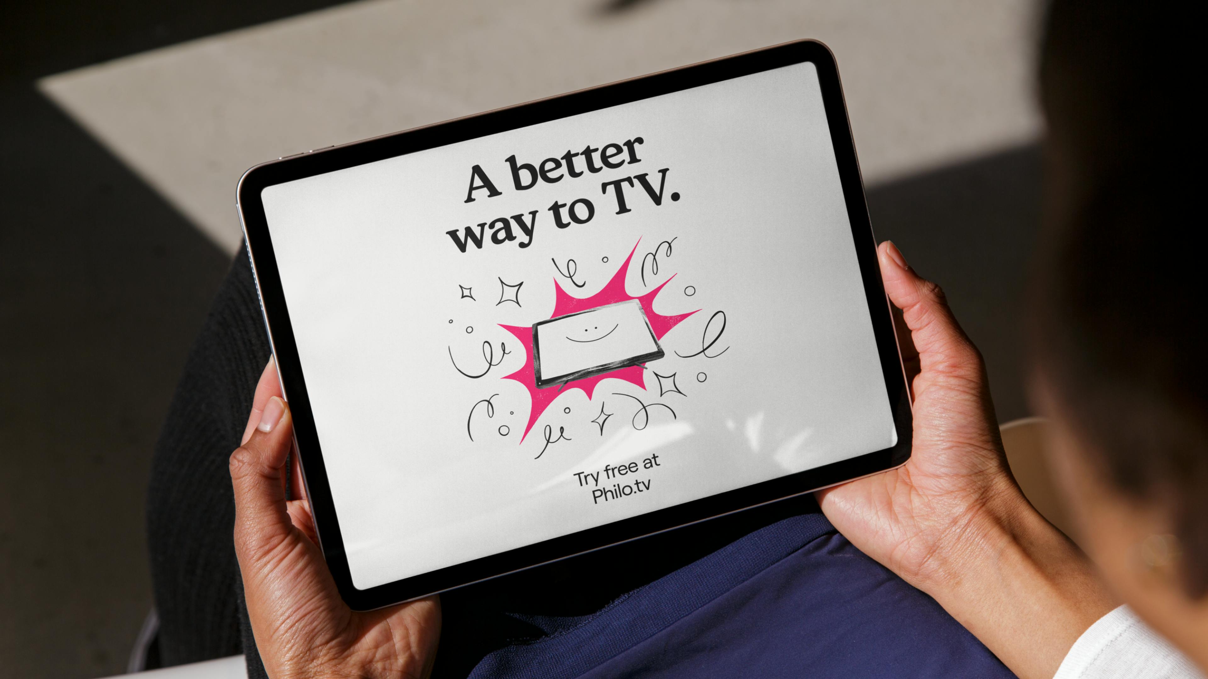
Image Courtesy by Philo
The phrase also taps into the versatility of “TV.” It can mean the device on your wall, the show you’re watching, or the overall experience of relaxing on the couch. We wanted a tagline that could encompass all of that and feel hopeful.

Image Courtesy by Philo
It ties back to Philo Farnsworth, the inventor of television, who had this vision at a young age and was driven to create something better. That spirit of innovation and striving for improvement is at the heart of what we aim to do.