

Interview with Aristia Kinis, Director of Strategy and Partnership at OpenResearch
Can you introduce us to OpenResearch and the brand’s identity through the years? How were the past brands conceptualized?
OpenResearch started in 2015 as Y Combinator Research, designed to explore open-ended research projects that don’t usually fit into traditional environments like universities or government-funded programs.
While we were always separate from Y Combinator, our original brand reflected a new way of doing research that takes inspiration from the problem-solving mindset of startups. In 2020, we became OpenResearch Lab to better reflect our independence and our mission to share findings and data openly.

OpenResearch Old Logo
Our old logo used the letters “O” and “R” in an open shape, showing our focus on openness and community. The design even looked a bit like a person, highlighting our collaborative approach and non-traditional research style.
We work closely with other researchers and conduct studies in real-world settings, adapting as we go. As a small nonprofit with limited resources, we prioritize work that directly supports our mission: doing research and sharing what we learn.
Source: OpenResearch
About this current rebranding, how did it come about? How did that conversation start?
At first, we only planned a simple website update, but a discussion between our Research Director, Dr. Elizabeth Rhodes, and one of our donors, Sid Sijbrandij, CEO of GitLab, changed our direction.
Sid encouraged us to think bigger and look at important parts of our work that we hadn’t considered. This conversation made us realize that we needed more than just a website refresh; we needed a rebrand to support our mission.

Source: OpenResearch
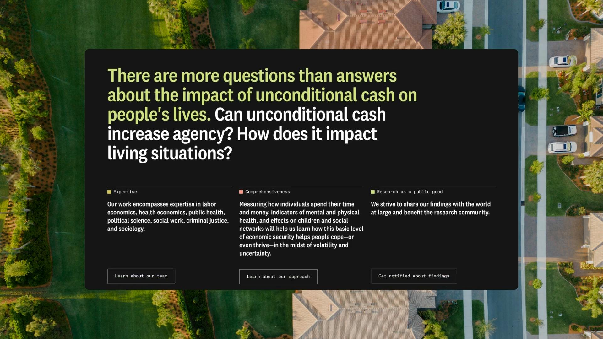
This led us to think more broadly about what’s important for our organization. As a small nonprofit, we focus on research, but we realized that a fresh brand would help us reach more people and make our work more accessible. This decision was a key step in helping us grow and continue sharing our findings with the world.
Source: OpenResearch
A big change was to your logo. Can you tell us how it was conceptualized?
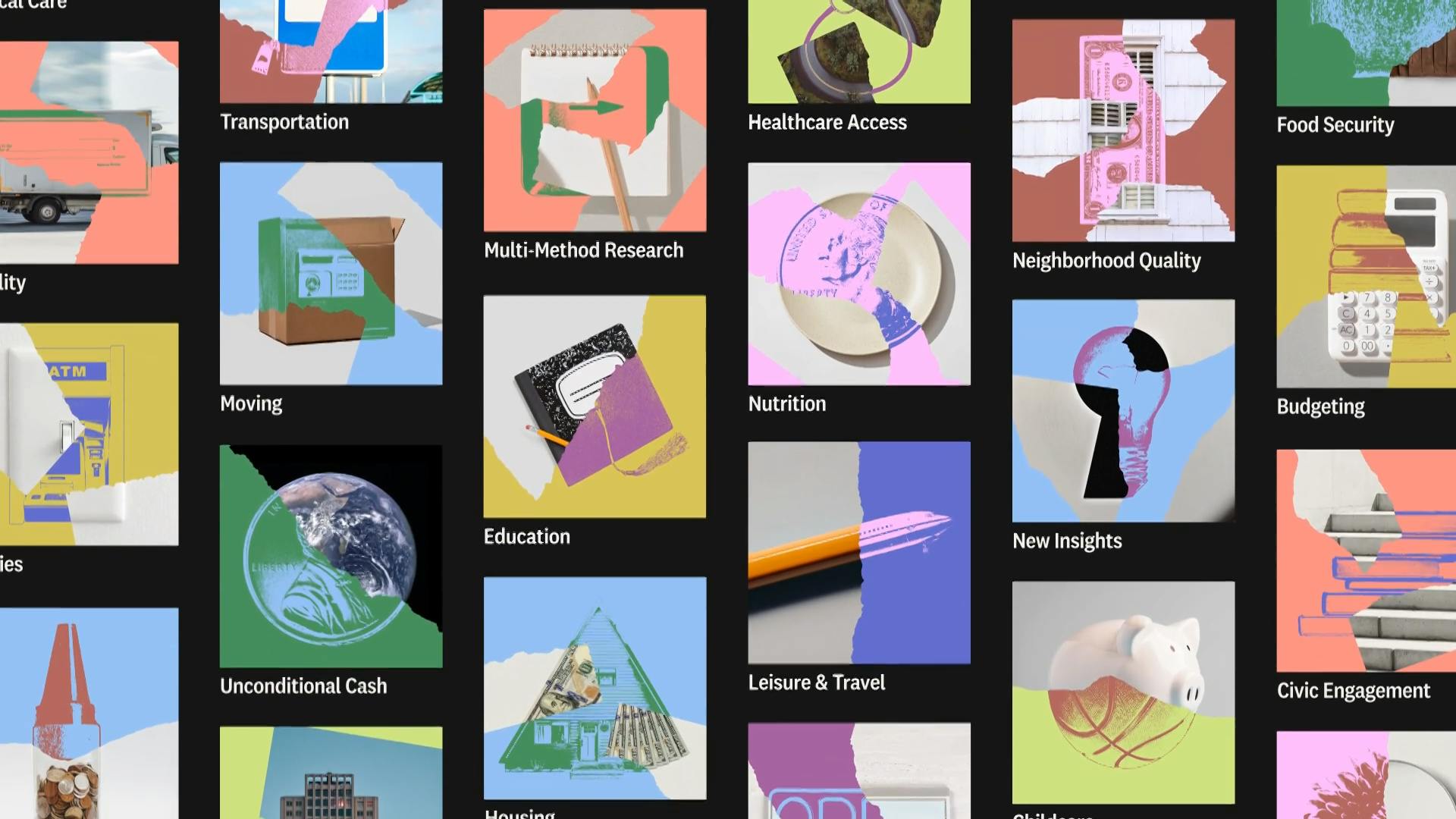
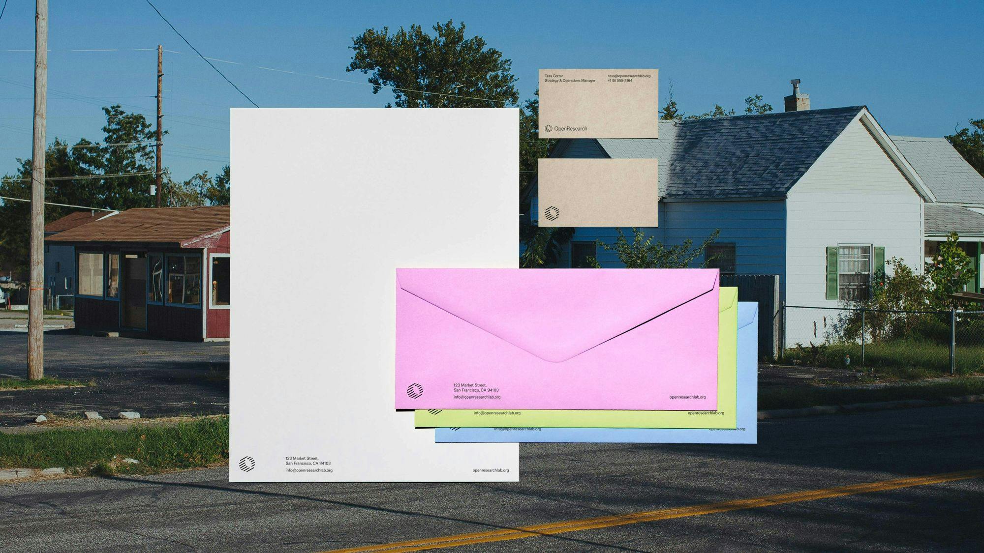
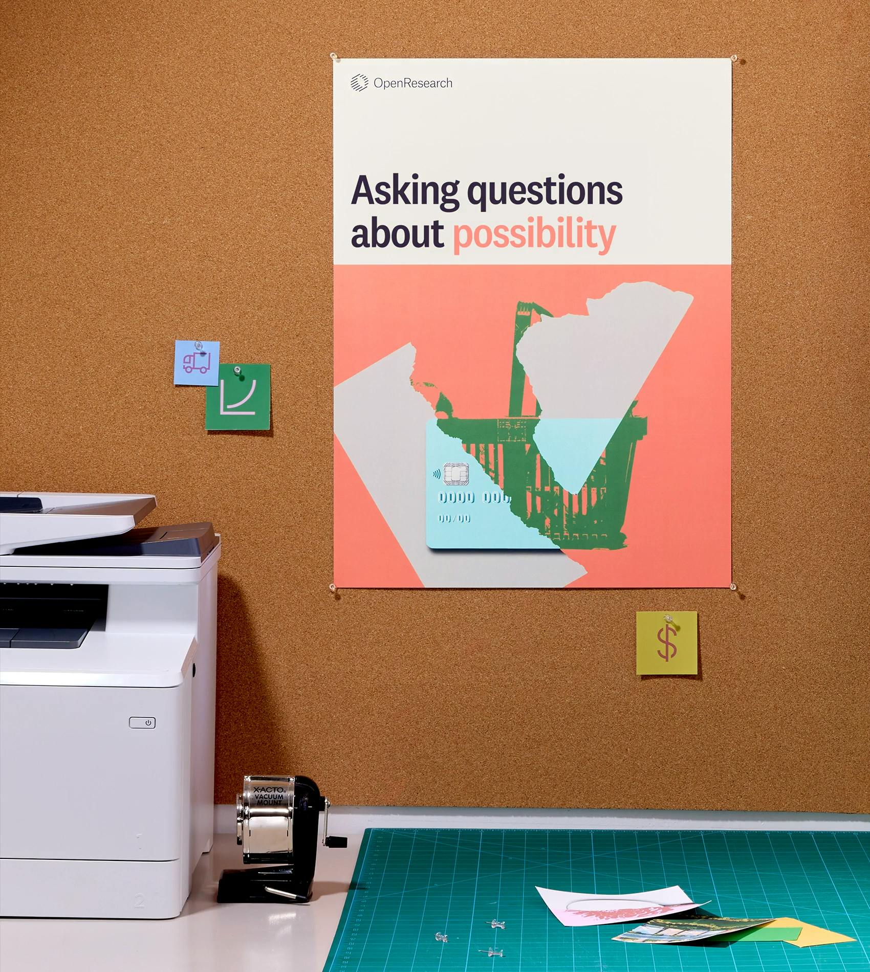
When creating our brand identity, we drew inspiration from the research world, such as sticky notes, documents, whiteboards, and bulletin boards. These elements represent the blend of careful study and the entrepreneurial spirit that drives our work. Our old logo aimed to reflect that passionate search for answers, highlighting our curiosity and dedication.
Source: OpenResearch
For the new logo, we explored three design directions: a dimensional look, an additive one with plus signs, and building blocks. The additive concept focused on how research adds new information, while the building blocks symbolized data as the foundation of knowledge.
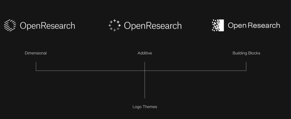
We chose the dimensional design because it represents how researchers pull together information from different sources to create something bigger and more organized.
The dimensional logo captures the idea of adding depth to data through collaboration. The tilt in the logo shows movement forward and upward, symbolizing progress. This design reflects our approach to collecting data from various places and working together to uncover new insights. It represents our optimistic view of driving research forward into the future.
About color palette, how did you land on these colors, what do they say about your brand?
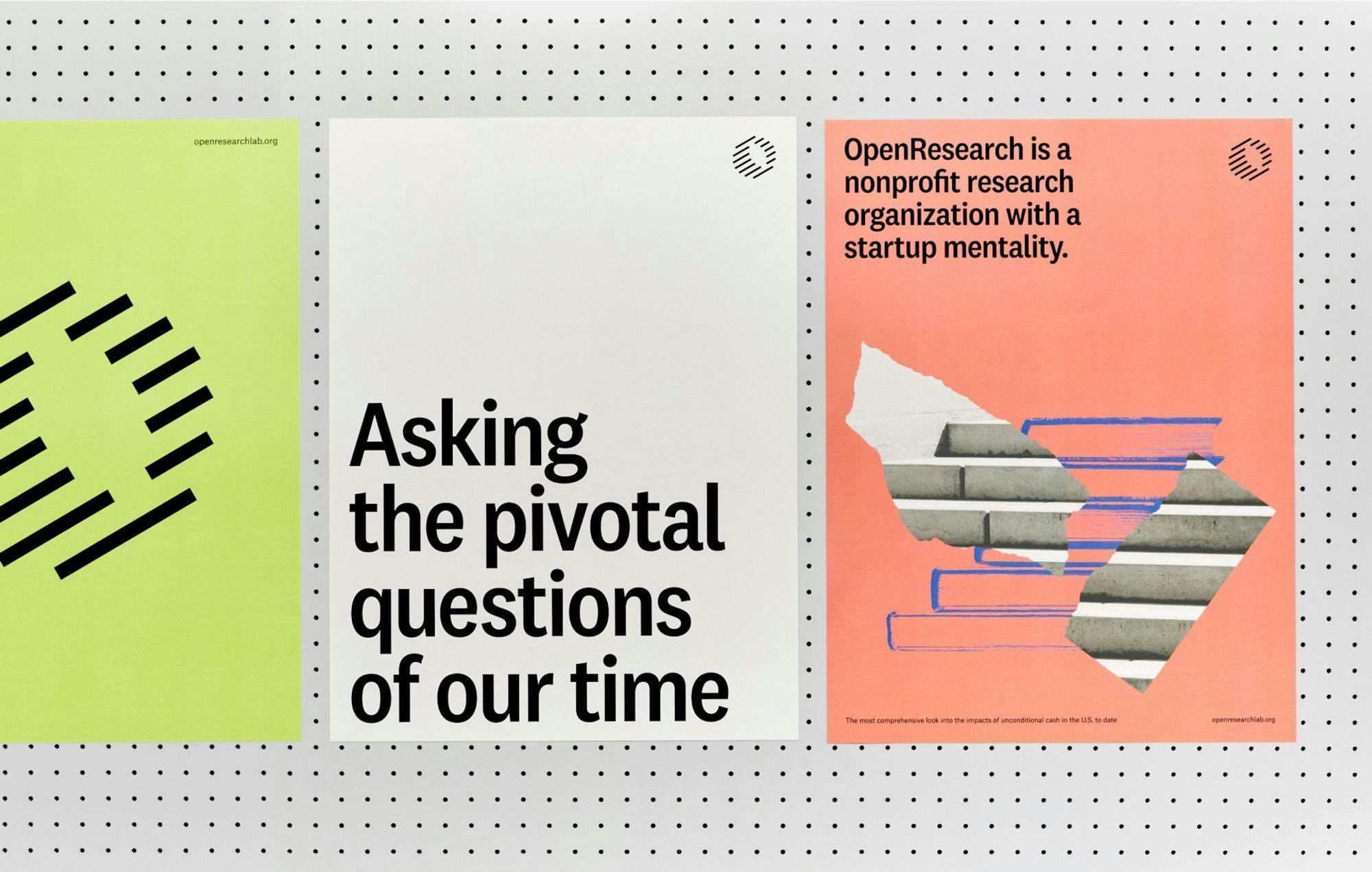
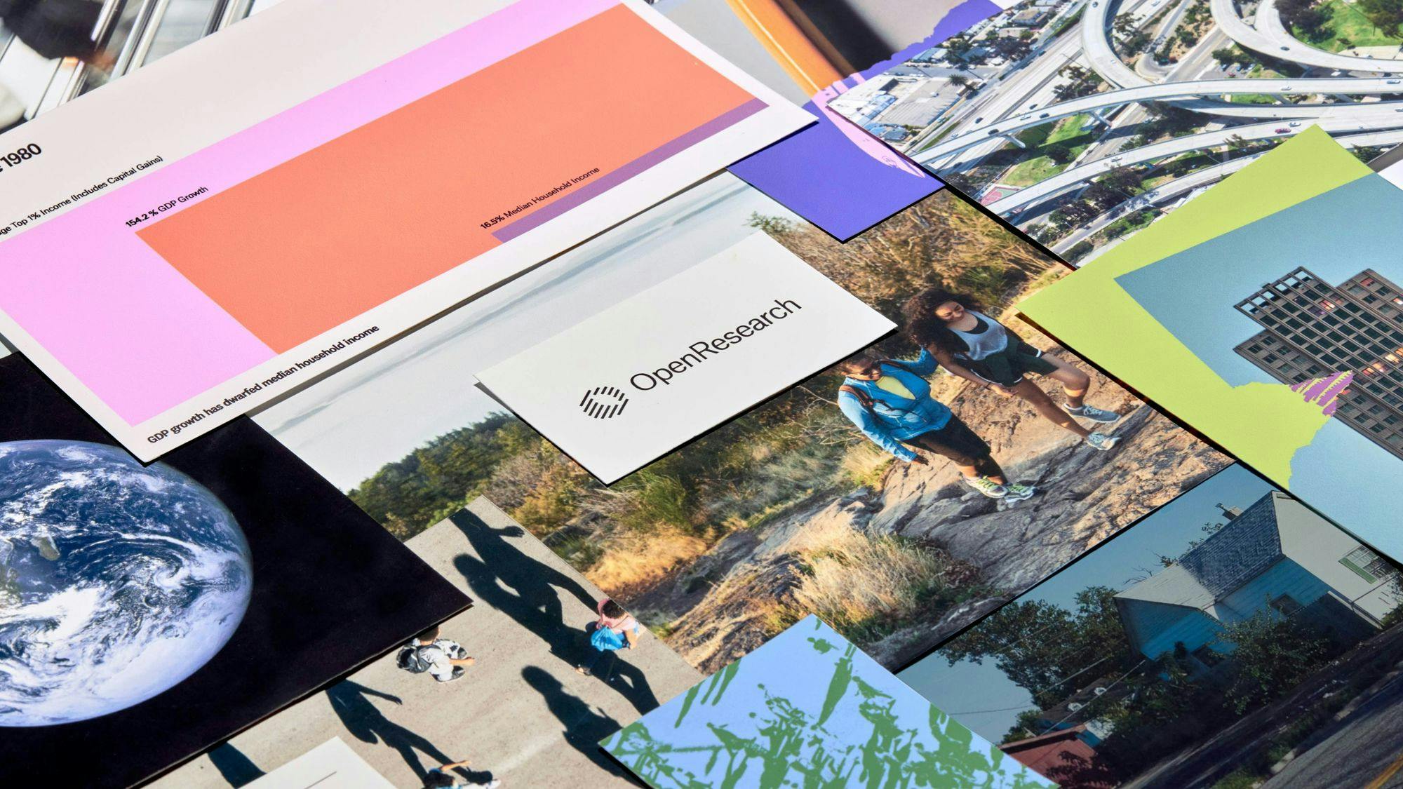
Our color palette reflects our unique identity as a nonprofit research organization with a startup mindset. We combined muted and vibrant colors, inspired by research tools like sticky notes, whiteboards, and bulletin boards.

Source: OpenResearch
The black and white tones represent the traditional side, resembling ink and paper, adding a sense of seriousness and connection to classic research. The brighter colors, like coral and honeydew, are inspired by highlighters and sticky notes, adding a playful and exploratory feel.
These vibrant hues capture the creative spirit of our work, showing that while we’re dedicated to serious research, we also bring a fresh and forward-thinking approach.
How did Play Studio help shape OpenResearch’s new identity during the rebranding, and what challenges did you face?
Play Studio, a creative agency based in San Francisco, partnered with us on the rebranding. Working with Play was a great experience; they brought strong design and creative expertise and weren’t afraid to push us and challenge our ideas.
The process was very collaborative and iterative, with many phases of discussions, feedback loops, and adjustments, which often involved revisiting decisions and looking at things in new ways.
Source: OpenResearch
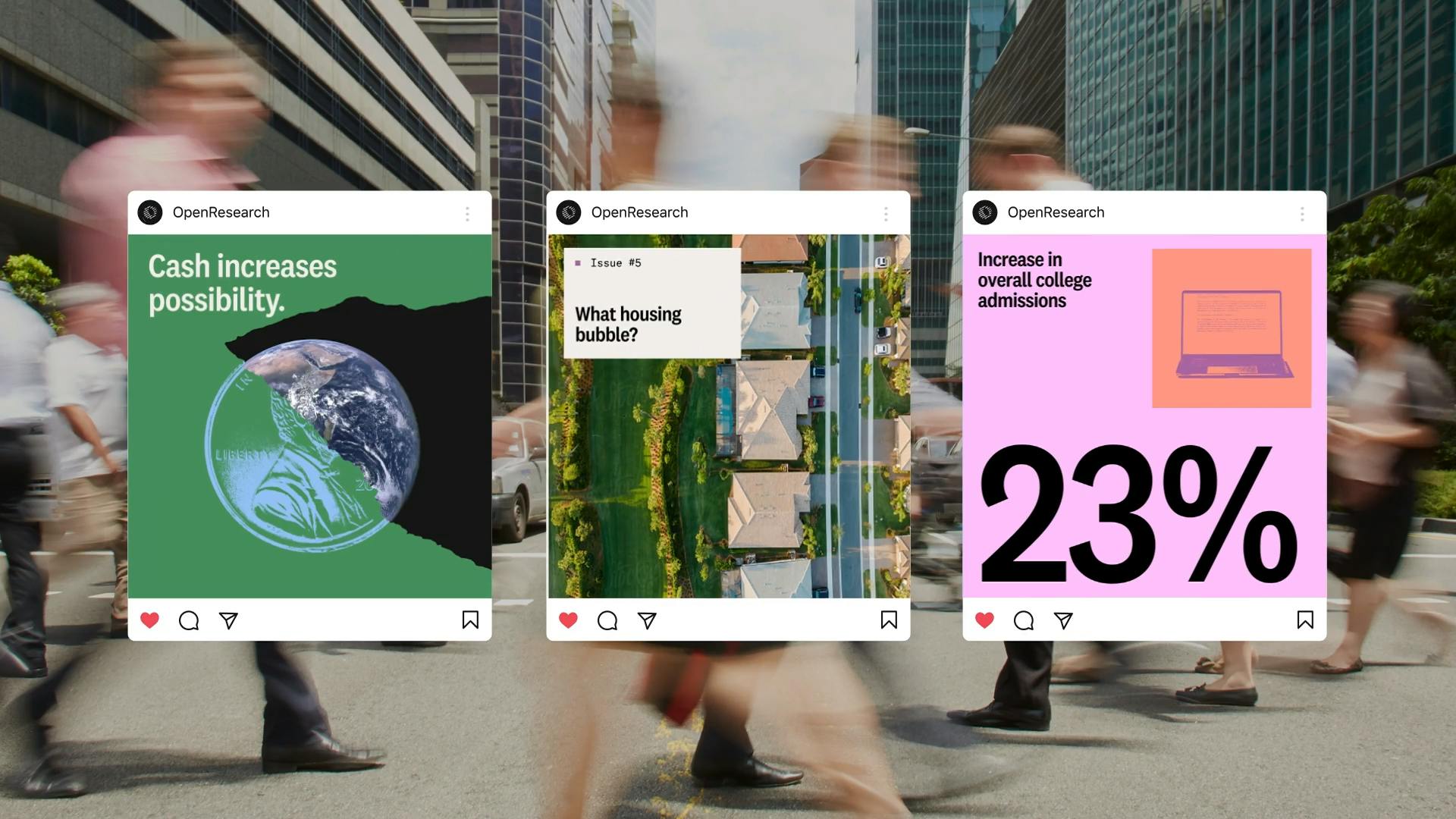
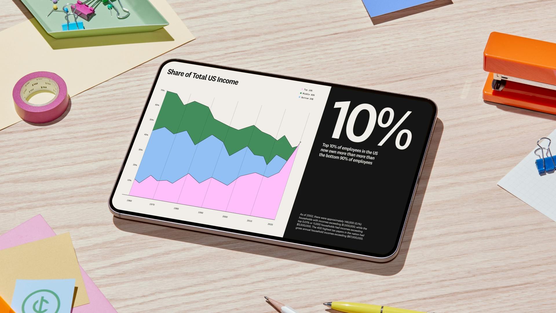
One of the main challenges was connecting our rebranding work with our broader mission, especially when making decisions on visual elements like photography styles, illustrations, and colors. As a team used to academic research, learning the language of design was new to us, but Play Studio’s support helped us through this learning curve.
They guided us to see how our brand could better reflect our mission, making the process both rewarding and professionally fulfilling. Their expertise allowed us to shape a brand that truly represents OpenResearch and makes our work more engaging and accessible to a wider audience.
Source: OpenResearch
Our rebranding timeline included four phases: strategy, design, execution, and the final website build and launch. We started in November 2023 and aimed to finish by July 2024, aligning with key research publications and presentations at the NBER (National Bureau of Economic Research) Summer Institute.
Managing this schedule while adapting to new design concepts was demanding, but the collaboration turned these challenges into valuable growth opportunities, helping us achieve a refreshed brand identity that supports our mission.
Source: OpenResearch
How will OpenResearch keep its branding up-to-date with trends in the nonprofit and research sectors?
OpenResearch combines the structure of traditional academic research with the creative, problem-solving mindset of startups, making us naturally adaptable. Our recent rebranding taught us how important it is for our brand to clearly reflect our mission and stay connected to the evolving needs of the nonprofit and research sectors.
Source: OpenResearch
We have built regular strategic planning cycles into our process to keep our brand fresh and impactful. During these reviews, we look at our visual tools—like logos, photography, and colors—and evaluate if they still fit our mission. This helps us decide if we need to make changes to stay up-to-date and keep our brand aligned with who we are.

Source: OpenResearch
By regularly reviewing our brand during planning sessions, we ensure that it stays aligned with our mission and the evolving needs of the nonprofit and research sectors. This ongoing evaluation helps keep our brand strong, relevant, and focused on our goal of asking big, open-ended questions.
What is your major takeaway from this experience? Do you have any advice, personal anecdotes about challenges, or interesting trivia for brands or designers considering rebranding?
I came to this rebranding process without much experience in design or branding, so one of my key takeaways was the importance of listening to everyone involved. With a small team, I wanted to ensure all voices were heard while staying focused on our core strategic goals and the input of key decision-makers.
It was essential to balance gathering feedback from the team with keeping the process centered on our mission and what we were trying to achieve.
Navigating the subjective nature of design choices, I found it crucial to define who the main decision-makers were and what our core objectives were.
For us, the strategy was about representing our ability to collect comprehensive, rigorous data and to share it widely. Centering the strategy helped me stay focused on the bigger picture and refine the decision-making process to keep it aligned with our mission.
"My advice would be to embrace challenges, let the agency push your thinking, and clearly decide where collaboration is beneficial and where internal leadership drives the vision."
Source: OpenResearch
When seeking final decisions upon the rebranding, I am looking for all the inputs from the key stakeholders, but then making the decision both based on those inputs and the relevance or connection to the strategy.


