

Lacey Waterman, founder Creative Director of Strand Studio, has spent over 15 years working with companies like Mythology (Previously known as Partner&Spade), Red Antler, Pentagram, Media Arts Lab, Google Creative Lab, Mother, Droga5 and TBWA/Chiat/Day. For the past three years, she has been leading the studio working with clients such as Ollie, GoPuff, Amazon, Floravere, The Only Jane, and ManyPets to name a few.
Can you tell us how this project came about? How did that conversation start with Ollie?
Ollie approached Strand Studio with a desire for a strategic rebrand. With the fast-growing brand evolving its offering to support its mission, it was time to re-evaluate the brand's visual identity. The brand already looked good, but the visual approach and tone didn’t match with their evolving mission and offering.
Since Ollie launched in 2016, there have been a lot of new brands popping up in the category. All dog food brands care about dog health. But none go as far as they can in treating dogs as the unique individuals they are — with specific tastes, lifestyles, and needs.

New Ollie branding
How did the rebranding process go? Can you tell us more about it? Where did you start?
Strategically, it made sense to present a more elevated, yet approachable visual system that seamlessly fits into their consumers' lives and breaks away from the pack (pun intended). We always start with category and consumer research, which helps guide the strategy. Then once we land on a strategic approach, we begin work on the visual identity.
I like to relate the process of creating an identity system to cooking. I can present you with a final dish, but if you taste it and don’t like it, you basically have to throw it out and start over. So I like to make the process collaborative where we all taste test the ‘ingredients’ as they come together for a seamless process to arrive at the final dish. It’s more fun this way too!

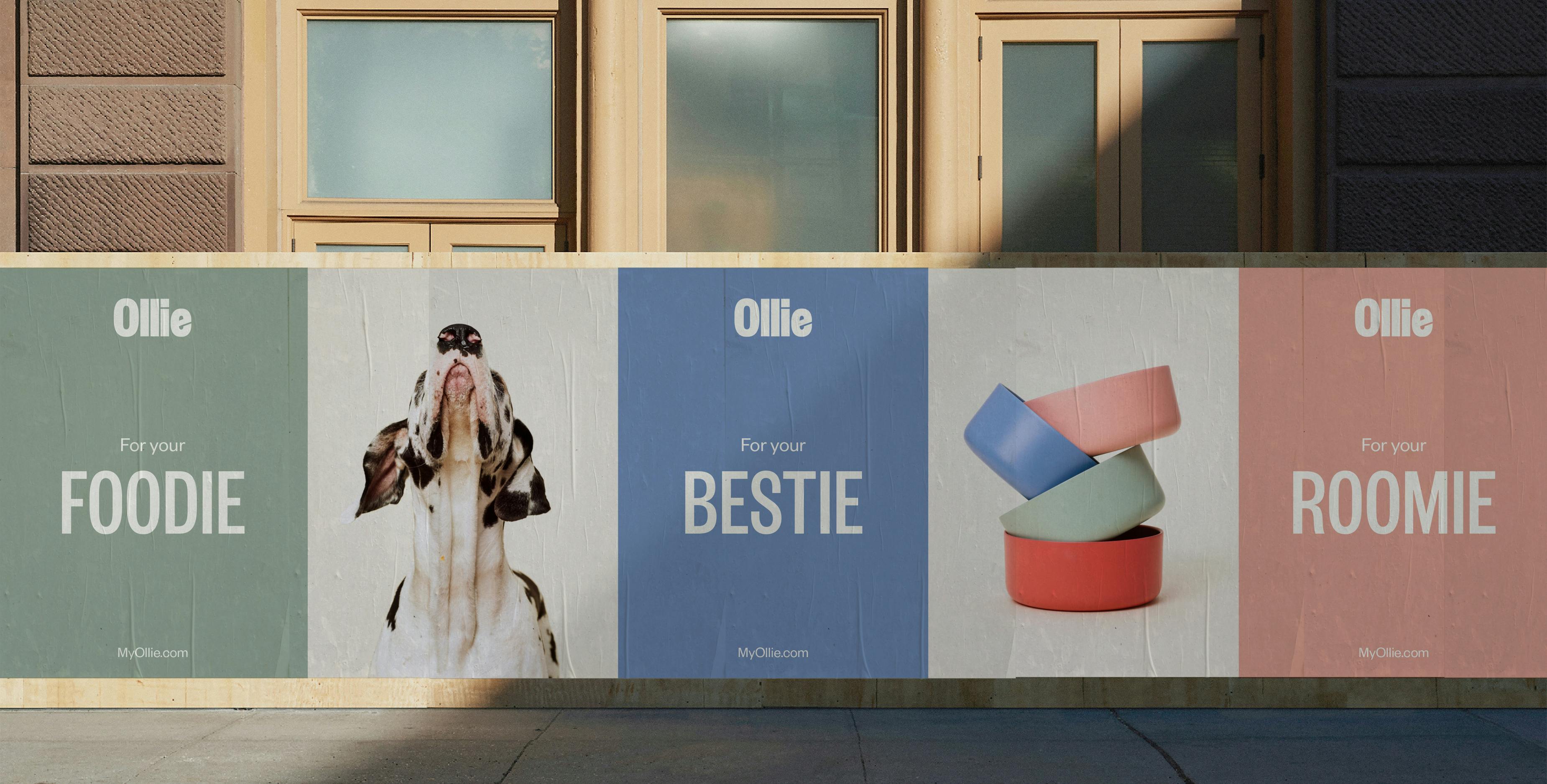
Ollie posters
Were there surprising challenges you encountered along the way?
The most challenging part of the process was executing this complex production in peak Covid months. It wasn't any easy task with animals involved, but we made it happen safely as a team. Since it wasn't possible to get the entire production team in a room together until we were on set, I learned to lean on the team's strengths in ways I may not have on prior shoots. It definitely wouldn't have been possible without our fearless producer, Geoff Guinta!
The logo was a big change in this rebrand. Can you talk about how it was conceptualized?
I’m a strong believer that if you’re going to rebrand, it should have a strong point of view and be a noticeable change. The old logo was whimsical and friendly, but it didn’t reflect the evolution of the brand. We redesigned the Ollie logo, to be capitalized in a bold sans serif, yet still friendly and able to scale for a variety of touchpoints. If you look closely there’s a hidden ‘scoop’ in the negative space of the ‘e’ in the logo. Easter eggs like these are my favorite moments in design.

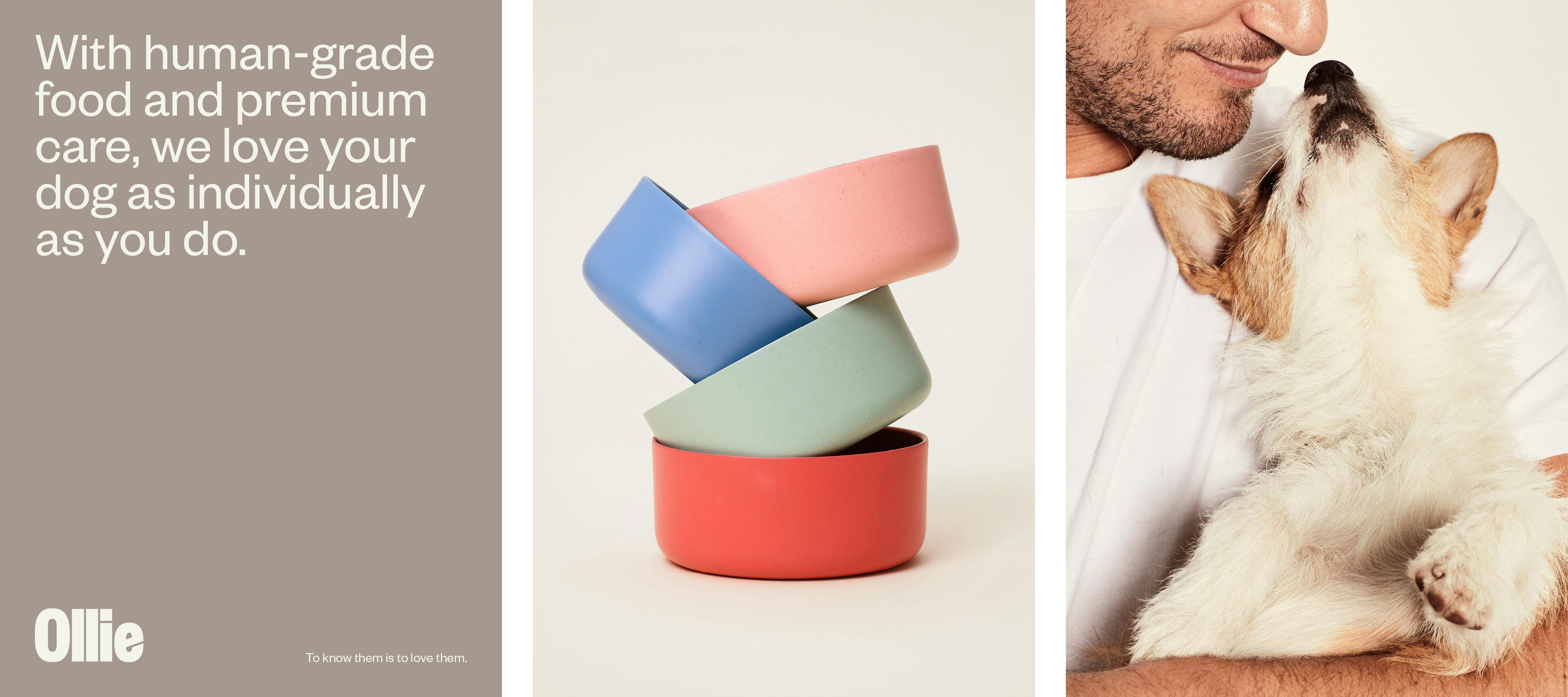
Ollie messaging and bowls
The color palette for this brand also changed. How did you land on these colors and what do they say about the brand?
We really wanted the colors to represent the fresh ingredients that go into the four hero recipes and not be chosen based on trends. The featured brand color has been named “bone”, a fitting name for a dog wellness company’s base logo. Also part of the redesign is new packaging featuring four hero brand colors — sweet potato, blueberry, cranberry, and spinach, pictured here in their new branded bowls by the industrial design studio, Friends of.

The essence of Ollie
Photography is predominant in this visual identity. How is photography used to help with this rebrand?
We approached the brand photography with real food in mind, not just food for dogs and that led to some magical moments on set with Brayden Olson and Nathan Kraxberger. Since we had the large task of replacing a brand library of hundreds of assets, we wanted the photography to be versatile and scale well for small formats. So we kept it clean to hero the new logo and packaging, but also to provide space for brand messaging and future partnerships.
Lastly, do you have any advice or pro-tips for designers embarking on branding projects like this?
It can be overwhelming at first, but nothing of this scale is ever accomplished alone, so I would surround yourself with collaborators that you respect and that respect you in return. It's rare you have clients that are willing to take risks and put so much trust in your vision, especially as a small studio, so I'd just like to thank the entire Ollie team and our collaborators at Strand Studio.
