


João Duarte, Co-Founder & Executive Director at Impulso, shares how the company shifted from program to community as well as how they used their rebranding to communicate to different target audiences.
In your own words, can you introduce us to Impulso?
Impulso is a community of micro business owners that prosper through collaboration. Our vision is to have micro-businesses from across Portugal and across other countries to collaborate.
We mostly work with more traditional businesses–micro-businesses that need reinvention. We help businesses go from an idea to a product or service in the market as fast as they can for as little money as they can.
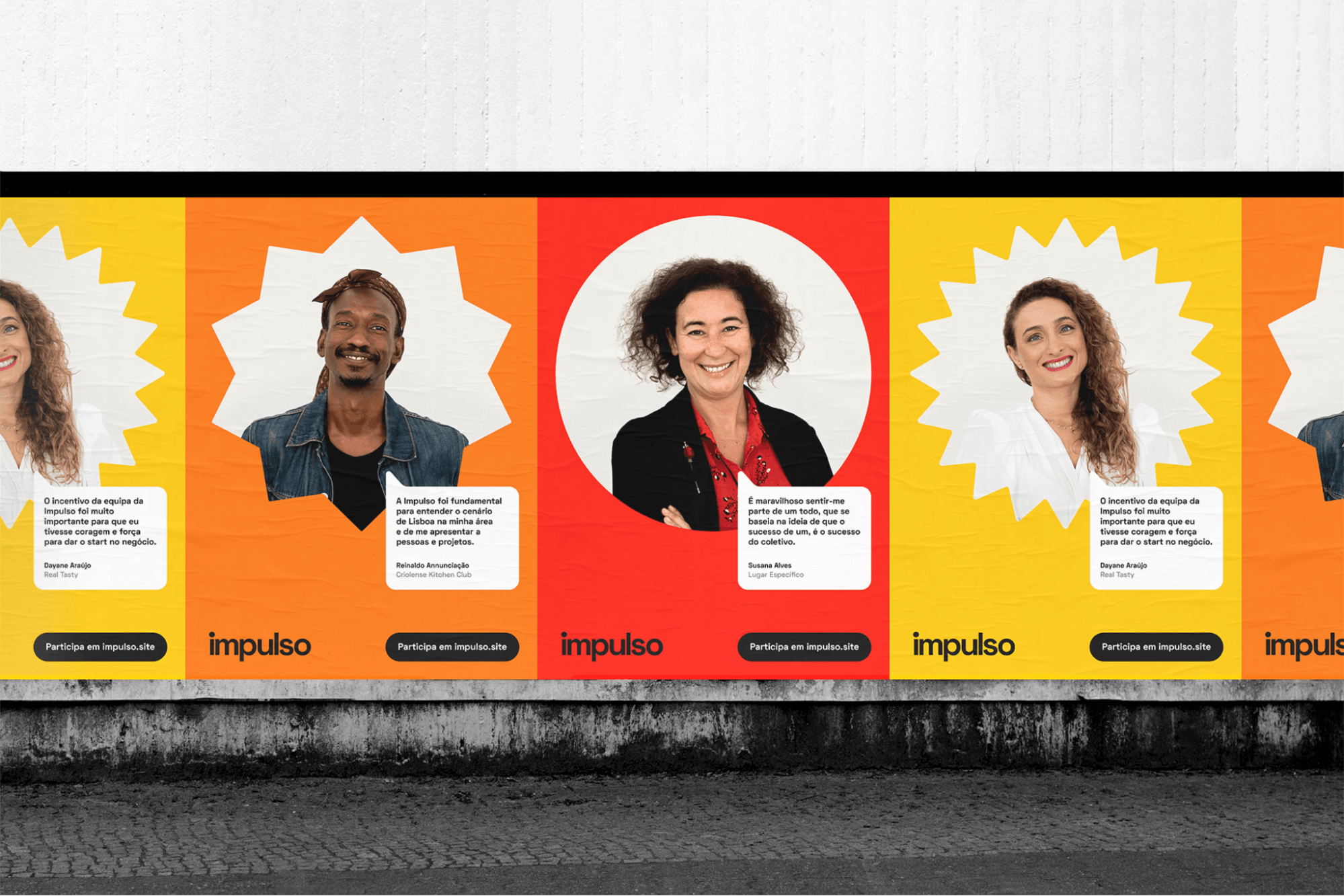
Impulso posters
To help kickstart businesses, we designed a market validation program called Ignition. You start by validating the product, going to the market, prototyping, structuring, and then you properly start working on the business model. We work mostly with people without business knowledge.
Impulso was previously called ‘Menos,’ Can you tell us the story behind that?
We became Impulso in 2021. Before that, we were called Menos, which means “less.”
When we started Menos, we wanted to represent two main things. One was trying to reduce the costs of starting a business, to simplify that process. That was our target because we work with people in difficult situations that want to create their own opportunities. We also wanted to represent resourcefulness and resourceful businesses.
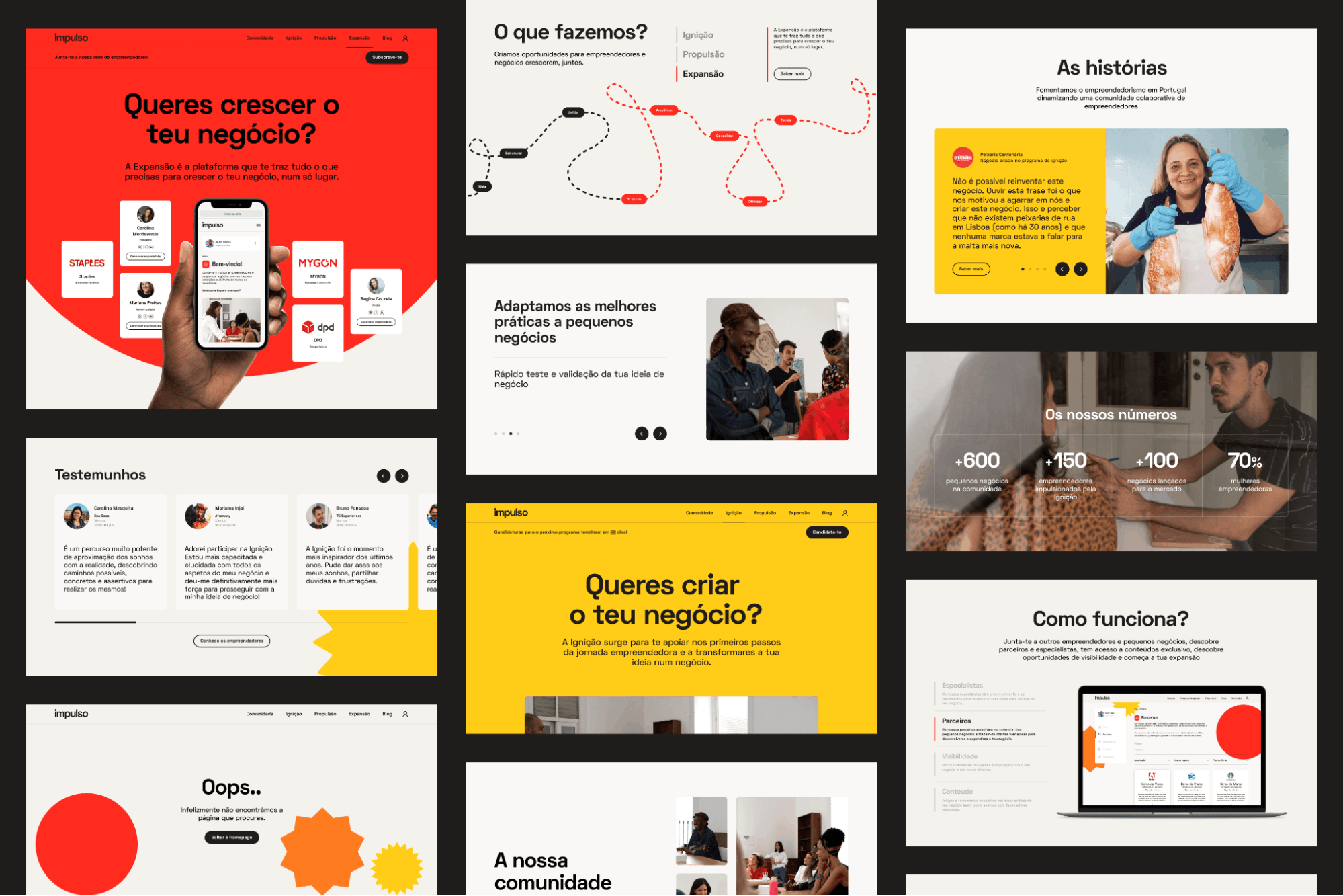
Impulso webpages
I really enjoyed the old branding, but a lot of people didn't get it. When you were working with someone offering a consumer product and you want to give them high spirits but you’re called “less,” a lot of people criticized us for that.
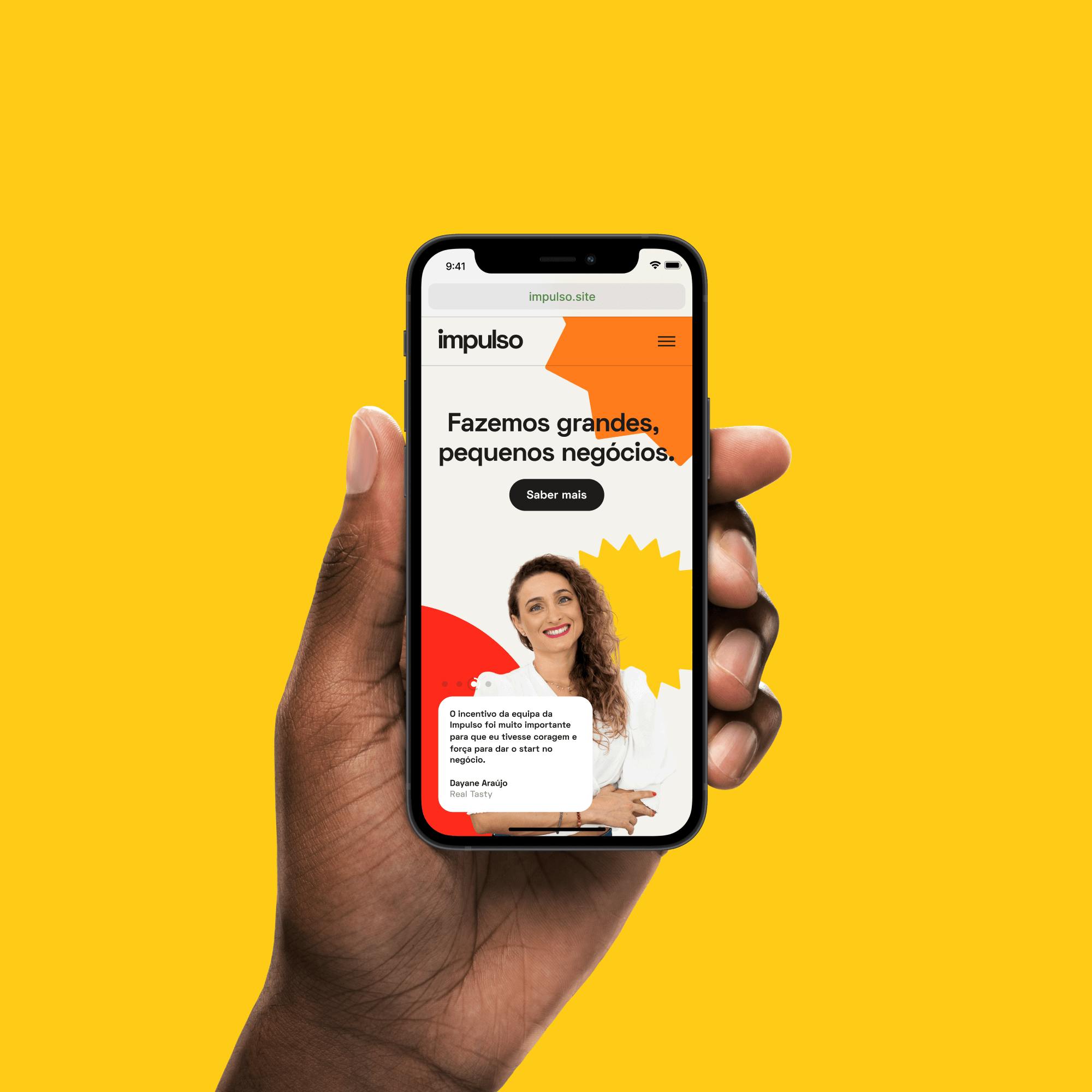
Impulso on mobile
I think it started out as “less” because I also come from an architecture family, so we’re always focused on reducing. I thought that could also apply here. But a lot of people told me, especially one of our mentors, that when you’re starting a business, you don’t want to hear about negative stuff. You want to give energy.
That was really the point where we thought that we needed to rethink how we communicated.
How did the rebranding process go? Did you work with an agency? What kind of challenges did you encounter?
We worked with Sam George, who is an incredible professional. But at the time, we talked with a few agencies. The process was very interesting because we really wanted to start from zero, but we wanted to talk with everyone during the process so to explain this transformation.
This is because a lot of times, people associate us with the startup world. We really want to distance ourselves because our target normally runs a bit away from the startup world.
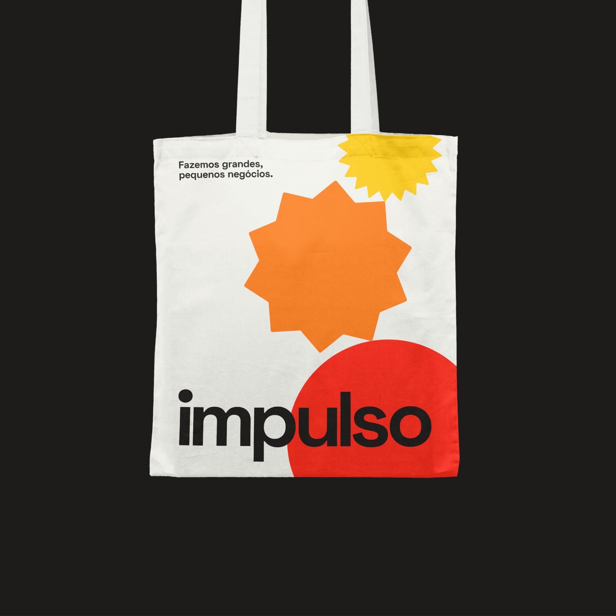
Impulso tote
Our market is a 50-year-old lady that sells cookies and she doesn’t want to hear about growth or scaling. So, for us, it was also that challenge of, "How do we give this a very human touch?" We wanted to focus a lot on this human side.
There were two or three proposals before we reached this final one where we felt, "Okay, this represents us and this represents what we want to represent."
Can you tell us about the change from ‘Menos’ to ‘Impulso?’
When we started doing what we were doing, we were basically an organization doing these Ignition programs.
We assembled a community for people who would complete these programs. From there, we realized that our essence, what we were really doing well, was the community that we built.
It took us many months to understand that our core product was the community and not the program. Once we understood this, we tried to understand how to put the community in the center. That was the main trigger for us to look into a new identity.
We were also having a very hard time communicating with our different target audiences. We were communicating with people that want to be entrepreneurs. We were communicating with micro-business owners, we were communicating with small business owners. The targets are very similar, but very different.
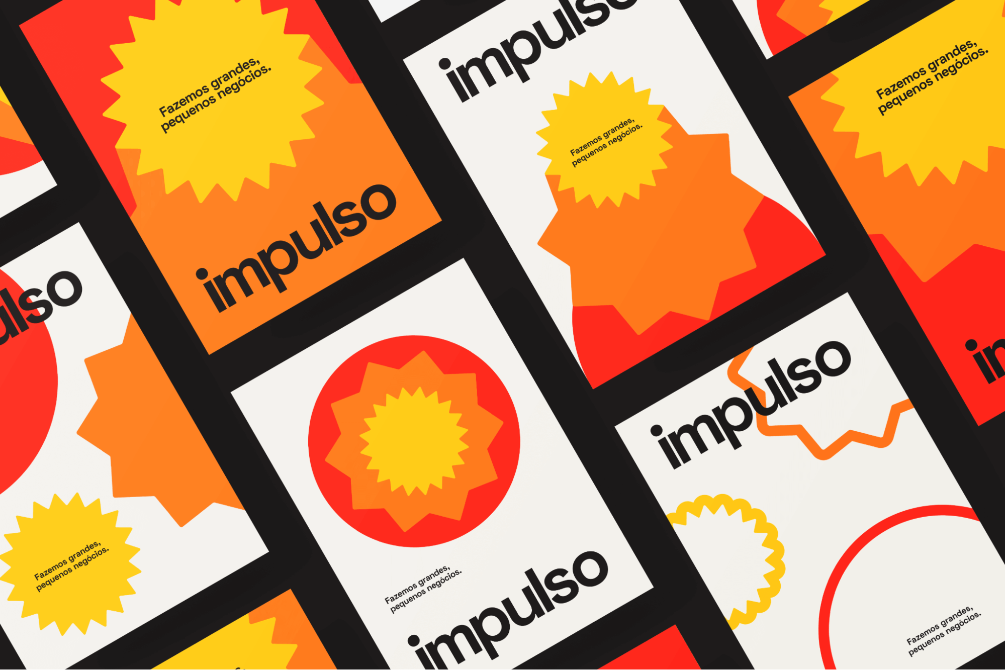
Impulso posters
We needed a very clear and visual way to communicate with these different target segments. I think that was for me the fascinating thing behind Impulso, how we actually understood that we needed very strong visual identities inside the same brand to communicate different products.
Can you tell us more about communicating with different target audiences through branding?
We brainstormed with the entrepreneurs that we worked with, our team, and we also talked to external experts. We brought these to the designer.
The main value that we wanted to give was this value of energy. We wanted to give them an impulse for people to work with. We wanted warm colors. We wanted very strong energy out of the colors of our brand.
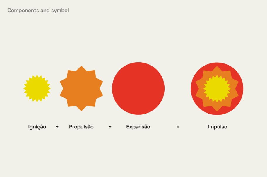
Behind Impulso’s symbol
The way we did it was having three products and having three segments, using different warm colors as well as using different shapes. The final branding is the sum of all these shapes and colors. If you look at the logo, it is red, orange, and yellow, which is the community of all these three segments.
When we want to communicate Ignition, we just communicate in yellow. These are people that want to be entrepreneurs. When we want to communicate Propulsion, we are talking to people that already have a business but need to reinvent themselves, and we communicate in orange. When we want to communicate Expansion, we use red. It's the digital platform that helps micro-businesses operate.
We really felt a big difference when we clearly divided and started using colors that are part of our one brand, but using them to cater to different needs.
Our goal was also for the name of the programs–Ignition, Propulsion, and Expansion–to take off. We wanted the branding to be where you turn on the engine and then you let yourself go. We also wanted this combustion to remind people of the fire of the Sun, or even a heatmap.
We considered heatmaps initially, but there were too many colors, so it came to this.
What about your typography? How did you choose which ones to use?
We ended up with these because we felt we wanted something that was friendly and human, but also not too funky. We didn't want something too funky because we work with people who are maybe 50+ years old. They don't want funky startup styles.
These just felt right. We wanted something not too uptight, but not too funky. I think these were the middle ground.
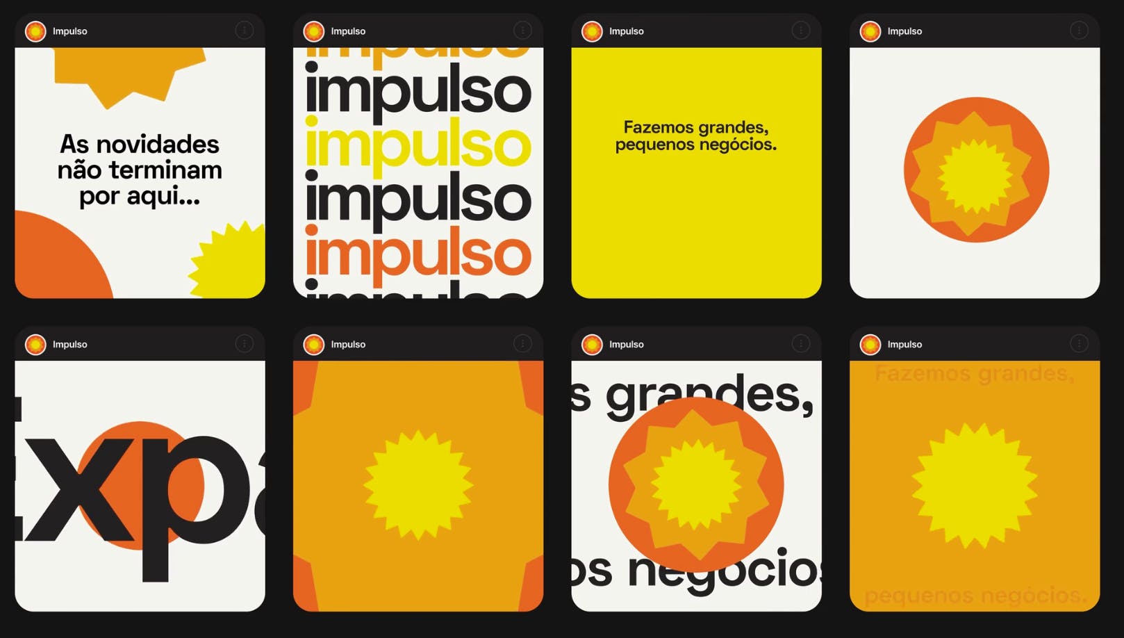
Sample social media posts for Impulso
With a lot of small business owners, things need to be very clear, very visual, very straight to the point. And that was really what we wanted to make sure that we address because we really felt that it’s a lot of what distinguishes us.
Either you have super startup-y programs, or you really have old-school inter-partnership programs. So, we really wanted to give this flavor that there's energy, but there are people behind it, and that Impulso is for people.
Did you rebrand all at once? Or was it step by step?
It was all at once because we also launched a new product, Expansion, which was a digital platform.
At that point we were also a bit bigger, so we had a bit more money to do it. We launched a new website, a new platform, and the new branding. It was a lot of work.
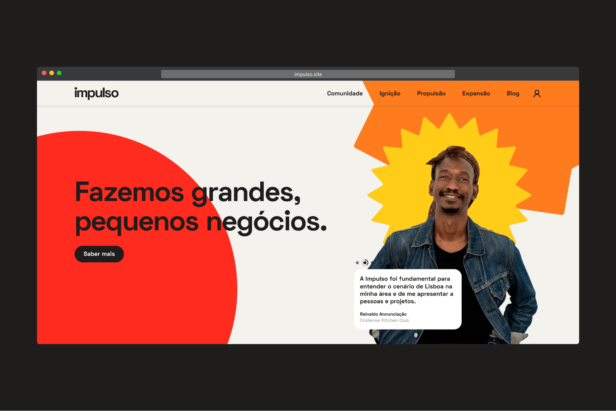
Impulso homepage
It was very interesting. We first launched the yellow, then the orange, and then red one week after the other. We created this teaser of, "Something's coming," and then first came one, then came the other, then came the other, and then in the end, they all got together and it was the big brand.
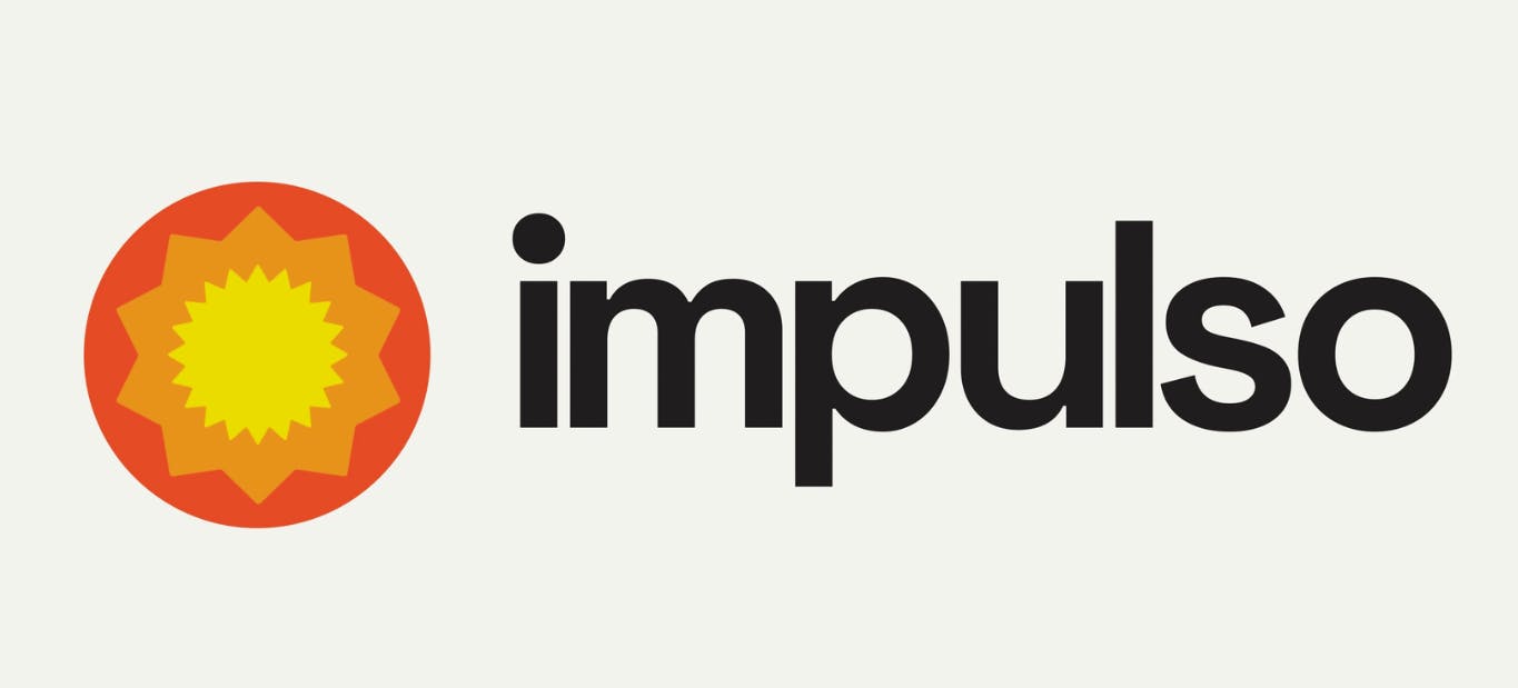
The new Impulso
I think it was good that the change to our brand was shocking. Our colors were light to blue and then we went to red, yellow, and orange.
We were just afraid that some people wouldn't understand that we were the same core even though there were changes. But overall, the feedback had been extremely positive.
What kind of advice do you wish you had before you started this initiative?
When we shifted from being an organization with a program to a community that has programs and solutions, just understanding that took us months. It was a lot of reflecting on what we were really good at. That had been where we needed the most help and where we spent the most time.
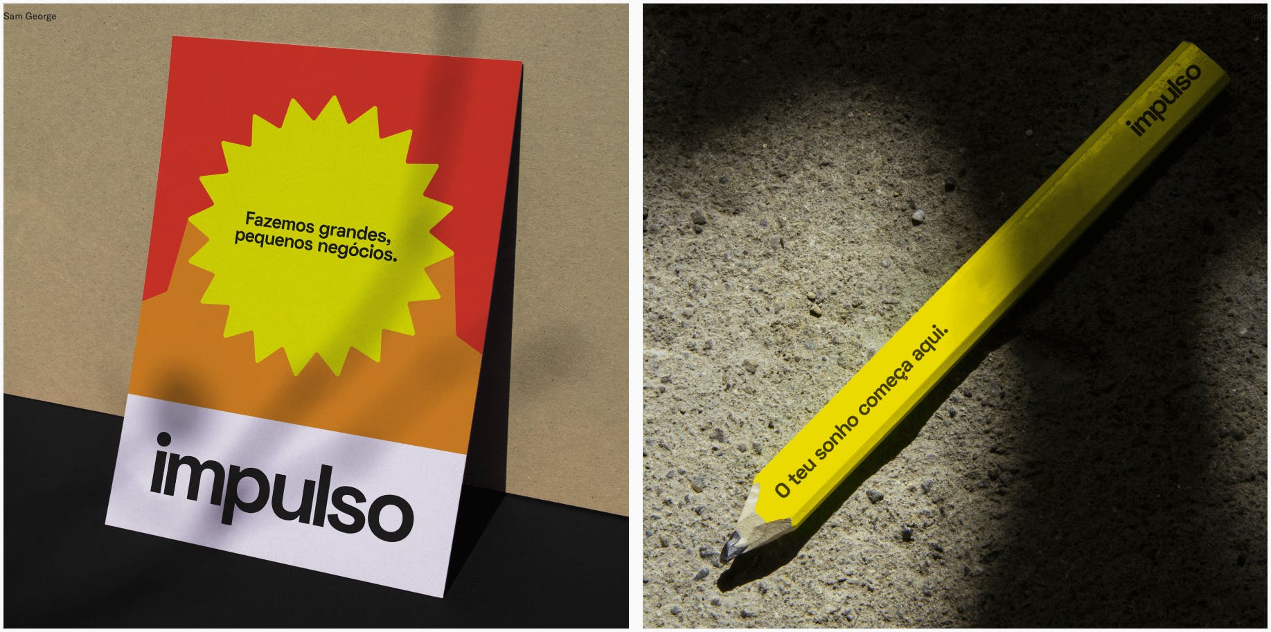
Impulso items
My advice would be to try and put aside what’s working best in your company and try to focus on what is really your key thing and build your brand around it because then everything will revolve around that.
That had been the key for us because our new branding came out of that. Our products came out of that, our communication as well. Figuring out who we are was the most important step in our rebranding.


