
We talk a lot about rebrands and branding projects at Brandfetch, often interviewing the graphic designers and marketing professionals behind the fresh art. At the end of our interviews, we almost always ask something along the lines of, "What tips do you have for a young designer or a company taking on a similar project? What are your takeaways?"
It occurred to us that, hey, this is valuable information that might help people. Why not share that collective wisdom in one post?
Hang on to your hats, folks, because you are at that post.
Below is a compilation of tips, tricks, and takeaways from the professionals behind the branding of companies from Carlsberg to Schwinn. Start scrolling and start learning.
Project planning and accountability
Census' new logo
"These projects always benefit from project plans and accountability. Design is obviously important, but difficult — maybe impossible — to launch without a capable team." -- Matt Yow, Census
Avoid dramatic changes
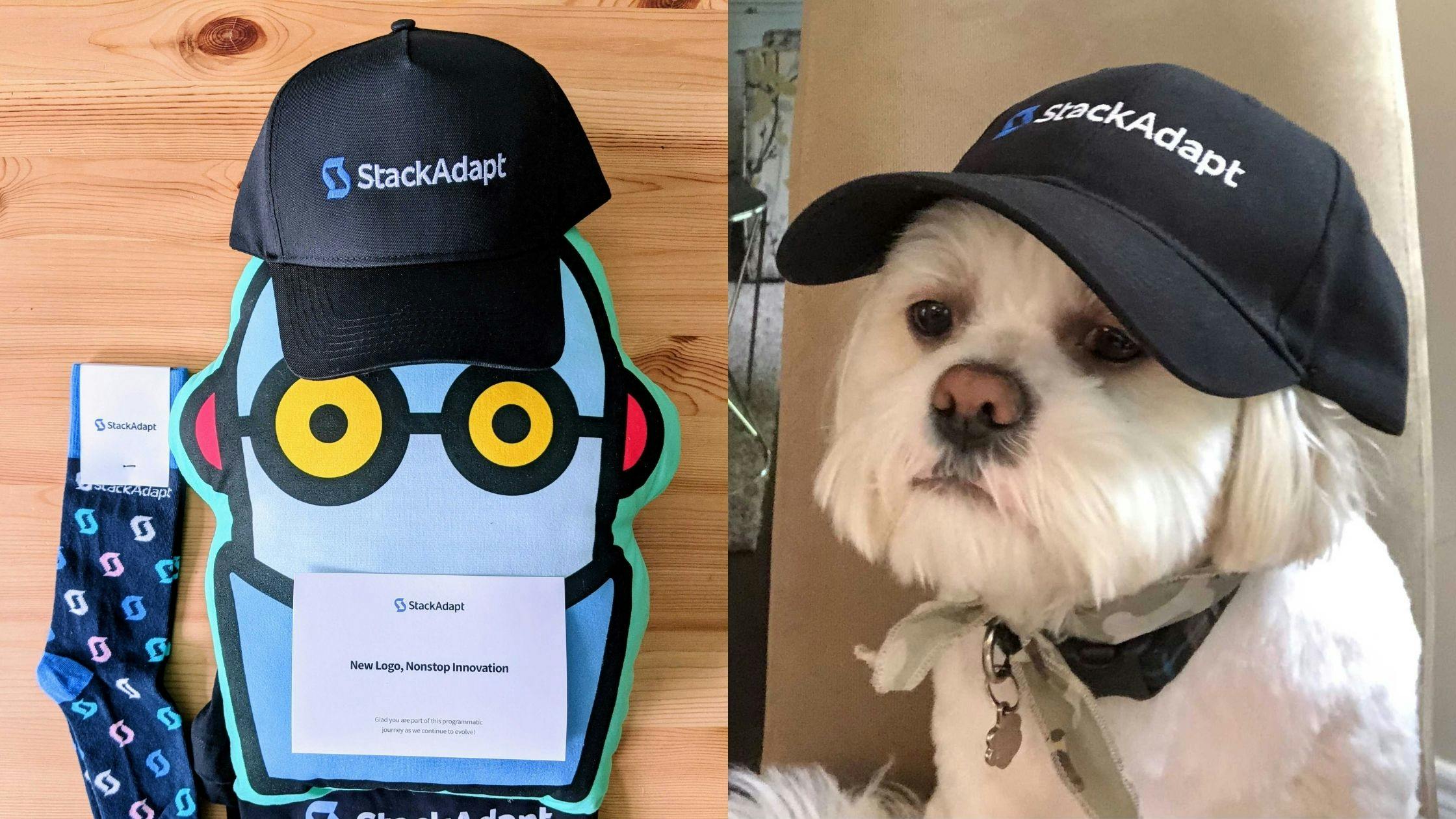
StackAdapt swag
"We knew we wanted to create a logo that would represent StackAdapt as the bigger organization that we have become. A brand that provides a comprehensive solution to help all who seek to innovate in digital marketing from individual media buyers to the larger agency or the in-house marketing organization of a large brand. A brand that delivers results.
Some brands have a history of making dramatic changes to their logo. While it works for some, I would not recommend this to everyone.
I think there is a fine line to be walked here. Yes, it’s good to continue evolving your brand to stay relevant, but it’s important to answer the question of “why?” when you want to do dramatic rebrands and logo redesigns.
Too many organizations fall back on their brand as the reason for any slowed growth. As a result, they burn a lot of resources trying to market themselves better, while instead they should perhaps spend more time with their customers to understand their evolving needs, over-invest in their product, or level-up their team." -- Vitaly Pecherskiy, StackAdapt
Understand usage occasions for the brand

Fandom: For the Love of Fans
"A rebranding effort can help significantly amplify broader and deeper evolutions of the end-to-end customer experience. But to drive awareness, different brands may need to activate different levers in different ways, depending on how the product can be effectively communicated to, as well as experienced and shared by respective audiences.
General advice for developing awareness-driving strategies would be to intimately understand usage occasions for the brand (why, in which context, and when are people using it?), and usage behaviors and patterns (how--long, often, deeply etc.--are they using the brand?) and then deliver coherently and consistently against these motivations and behaviors across the customer journey touchpoints." -- Nic Brandenberger, Fandom
Think about positioning and strategy
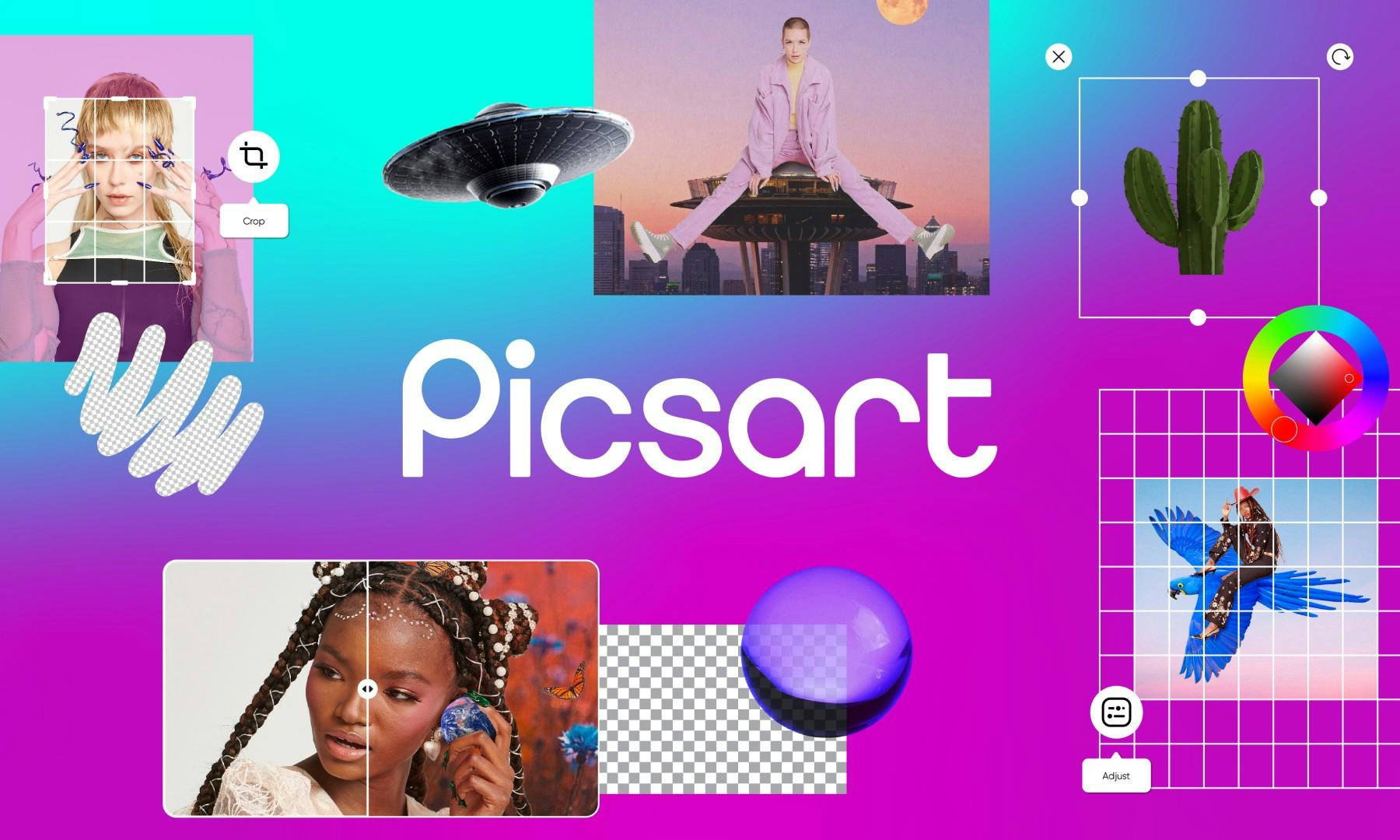
Picsart's new branding
"I would say that before you even touch the visual frameworks, before you even do your logo or design, think about your positioning and your strategy. How do you want to come across to the world? That’s what we asked ourselves internally. Strategy is so important to get that end result in a smooth way without too much back and forth. I think without knowing your goals or what you want to accomplish, it can potentially create chaos for you or any potential designer that might be working on the rebrand." -- Shachar Aylon, Picsart
Energy and passion is not enough

Zenfolio
"The biggest lesson: Energy and passion is not enough -- give a rebranding initiative the time it deserves. If we’d started sooner, the brand would have been established before we started product design, making it much easier to create brand consistency through every touchpoint.
Incorporating the original orange in the new brand provided compatibility with both the Classic product and the new product. That made things a bit easier.
But branding is not only about the visuals, right? Finding the right tone and voice defines the brand, tells its story, and gives it life. We put a lot of energy into creating the right voice.
In a perfect world, I would have rolled out the rebrand globally all at once. As time was not on our side we had to make compromises and trickle the rebrand out. If I had to redo this experience, I would've preferred to launch the brand with a bang, not a whimper." -- Jason Egnal, Zenfolio
Critique your work
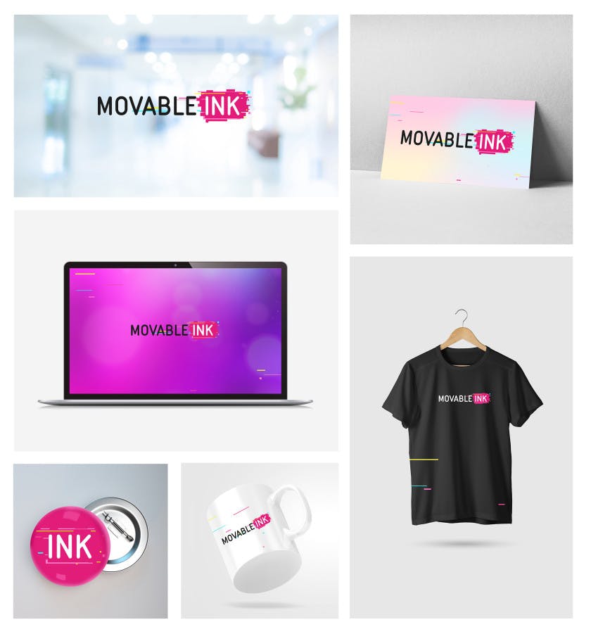
Movable Ink mockup
"Trust in the process. Don’t dive into it blindly.
I would often find myself making the mistake of skipping past the process, past the research, and instead design logos I thought would work. Every time I did this, I learned more about our logo, balance, weight, and different techniques.
And every time it failed. The logos looked great, but none of them were relevant. Self-awareness and the ability to critique your work can be one of the hardest things to face as a designer, however, it is crucial to personal growth and development and the overall outcome of the project.
Revision and countless variations form part of the process. Although it may feel like an endless cycle at some times, it is all worth it in the end.
Every pixel added and shifted changes everything. So does color selection. Test everything. Often, and with diligence. Don’t rush it." -- Lindie Gerber, Movable Ink
Pay attention to the data
Startpage logo and illustration style
"When we landed on the new branding, it just felt right. It truly did. Even today, when I see the logo on our homepage, it feels like it’s been our one and only logo.
Therefore, my takeaway is to pay attention to the data and listen to all of the feedback—but trust your gut feeling for your final decision." -- Kelly Finnerty, Startpage
Get stakeholders on board
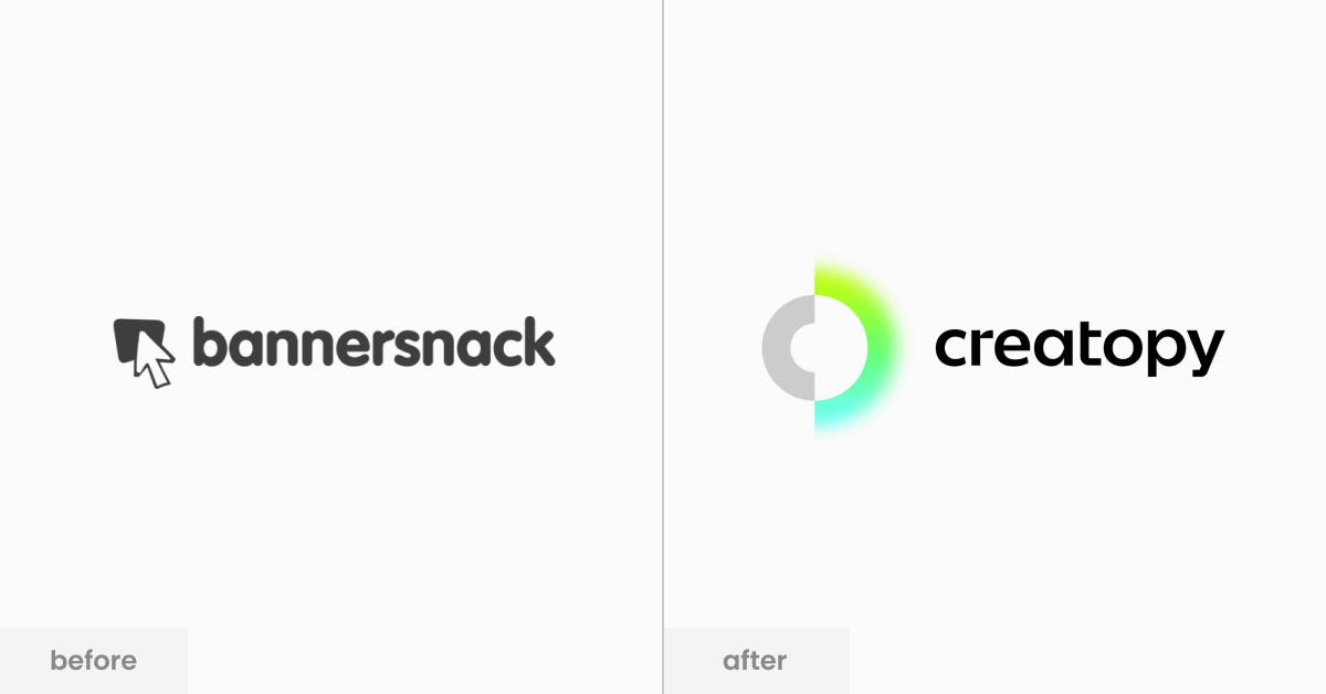
Creatopy before and after rebranding
"The rebrand was a challenge from start to finish. However, if I were to pick the most complex part in the whole process, I’d have to go with the actual implementation, starting with the education and acceptance from the entire team. You have to make sure you’re conveying the same messages and understand all the layers to get people on board, from the inside out, to really build upon this identity and develop the messaging.
It’s a tedious process because you need to make sure everyone knows and understands your brand’s mission, core values, and communication guidelines.
Designers need to embrace the same style, art direction, and stick to your systems, assets, and processes. What worked for us was organizing creative sessions with the entire design team, pushing the boundaries of the new brand. We worked especially hard on training the team and getting them to use the same system and implement the same rules.
In the words of our Head of Design, Gery Meleg, 'Consistency is key. Rules are essential. Creativity is mandatory.'" -- Teodora Gavrilut, Creatopy
Buy-in is essential
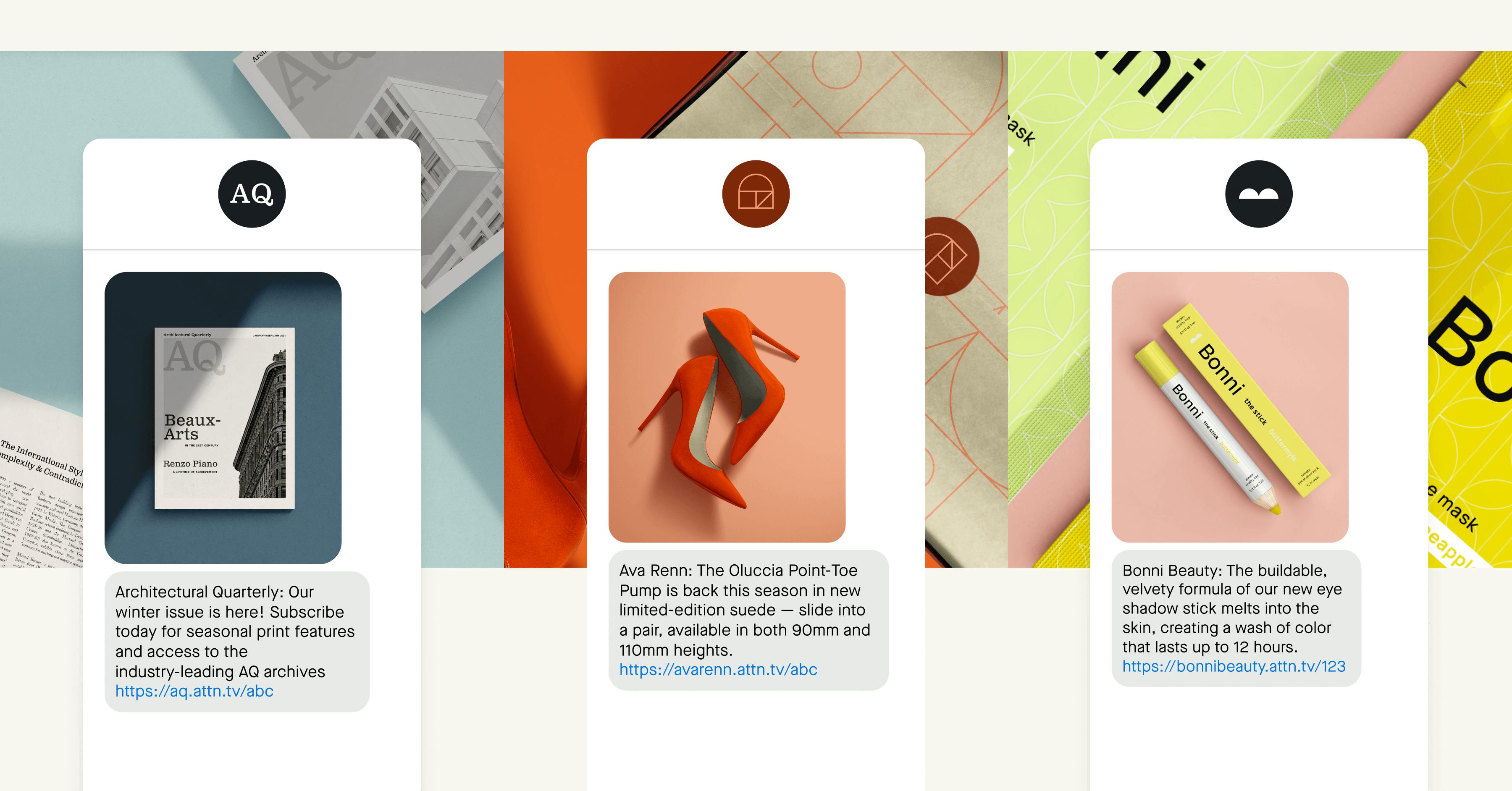
Attentive's visual style
"I’ve had the opportunity to do a few of these exercises in my career and this was by far the most rewarding and enriching.
Firstly, buy-in is essential. There’s no world where you can be successful in any rebrand or refresh without thoughtfully including senior leadership in the process.
I’d also say, especially when working with an agency partner, don’t be afraid to drive. You are the person/team that needs to use the design system every day. A beautiful brand book that doesn’t actually represent a thoughtful, flexible system is not going to work." -- Max Valiquette, Attentive
A sign of change

Audacy's color palette
"An identity project done well is not a change of sign. Rather it’s a sign of change.
After converting every single touchpoint inside and outside the company to Audacy, the real work began. And that was enrolling all of our loyal listeners, clients, partners and employees on our journey in a meaningful, thoughtful way. The importance of doing that well and continuing to remain unwaveringly focused on it today cannot be overstated. For us it was and it remains among our most important priorities." -- Paul Suchman, Audacy
Think upfront about where your brand will be
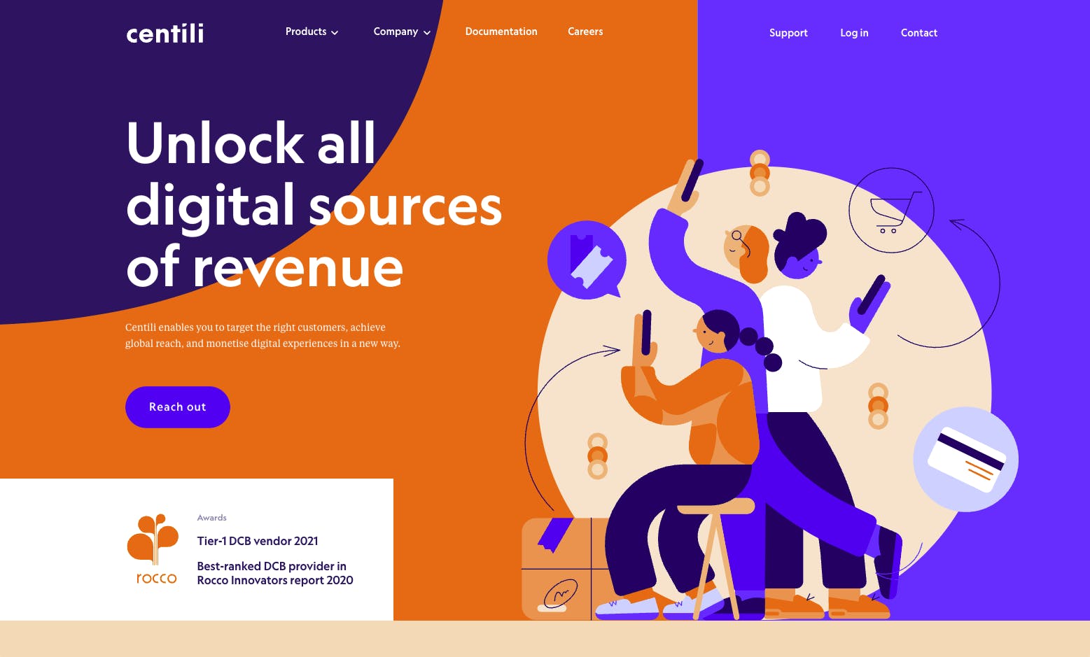
Centili homepage
"I think it's essential to think upfront about where your brand will be most visible and represented most often. When designing, have those applications in mind, and have the given media in mind. It's easy to get lost in your own computer screen observing the logo on its own or form a habit and look at a typical set of stationery for every brand you work with.
So I would advise taking enough time to think about where this brand lives before designing.
It's important to find the solution for the right problem, to make the brand recognizable and memorable in its ecosystem.
And speaking of the biggest takeaways, I would say that having a good identity makes employees perceive their company differently, and makes them proud of it. And there is no bigger asset than having people feel proud of working for you or having partners proud to work with your brand. We should all aim for that." -- Dina Janevski Farčić, Centili
See the whole process
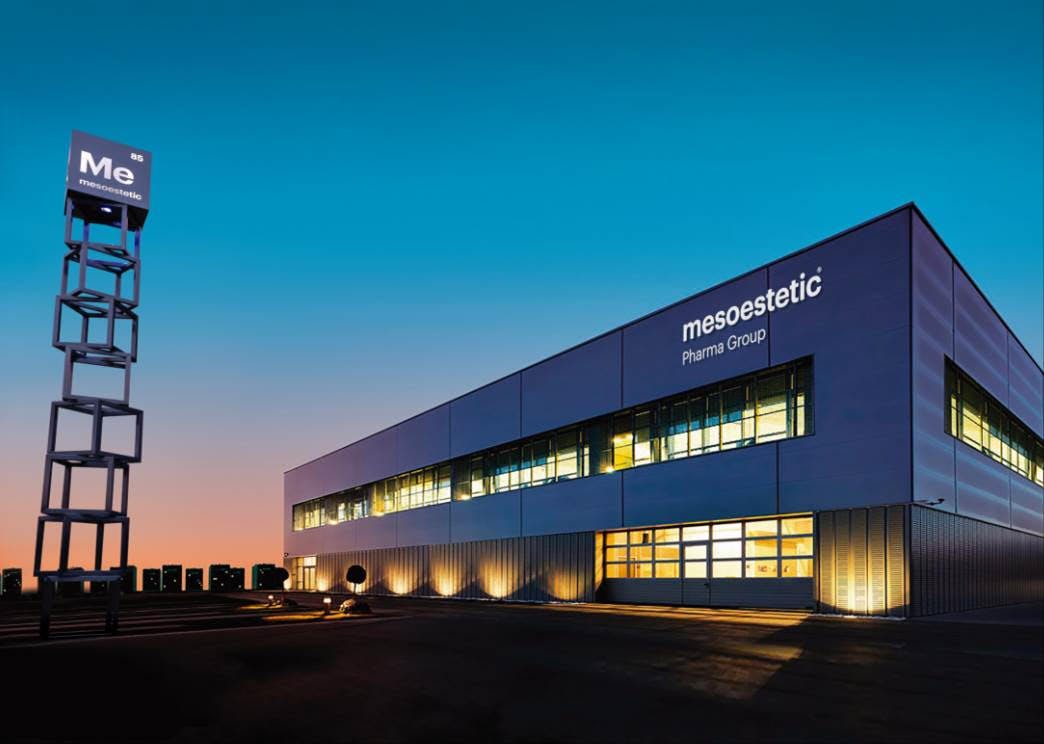
mesoestetic HQ
"We learned that when it comes to branding, you have to see the whole thing, not just one part of the process. You can’t just look at changing the packaging, or just the corporate branding--but the whole picture.
It’s also important that you make your people a part of the process, and it’s what we have done from the beginning, making sure the employees were the first to know about the rebranding." -- Fernando Gonzalez Pareja, mesoestetic
Listen, listen, listen

D2L logo
"A branding exercise requires openness to new ways of thinking and a deep dive into the anatomy of company vision, mission, and values. This is so much more than a selection of logos and colors – it's about holding a mirror up to the organization and having open and frank conversations about how we see ourselves and how others see us.
A brand brings together so much of a company’s DNA. In many ways, a branding exercise is like corporate soul searching.
I learned more about D2L through this process than I could have imagined. The passion and commitment of my colleagues is commendable, and this really shone through our work on this project. I’m amazed by the hard work that went into this process.
My advice to others would be to listen, listen and then listen some more! Also, be prepared for discussion and iteration that brings people together. Change is not easy, and it’s important to bring people along for the ride. It requires more engagement and time but it’s worth it in the end." -- Alys Reynders Scott, D2L
Find professionals
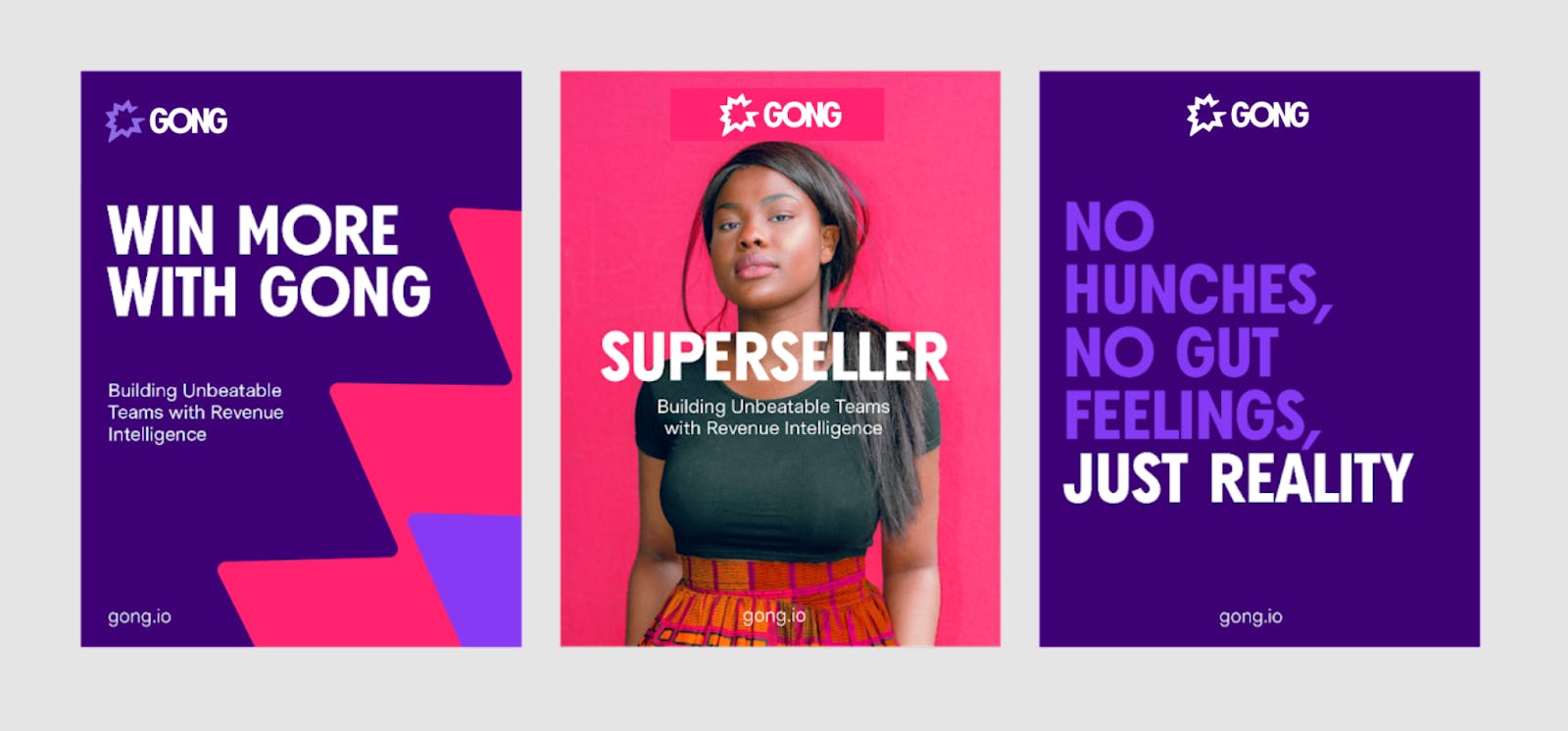
Gong visual identity
"Find professionals––the best brand strategists, designers, and writers you can afford. Educate them like crazy on your brand, your customer, their pain-points, and how your product solves a problem. Share customers stories so the agency can live the customer experience and start to become believers. Select a small core team of internal marketers who can make the tough decisions, but socialize progress as it happens.
Use the agency for what they’re good at—thinking creatively and designing great ideas. Choose those ideas you love best. Then let your internal team decide how to implement the new system." -- Lee Mincy, Gong
Align brand design with context

Tuborg Squash
"I would say there are two things we have been reassured about. First is the importance of keeping a simple design to make it pop on the shelves. Today, too many brands end up competing on noise, clutter and confusion. Rather, brands should boil down their communication. It’s the only way to make sure people remember and pick your brand.
Second is the importance of aligning your brand design with your context. This is crucial for being relevant in consumers’ eyes. Building on your company’s existing and promising brand assets. Explore the competitive landscape and see where the market is heading. Uncover consumer needs, demands and trends in order to stay relevant. Finally, dive into the culture and inspect the culture of the brand and consumers." -- Mikael Tonning on Everland's branding work with Tuborg Squash
Involve all parts of the organization
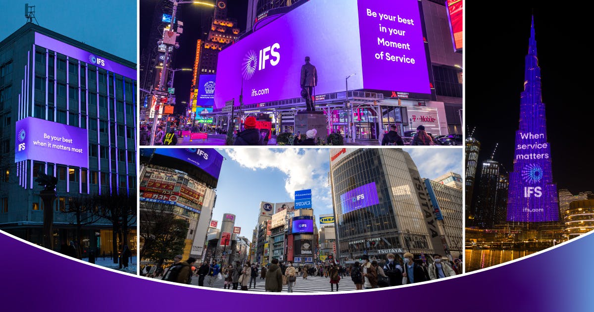
IFS logo and visual identity
"[...] always make sure that a rebrand is motivated by a tangible business decision. We had that strong rationale and therefore had no problem getting stakeholders on board in accepting the 'why' and the 'what' of the story.
Speaking of stakeholders, that’s a second main takeaway. We needed to involve all parts of the organization directly in a sort of steering council to make sure the brand changes had effects on everything from the HR process down to the log in screens for the product.
That synchronization made the impact even bigger and more true than if this had been 'just' a marketing project." -- Per Åsberg, IFS
Get the .com
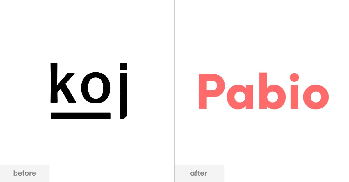
From Koj to Pabio
"There is of course a cost to redesigns. We did our best to SEO-proof our new site (e.g., properly setting up redirects, using alias URLs, etc.), so I wish we didn’t invest as much in the previous brand.
A famous Paul Graham (founder of Y Combinator, the startup program we are a part of) quote is, “If you have a US startup called X and you don't have x.com, you should probably change your name.” We did think about this but always thought to ourselves 'we’ll have money in the future, so we can get the .com then.' It doesn’t work like that.
In the early days of Koj, Carlo and I were incredibly passionate about our brand and name, because we felt so strongly that not only is a short and memorable name fundamental to our work, but this specific one is. Of course, we learned that our value is in the smiles of our customers when they see their new apartment for the first time, not in the name." -- Anand Chowdhary on Pabio's rebranding
Be bold and brave
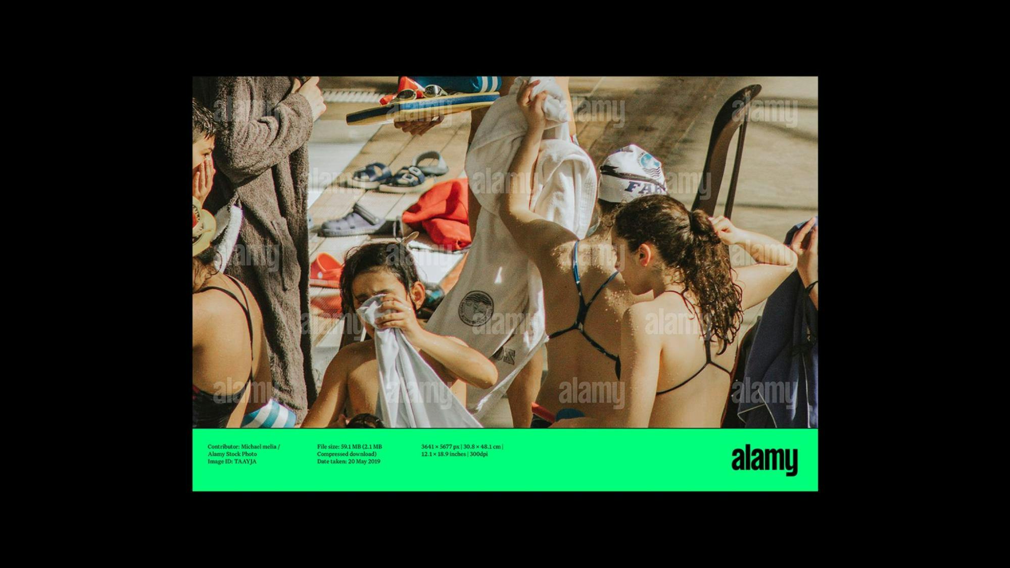
Alamy
"The Alamy rebrand has been a career highlight. I loved the creative process, working with the incredibly talented Phantom team and although there we many sleepless nights, our teams made it happen and on deadline.
Here are my top three tips:
1. Be aware of the primary color you select for your rebrand.
We chose a neon green which brings challenges when printing tangible branded merchandise on paper, fabric, and other surfaces.
We settled on an online and offline green color that allows us to maintain consistency across our branded assets. There are certain colors used in your UX design that need to work within your new color palette.
2. Take everyone on the journey.
If you are leading a rebrand, ensure that you are presenting milestones to the senior leadership team as well as the broader business. Their input or general feedback is extremely valuable. The success of a rebrand starts with your internal stakeholders so ensure you plan an internal launch strategy before you share your new brand with the world.
There will be haters but if you get the majority of the business on board and excited about the rebrand, you will set yourself in good stride for brand advocacy.
Collaborate closely with your Product team from the start as your brand’s visual identity comes to life differently online versus offline. Think about UX design elements such as the visual language, typography, colors. Beware of extra costs such as font licenses for your website and accommodate an extended color palette to cater to your website needs.
3. Have fun!
It’s not every day that you get to do a rebrand so enjoy the process and ramp up your creativity. Be bold and brave. You’ll surprise yourself." -- Katie Hayes on Alamy's new logo and branding
Have strong foundations
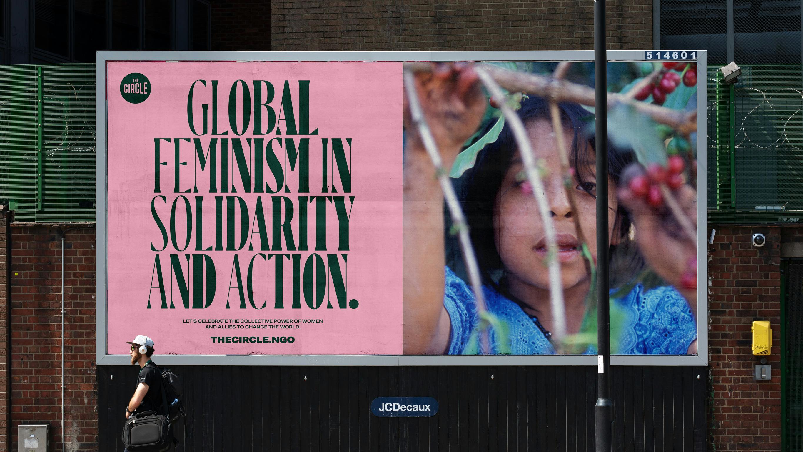
The Cicle NGO Billboard
"I really love this question because it addresses one of the big challenges of any brand project: what happens when you hand it over to the client. In this project, the client was The Circle team, their board, the incredible creative Annie Lennox, but it was also everyone out there who wants to call themselves a Global Feminist.
Like any great movement, it has to have strong foundations that provide the footing for freedom and creative expression. Really sweating those decisions and working with the client to bring them on a journey of demystifying the creative process will deliver a stronger and more cohesive brand outcome. And thinking about your audience beyond those in the room forces you to put principles of accessibility and diversity first. It actively encourages design teams to think more expansively about how the identity might be used.
So I guess the pro-tip from us on this project is; ask yourself how bigger audiences can use your brand. And see where that takes you." -- Natalie Burns on UnitedUs' rebrand for The Circle NGO
Surround yourself with collaborators you respect
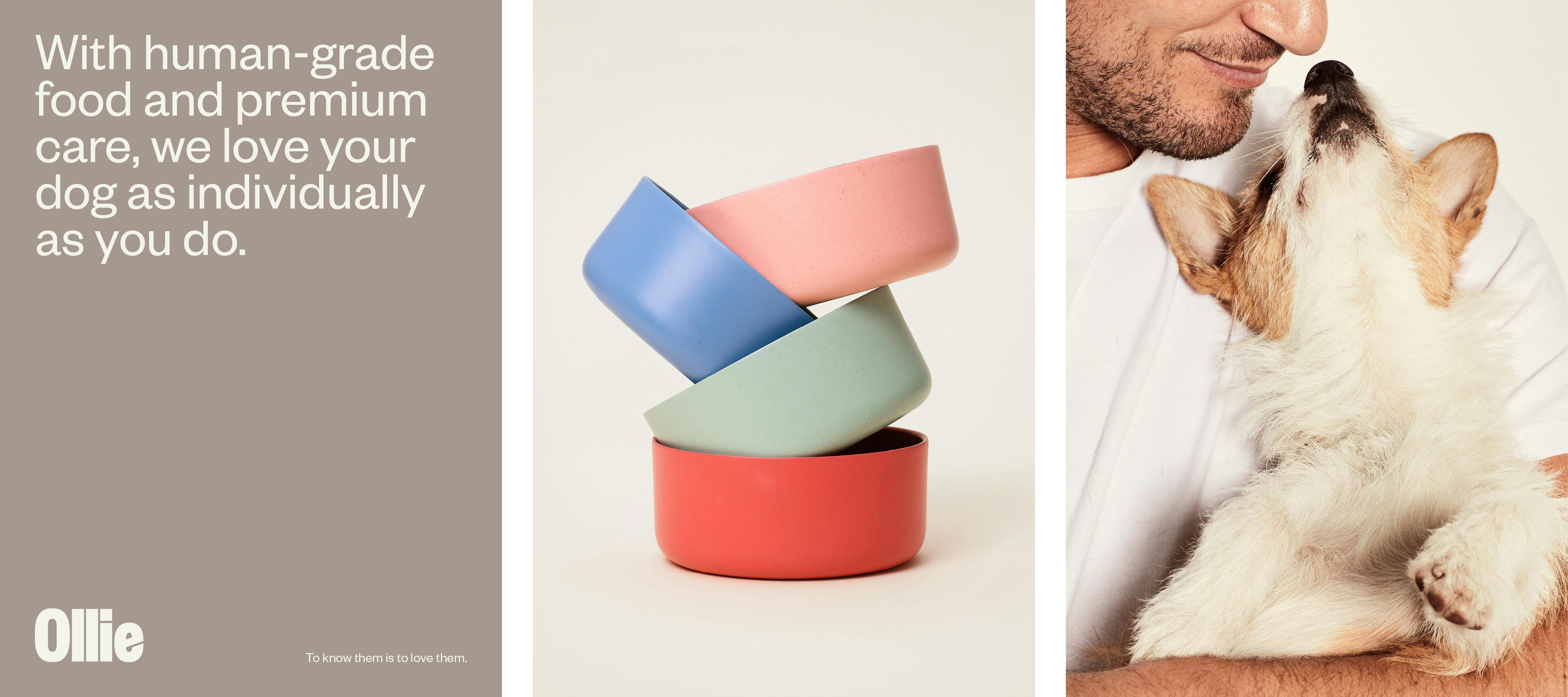
Ollie brand design
"It can be overwhelming at first, but nothing of this scale is ever accomplished alone, so I would surround yourself with collaborators that you respect and that respect you in return. It's rare you have clients that are willing to take risks and put so much trust in your vision, especially as a small studio, so I'd just like to thank the entire Ollie team and our collaborators at Strand Studio." -- Lacey Waterman on Strand Studio's rebranding work for Ollie
Be thoughtful and careful

Schwinn billboard
"When we approach a brand evolution, rather than designing a new identity from scratch, we have to look carefully at what exists, and where we need to retain current brand recognition and equity.
It’s tempting to wipe the slate clean and create new graphic elements, but I often find the best brand evolutions are thoughtful and careful.
It’s a bit like architectural restoration. You want to replace the things that have become a little tired, perhaps the roof, the windows, the paint job, but maintain the integrity of the structure so that the building remains recognizable, and can stand proud in its new skin.
A good brand evolution should feel both fresh, and like it’s always been there." -- Tom Crabtree on Manual's branding work with Schwinn
