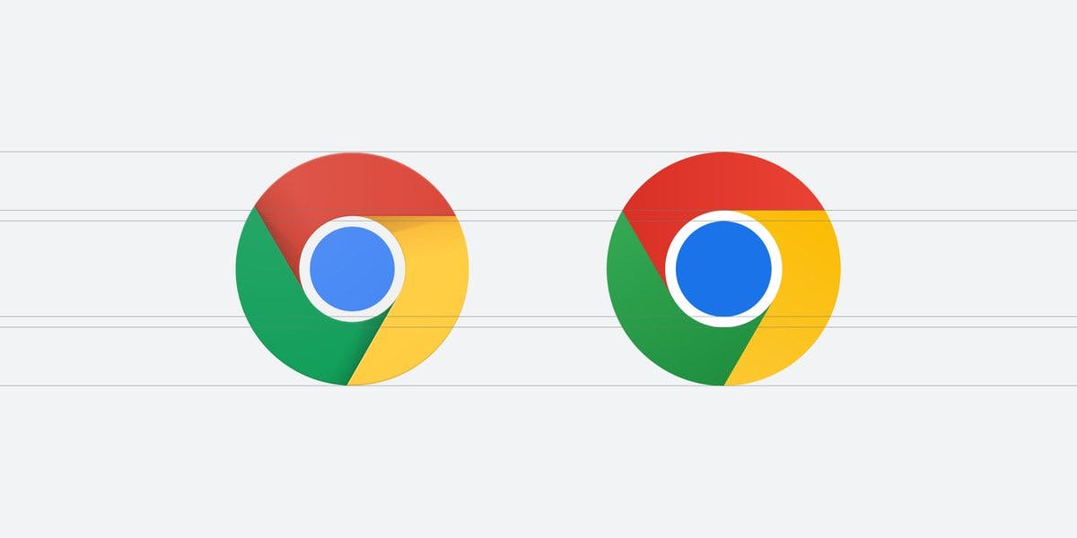
Google Chrome designer, Elvin Hu, took to Twitter and revealed Google Chrome's first logo update in eight years.

The subtle changes side by side.
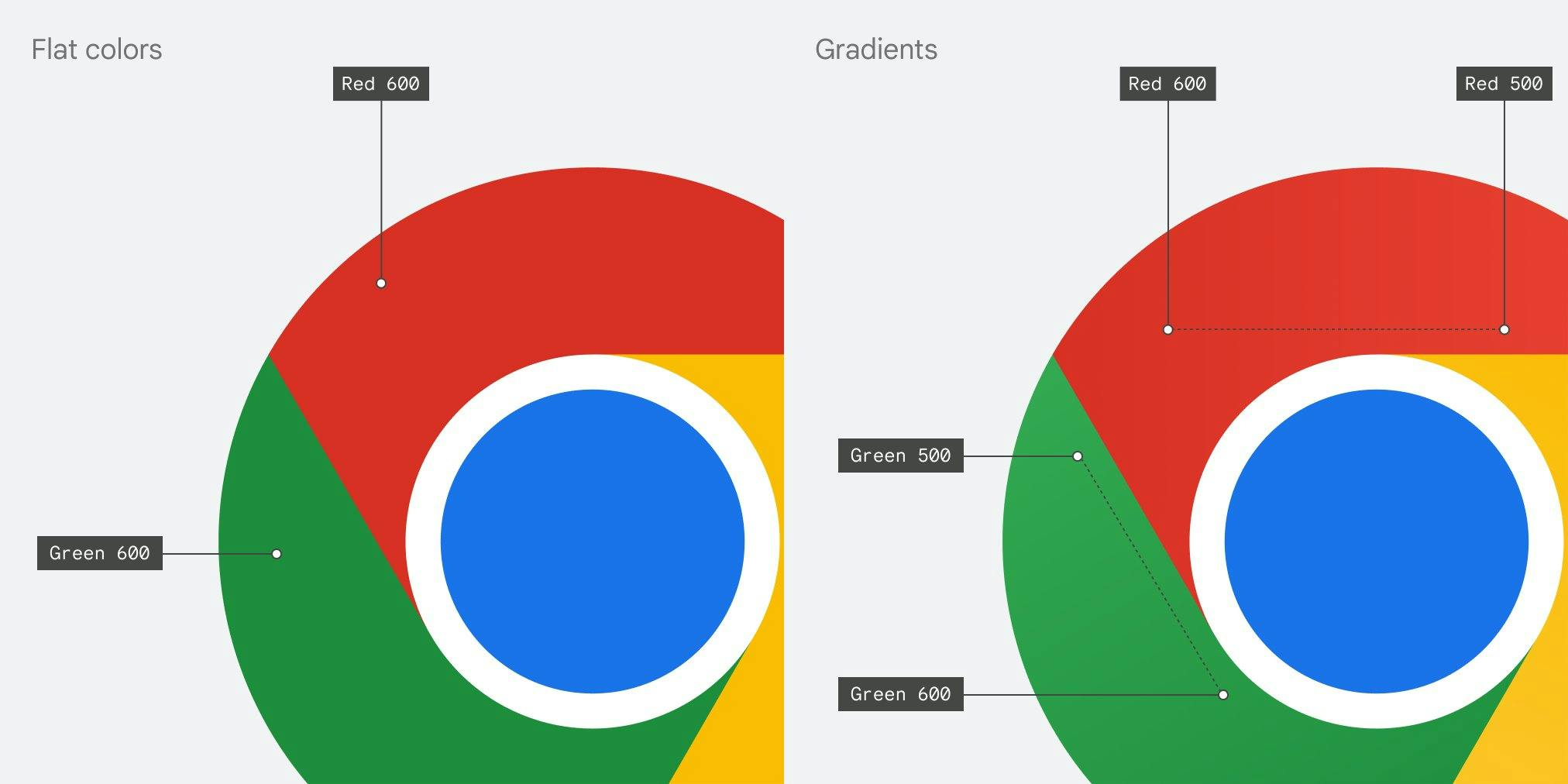
"We simplified the main brand icon by removing the shadows, refining the proportions and brightening the colors, to align with Google's more modern brand expression," tweeted Hu, adding "Fun fact: we also found that placing certain shades of green and red next to each other created an unpleasant color vibration, so we introduced a very subtle gradient to the main icon to mitigate that, making the icon more accessible."

Photo via @elvin_not_11
Check out Hu's full breakdown here.
