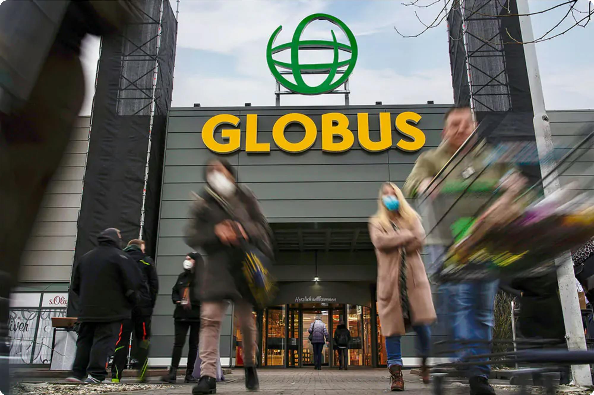

The German grocery store chain, GLOBUS, recently released their new logo at the entrance of their market hall in Maintal just outside of Frankfurt.
"With our new modern appearance, we want to emphasize our services and expertise even more and express our mission: Variety, well-made products, services and experiences," said Jochen Baab, spokesman for the management of GLOBUS Markthallen Holding, during the ceremonial unveiling of the new logo.

The new GLOBUS logo above a store entrance via globus.de.
GLOBUS' new logo is meant to convey modernity and transparency with a dynamic globe as well as the constant development of the company. The corporate design includes new colors, shapes, images, and fonts. The tried and true GLOBUS colors of green and orange remain and shine with a fresh take, supplemented by an extended color palette.
In the coming months, the new logo will be installed at 51 GLOBUS locations, followed by the conversion of the corporate design in all areas in the stores –– from the small price tag on the shelf to advertising posters.
Source: globus.de
