


Interview with Bob Wollheim, Partner and EVP of Growth & People at CI&T
Can you introduce us to CI&T and explain how the idea of rebranding came about? What motivated the company to rebrand at this point in its nearly 30-year history?
CI&T is a company with nearly three decades of experience in tech transformation, covering areas like digital innovation and AI. Last year, we realized that our brand, including our logo and overall image, didn’t fully represent the scale of our global presence or our advancements in technology, especially in AI. As a company supporting many global clients and helping them tackle digital and AI challenges, we wanted our brand to reflect that strength and relevance.
The rebranding journey started with internal reflections and listening to feedback from our team, which has grown to about 7,000 people worldwide. We conducted internal research to understand what the brand meant to our people, why it might not feel representative, and what was missing.
Image Courtesy by CI&T
We also explored our brand archetype - partnering with the UK-based studio MAKE, we conducted initial brand studies, but halfway through last year, we realized it wasn’t the right moment to rush a full rebrand. We decided to slow down, taking time to refine and perfect each element of the brand so it would truly reflect our evolving identity.
By early this year, with our CI&T Flow platform progressing and client relationships thriving, we felt ready to launch the new brand. We spent months aligning on every detail, from visuals to our new tagline, ensuring it matched our values and future direction.
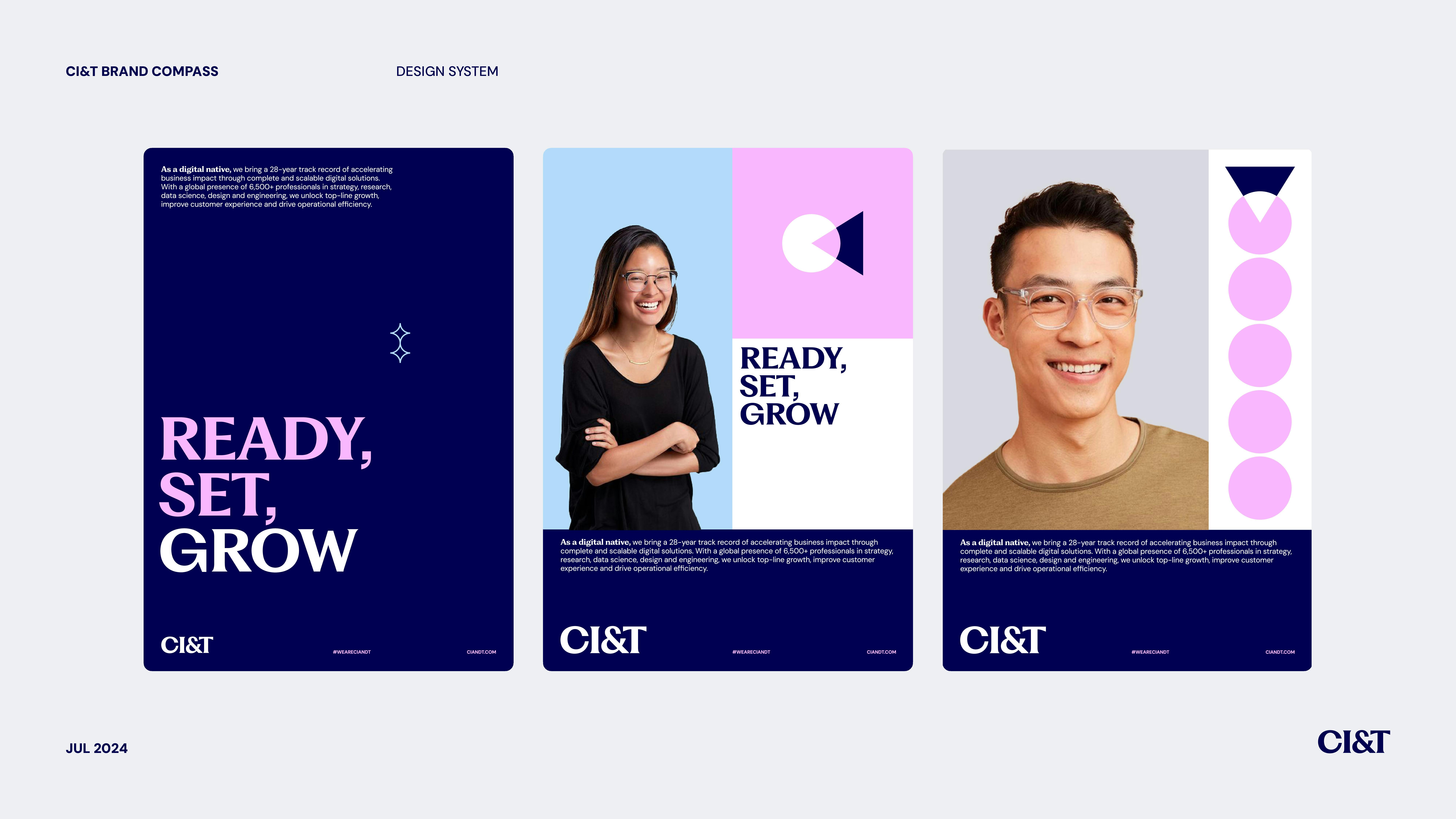
Launched in early August, our rebrand has been global, allowing different teams and regions to transition at their own pace. We wanted a flexible brand evolution, believing that a more organic approach leads to better, lasting results.
What inspired the use of geometric shapes as the foundation for the brand symbols?
The idea for using geometric shapes came from MAKE studio, and it connects directly to our name. CI&T stands for "collaborate, innovate, and transform"—values we haven’t emphasized much over the past decade but felt were important to bring back.
MAKE suggested we link these principles with simple geometric shapes to create a sense of movement and endless possibilities, reflecting our identity as a dynamic, ever-evolving company.

Image Courtesy by CI&T
At CI&T, we pride ourselves on constant change and adaptation, never getting stuck with one method or technology. The shapes symbolize that flexibility and growth, forming infinite combinations that align with how our teams operate. Each unit within CI&T has autonomy, allowing them to interpret and use these shapes in various ways, representing the diversity and adaptability that defines us.
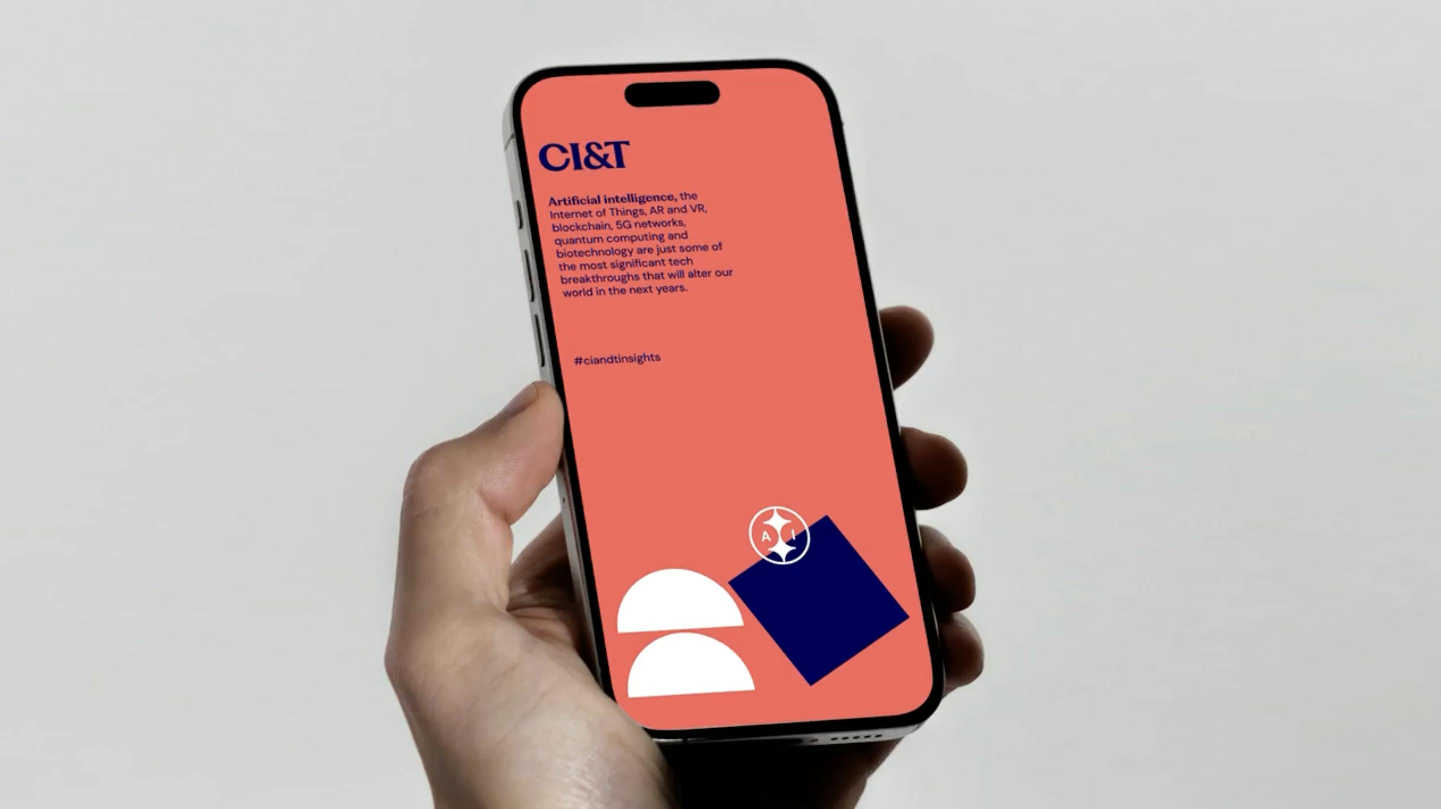
Image Courtesy by CI&T
What led to the choice of Bright Coral as the lead brand color, and what does it represent for CI&T?
Our new color palette offers more variety than before. Previously, we used only two or three colors; now, we’ve expanded to more than seven, giving us a wider range of possibilities to reflect our brand’s versatility.
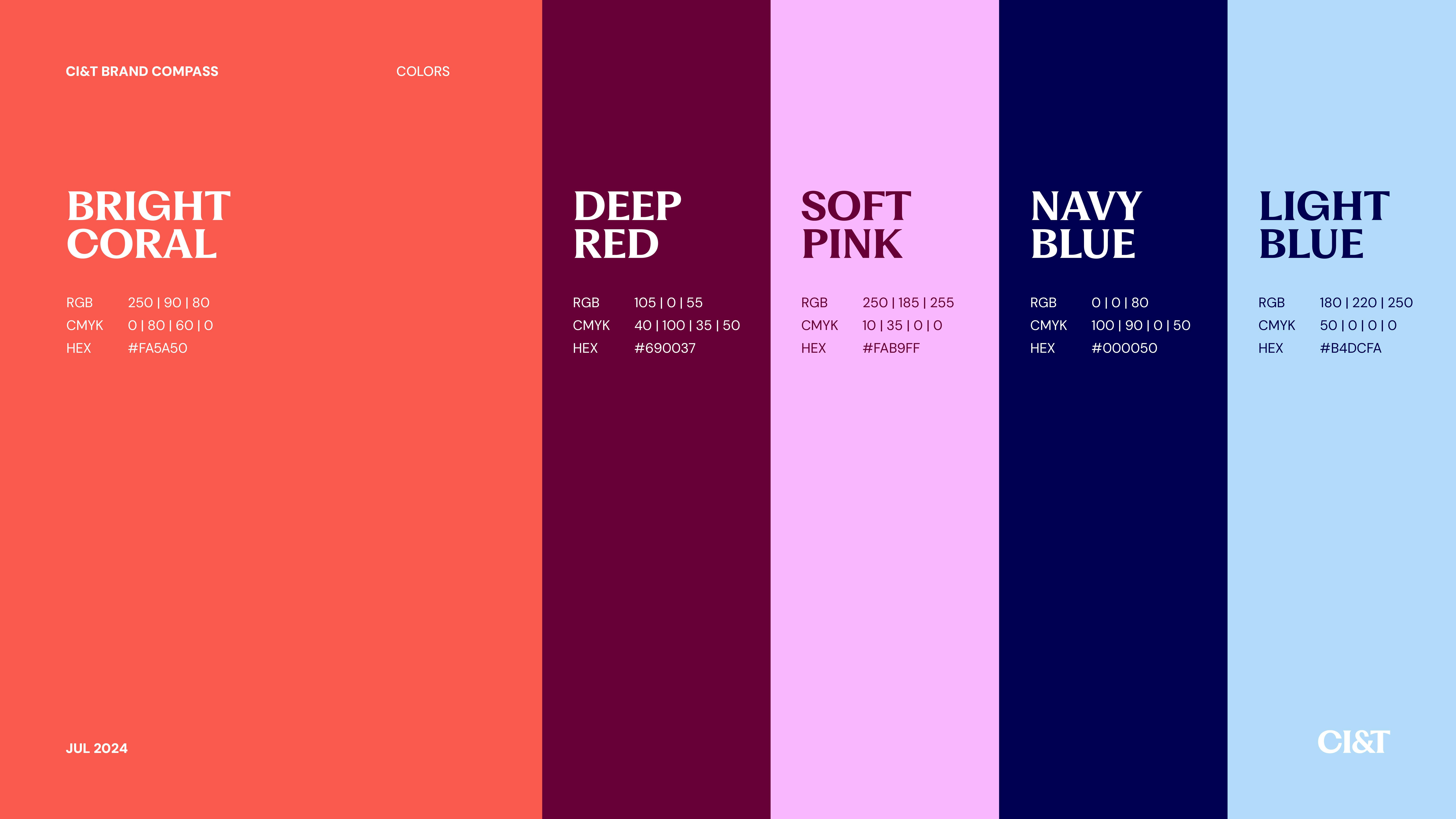
Image Courtesy by CI&T
Alongside color, we introduced other brand elements, like the ampersand symbol, which we’ve highlighted more prominently. While ampersands can sometimes clutter a brand, we chose to embrace it as a unique part of our identity.
This broader palette, along with flexible shapes and visuals, allows for more diverse expressions that match the different moments, challenges, and initiatives of our people. By integrating these colors and symbols, we created a brand that feels open and adaptable, giving our teams creative freedom to represent CI&T in ways that resonate with them.
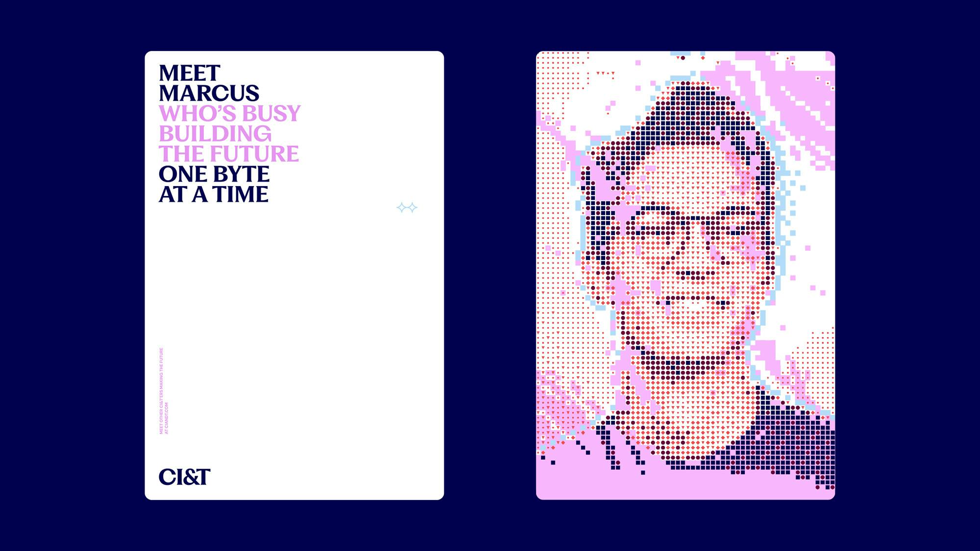
Image Courtesy by CI&T
Could you tell us about the roles the British agency MAKE and archetype specialist Yone played in the rebranding process? How is the collaboration going, and does CI&T have an in-house design team dedicated to this rebrand?
Image Courtesy by CI&T
Yone focused on an archetype study that provided insights we combined with our internal research within our GGP (Global Growth Partners) department, which has over 50 members worldwide supporting CI&T’s growth, marketing, branding, and campaigns.
The work with MAKE, on the other hand, was much more hands-on. While we have an internal team to lead our marketing, we wanted an external perspective from MAKE, allowing them to drive the creative process rather than just following our direction. Kenzo and Mariona, two of MAKE’s founders, took the lead, guiding us through the rebranding journey.
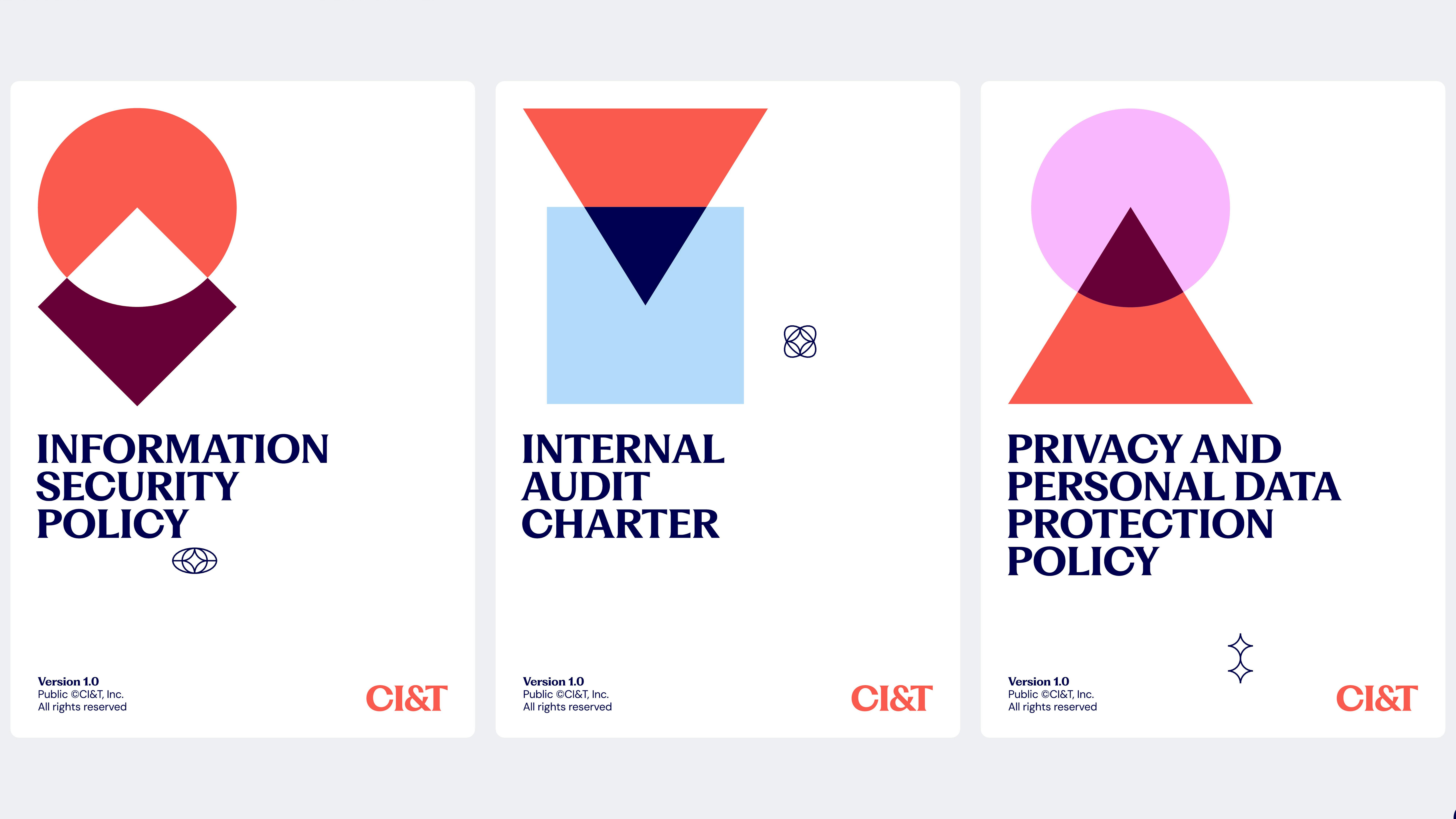
Image Courtesy by CI&T
Interestingly, the timing ended up working in our favor. Though we initially felt frustrated delaying the launch to this year, it gave us a chance to fully collaborate with MAKE and refine the brand. Having that extra time allowed both teams to adjust, improve, and polish every detail, transforming what started as a challenge into a major advantage.
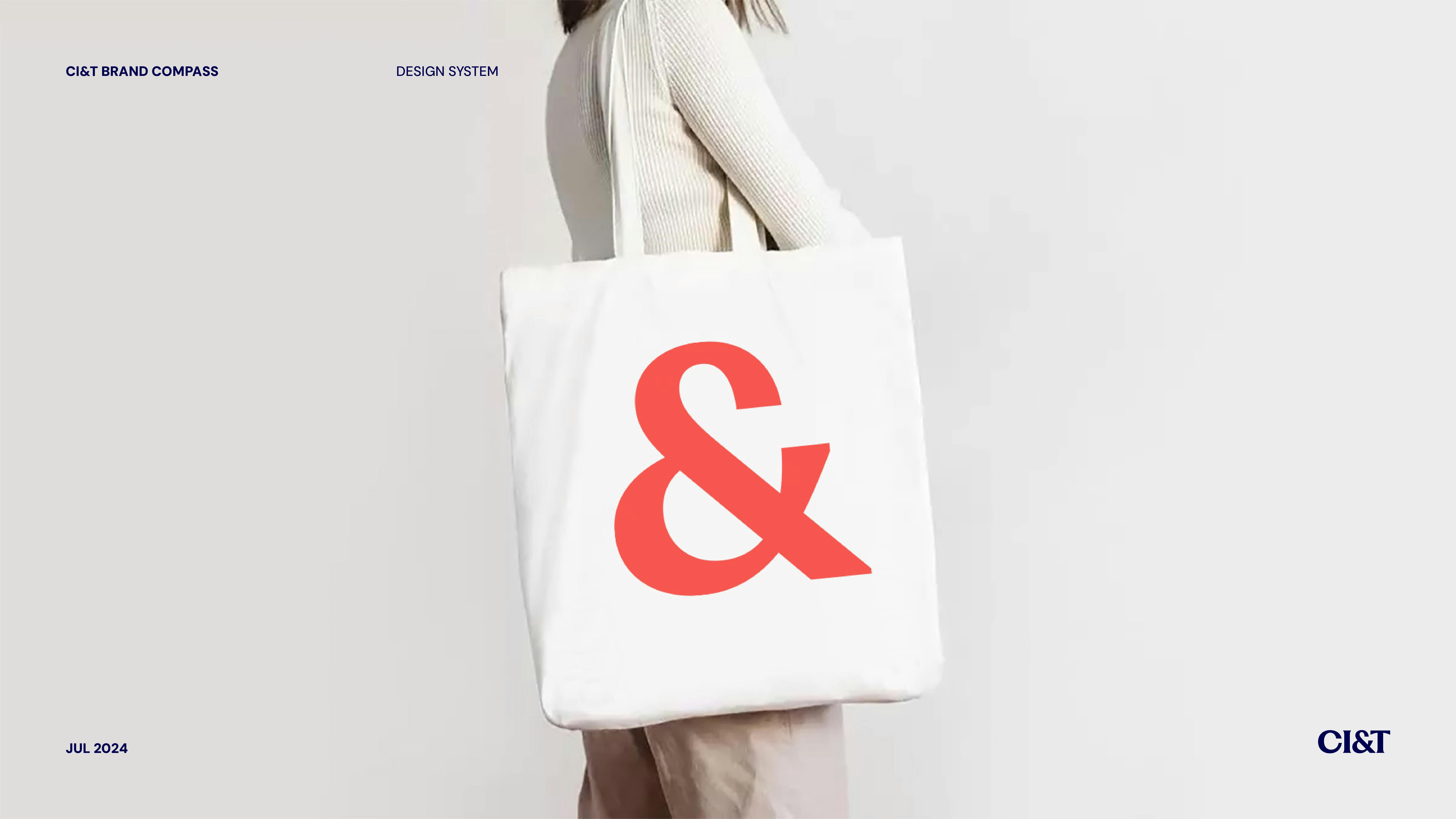
Image Courtesy by CI&T
Are you the primary decision-maker for rebranding matters at CI&T?
I made the initial decision to hold off on the rebrand launch because the timing didn’t feel right. At the start of this year, when I felt it was finally the right time, I shared the plan with our founder and CEO, Cesar. I then presented our nearly-complete concept to both Cesar and Bruno, as well as our group of 10 partners, which includes myself.

Image Courtesy by CI&T
To capture the essence of the rebrand, I created a short video summarizing the vision and direction. I wanted everyone to feel the energy of the brand’s new direction before analyzing it. The video emphasized our core values—collaborate, innovate, transform—along with the simplified visuals and flexible logo design.
This approach allowed them to experience the rebrand on an emotional level first, and then I followed up with explanations about each choice.
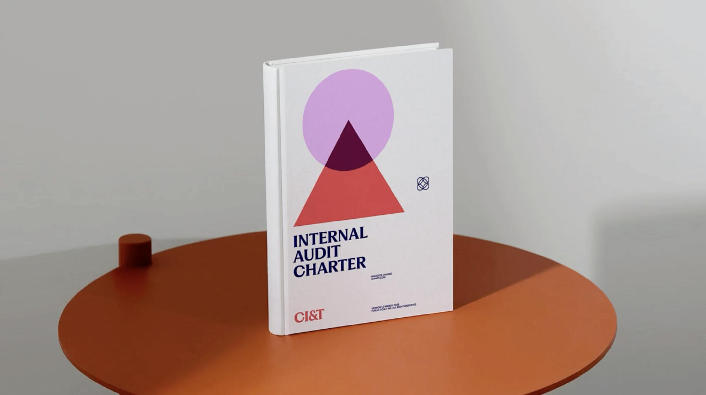
Image Courtesy by CI&T
What is the significance of the new tagline “Navigate Change”?
For years, we faced the challenge of explaining exactly what CI&T does, as our core is tech transformation, yet our work continuously evolves with each new wave of innovation. We quickly learn, adapt, and develop methodologies to help clients move fast and take advantage of new technology cycles, like digital, mobile, and now AI.
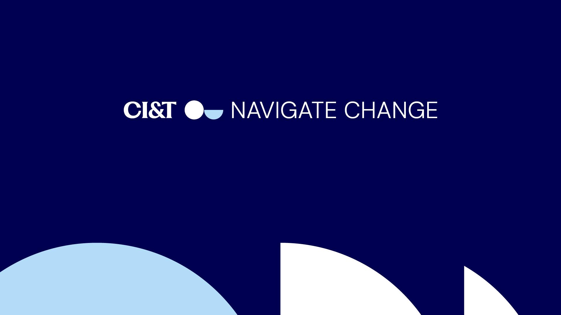
Image Courtesy by CI&T
The tagline "Navigate Change" simplifies this complex role. It represents how we help clients navigate various challenges, whether it’s growth, performance, cost, or customer experience. The phrase allows us to convey our purpose in a flexible way, adapting to each client’s specific needs and goals.
When we introduced "Navigate Change" to our team, it instantly resonated. Many CI&Ters saw new ways to use it in their work, which showed us it was the right choice—it captures our mission to guide clients through their unique challenges toward meaningful outcomes.
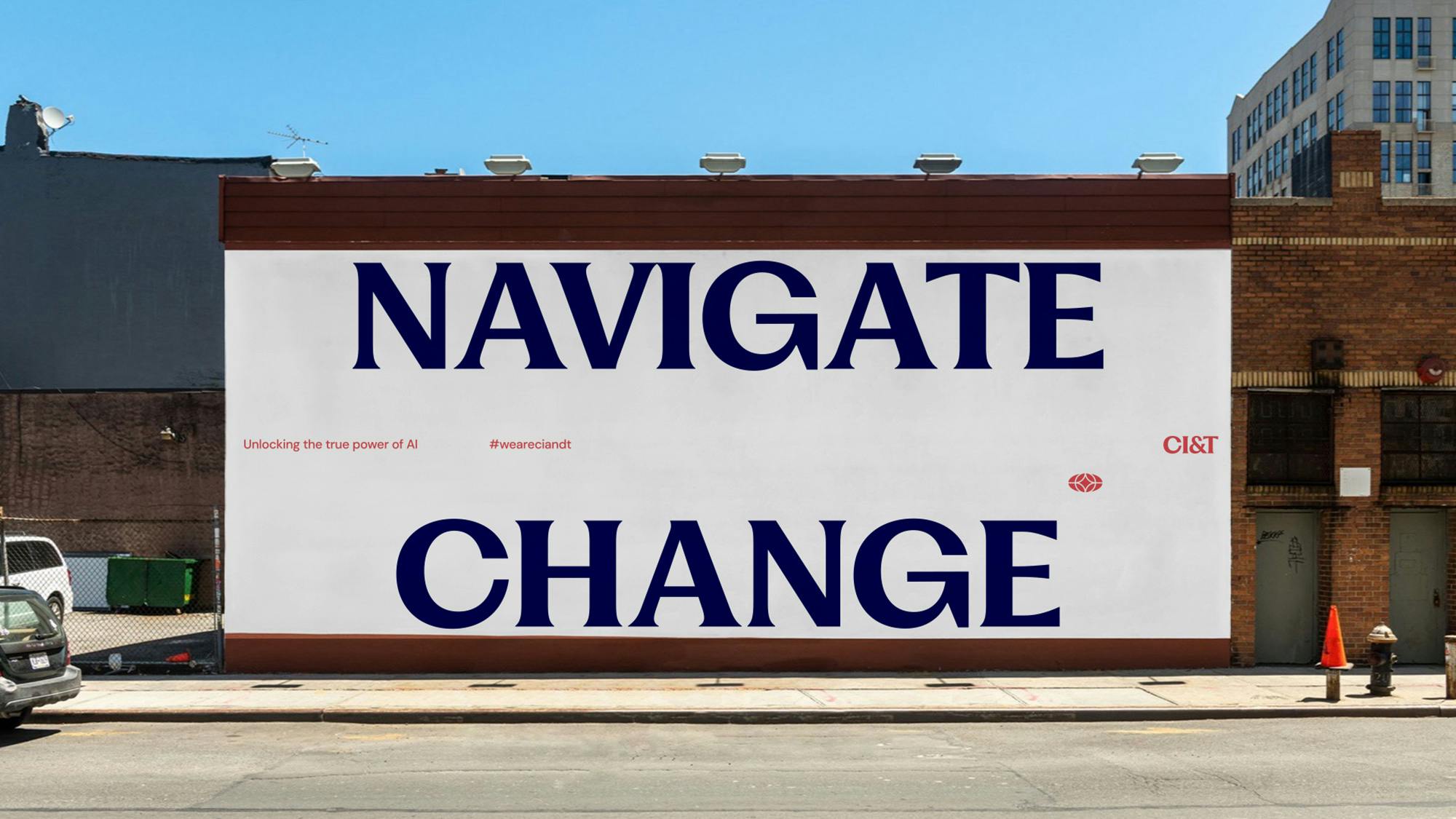
Image Courtesy by CI&T
Could you share any challenges you faced while collaborating with MAKE studio, especially as a global company? Was managing communication and handling numerous ideas overwhelming at times?
Early on, we hit a point where things didn’t seem to be going in the right direction. To resolve this, we decided to be completely open with the MAKE team, sharing our concerns honestly.
Instead of listing reasons why we didn’t like certain ideas, we expressed our feelings about the direction, saying, “something doesn’t feel right.” This open, honest conversation turned things around and helped MAKE understand our vision more clearly.
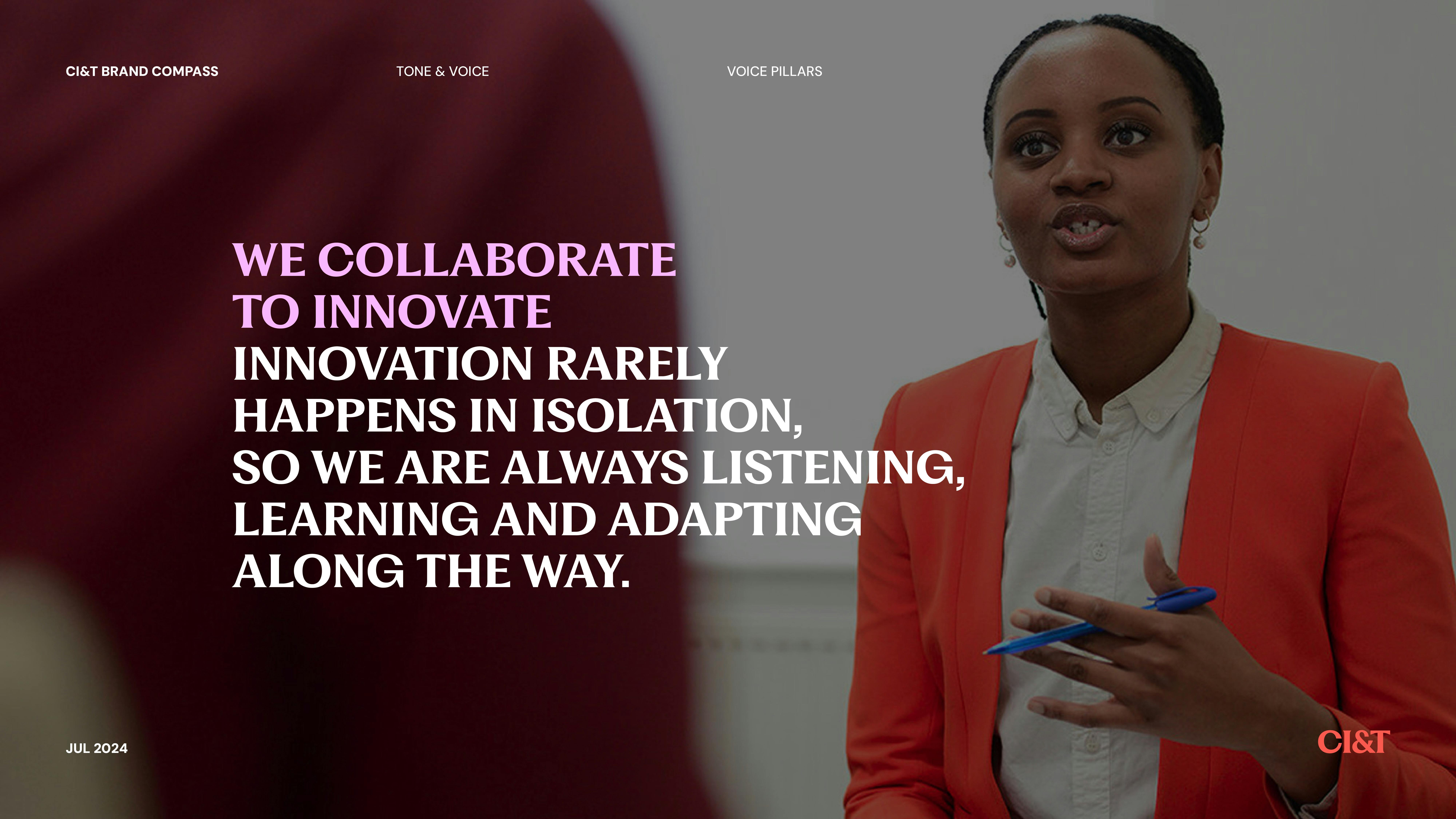
Image Courtesy by CI&T
Another challenge came when it was time to involve the broader team, from facilities staff to business units, and share how the new brand would impact them. To gain support, we showed each group the specific benefits of the rebrand for their roles, like the flexibility and autonomy the new branding offers.
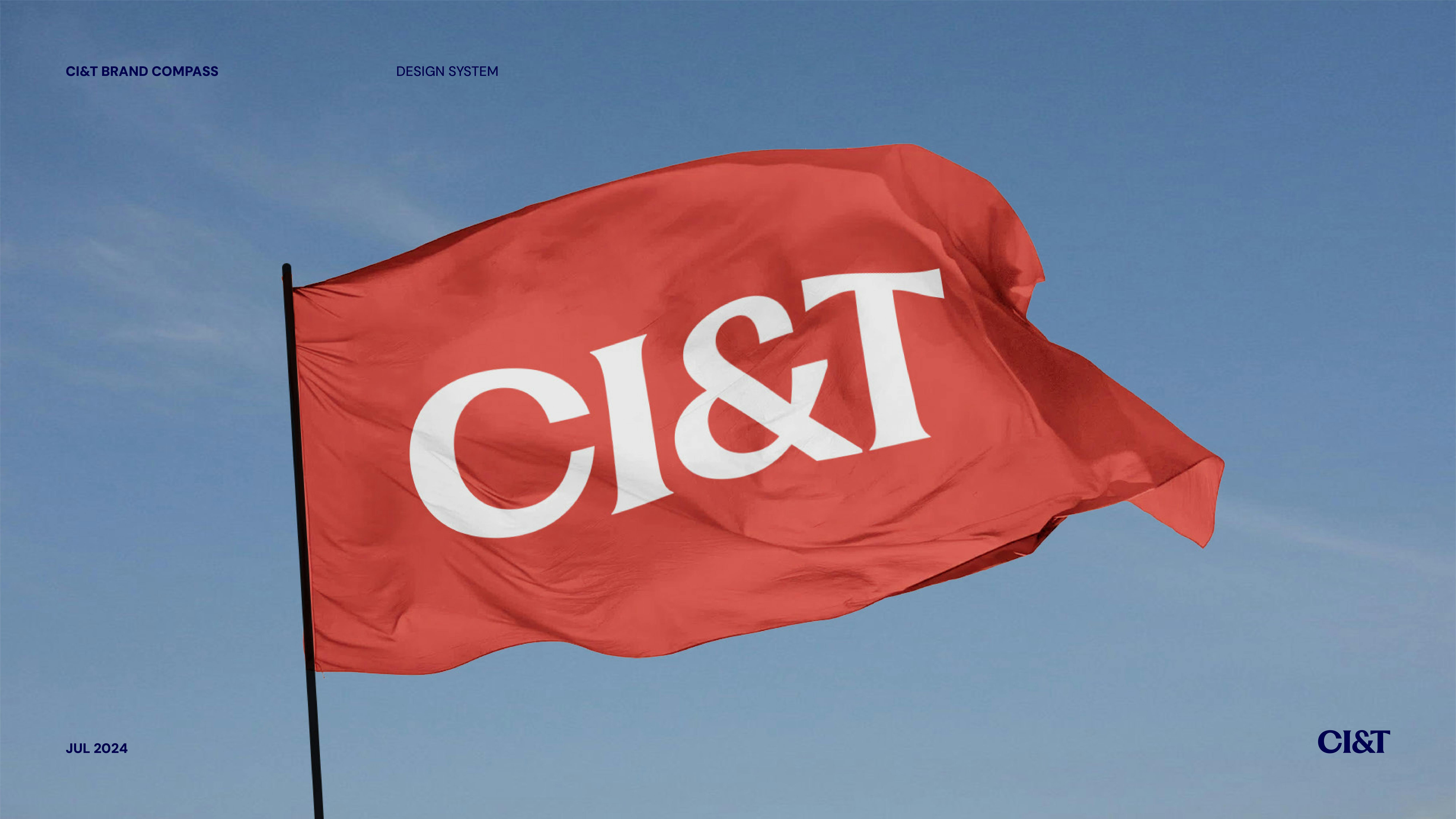
Image Courtesy by CI&T
We prioritized empathy, ensuring everyone felt that this rebrand was for them, not just the branding or marketing teams. This approach made people feel valued and connected to the process, even those who had extra work to do, like adapting the brand in physical spaces. In the end, everyone understood our intent and felt positive about the change.
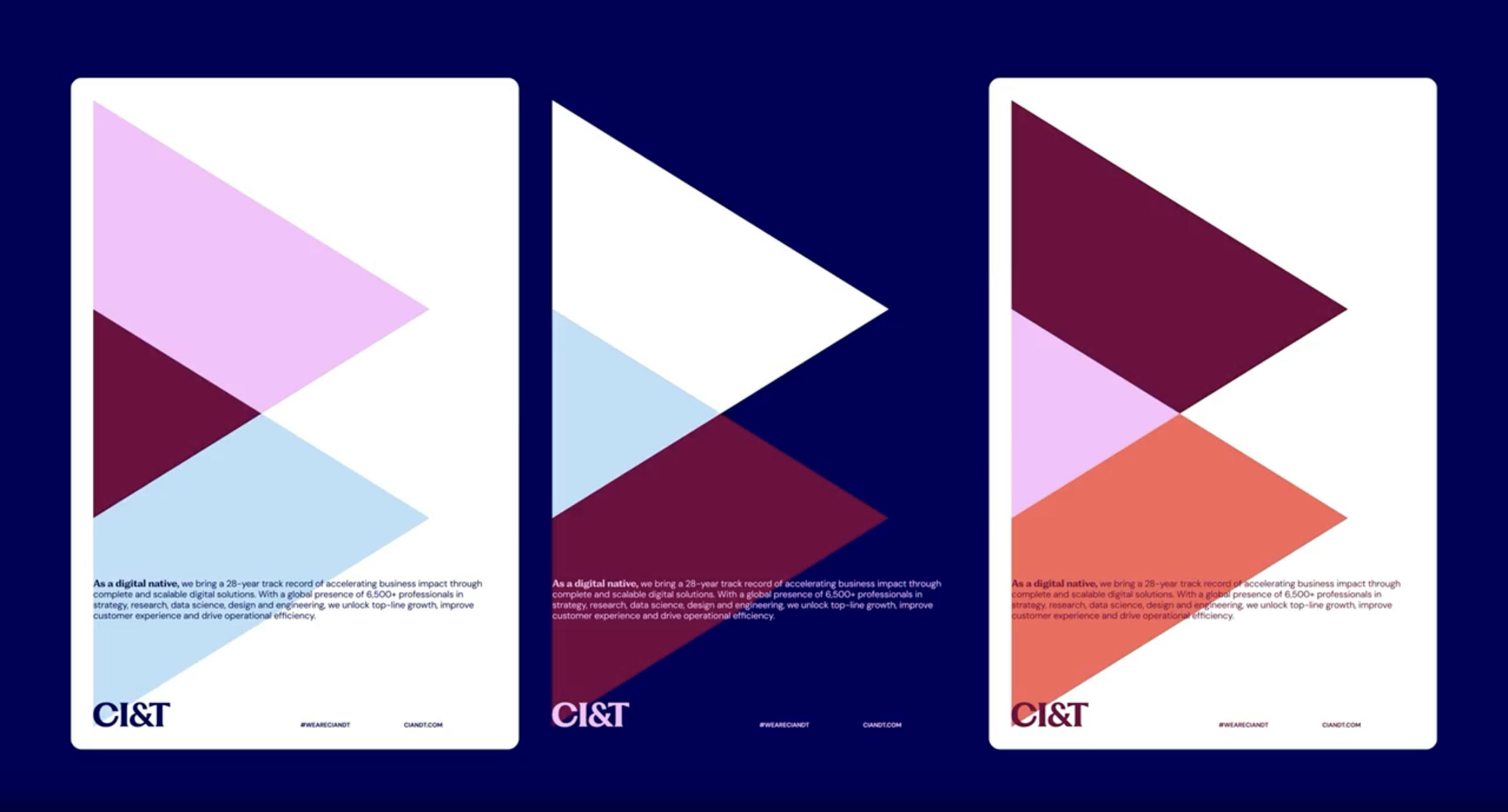
Image Courtesy by CI&T
CI&T has achieved significant milestones, such as going public, acquiring other companies, and working with Fortune 100 companies. How does the new rebrand reflect and communicate CI&T’s position as a leading multinational in the tech industry?
Since the pandemic, CI&T has rapidly evolved, from multiple acquisitions to going public and embracing the global focus required in today’s tech landscape. This shift called for a rebrand to reflect our expanded, more global presence, especially with our new CI&T Flow AI platform.
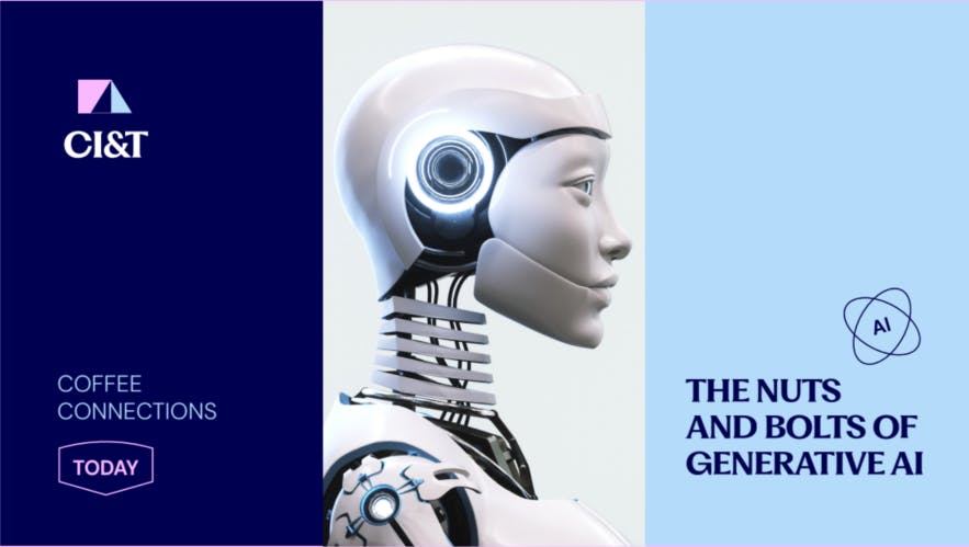
Image Courtesy by CI&T
The previous brand, while meaningful and impactful during its time, was becoming outdated—it represented a more conservative, Brazil-centered identity, fitting for when we were smaller and private.
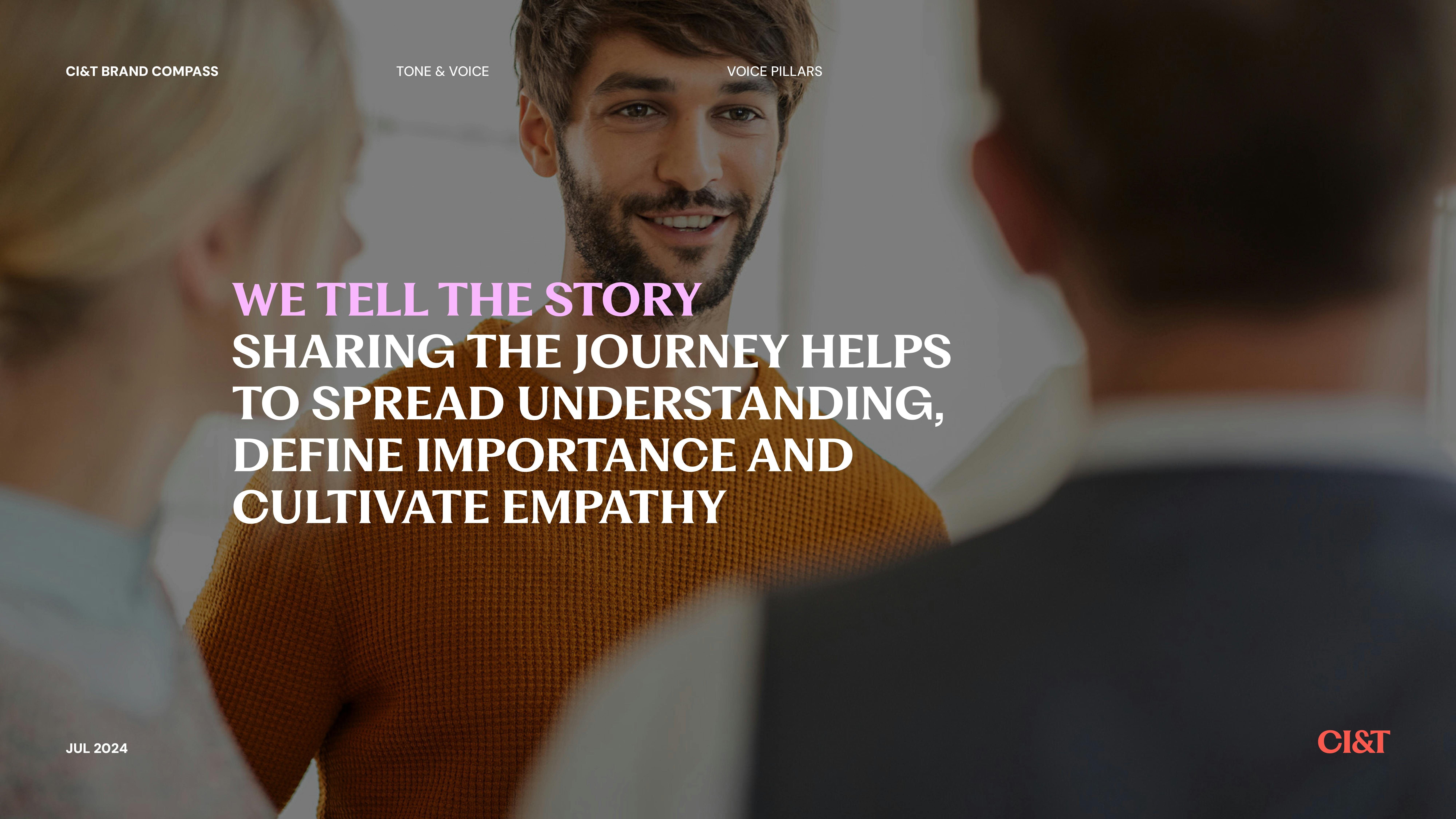
Image Courtesy by CI&T
With the recent changes, including more diverse teams from around the world, we needed a brand that better aligned with our current position as a global, AI-forward, and publicly traded company.
Our new brand image now reflects this broader, forward-looking identity and resonates with our global culture, making it clear that we are no longer just a local player but an influential multinational in the tech industry. This shift is one our teams recognize as necessary, which has led to strong support and excitement for the change.
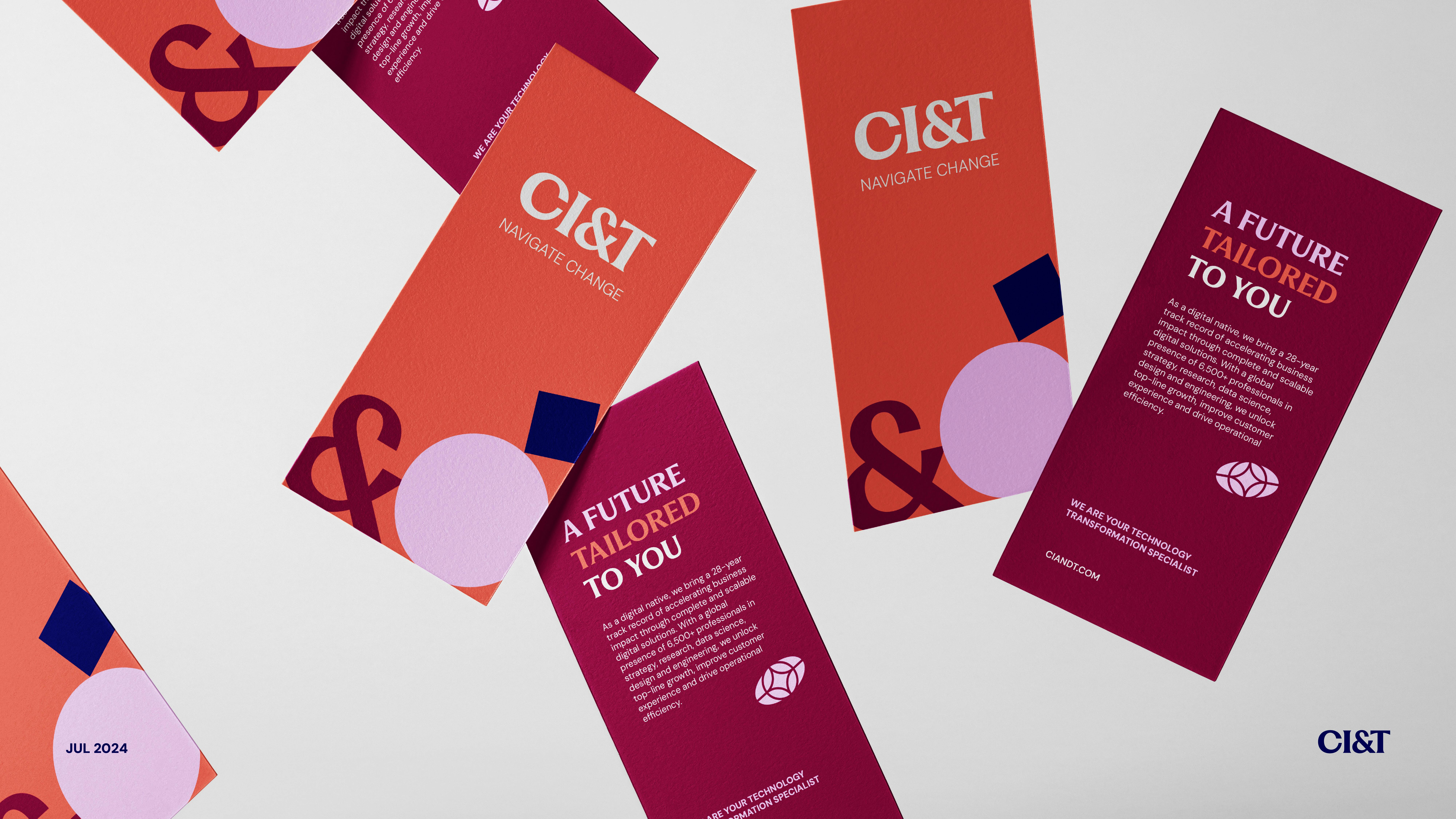
Image Courtesy by CI&T
From a personal perspective, what aspect of the rebranding process are you most proud of? Are there any personal anecdotes or experiences that stand out to you?
One of the most rewarding moments for me was hearing from a highly respected branding professional who told me, ‘I’m building my new company inspired by everything you’ve done.’ That external validation—especially from someone at the top of their field—was powerful. It showed we’d succeeded not by creating the ‘best’ identity, but by crafting something truly for our people.
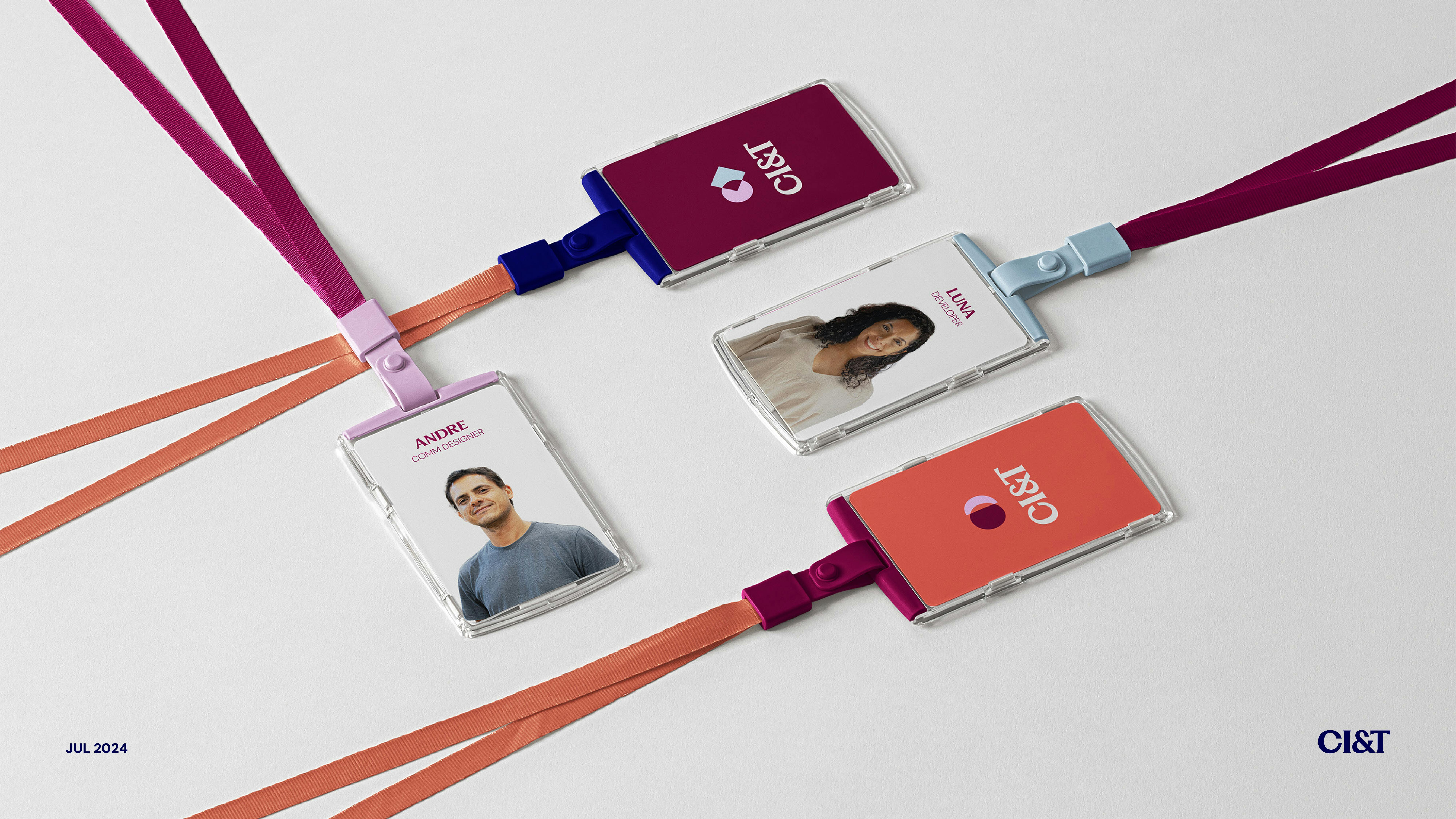
Image Courtesy by CI&T
Branding, when done for others, has a profound impact, and seeing our CI&T team feel represented, excited, and even eager to share it with their families, reminded me that we achieved what we set out to do.
We did this for them, not for ourselves, and that’s what makes it beautiful.