Since its launch in 2014, Bumble has been buzzing in the online dating scene. But their recent rebranding? Let’s just say, it got people talking — and not all in the good way.
The app fresh look and new features were supposed to shake things up, but instead it shook them up! The new campaign tried to get real about the struggle in the modern dating but ended up coming bit too gloomy.
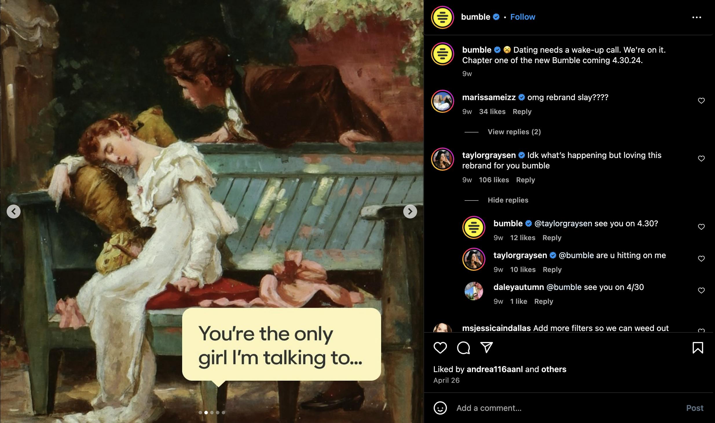
Source: Bumble's Instagram
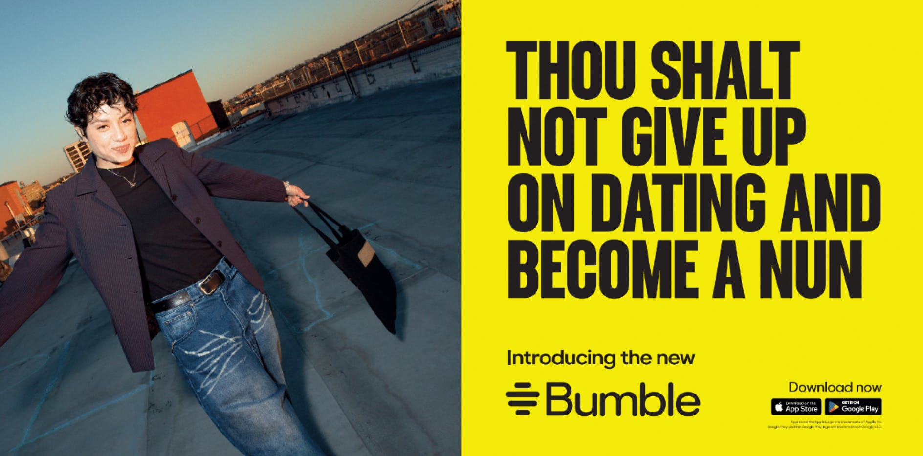
Bumble kicked off its rebrand by clearing out its entire old post and teasing the the new look with memes featuring 19th-century women, claiming dating needed a wake-up call. They even went all out with billboard ads boasting the slogan, "Women were having nun of Bumble's celibacy ad."
While Bumble aimed for a bold rebrand, it seems they might have missed the mark this time.
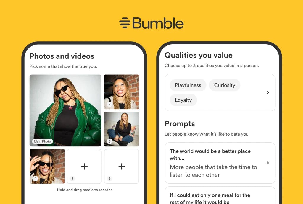
Bumble's big rebrand, launched on April 30, came with a several of fresh features designed to spice up the dating game:
- Brand Identity: New logo, fonts, colors, and updated illustrations.
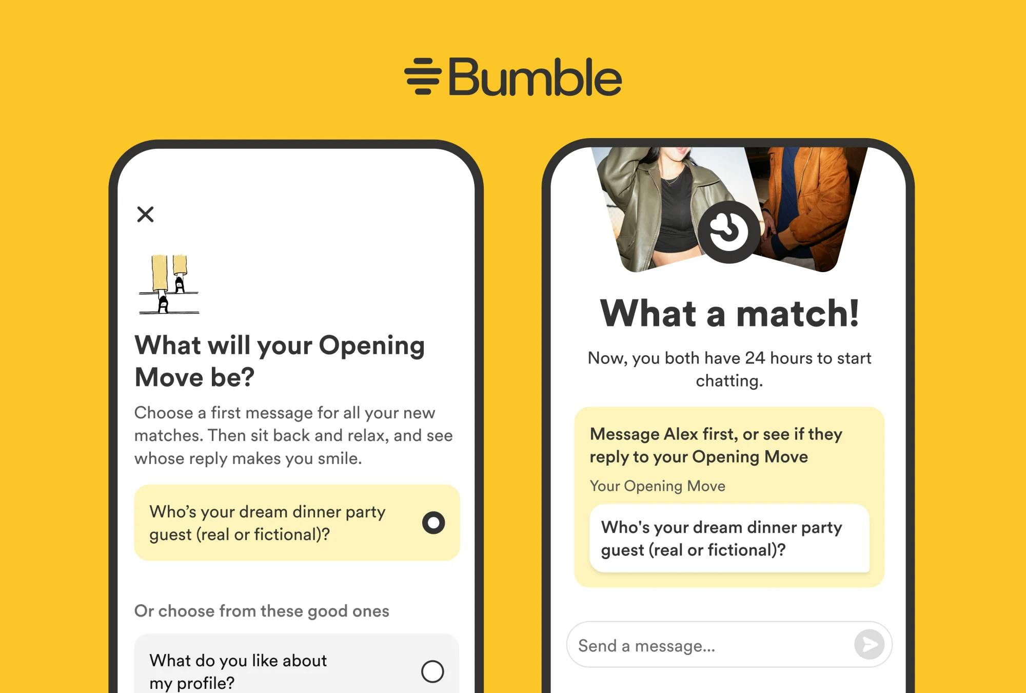
- "Opening Moves" Feature: Now men can break the ice first by answer to women’s question on their profile - less pressure on ladies. 💃🏼
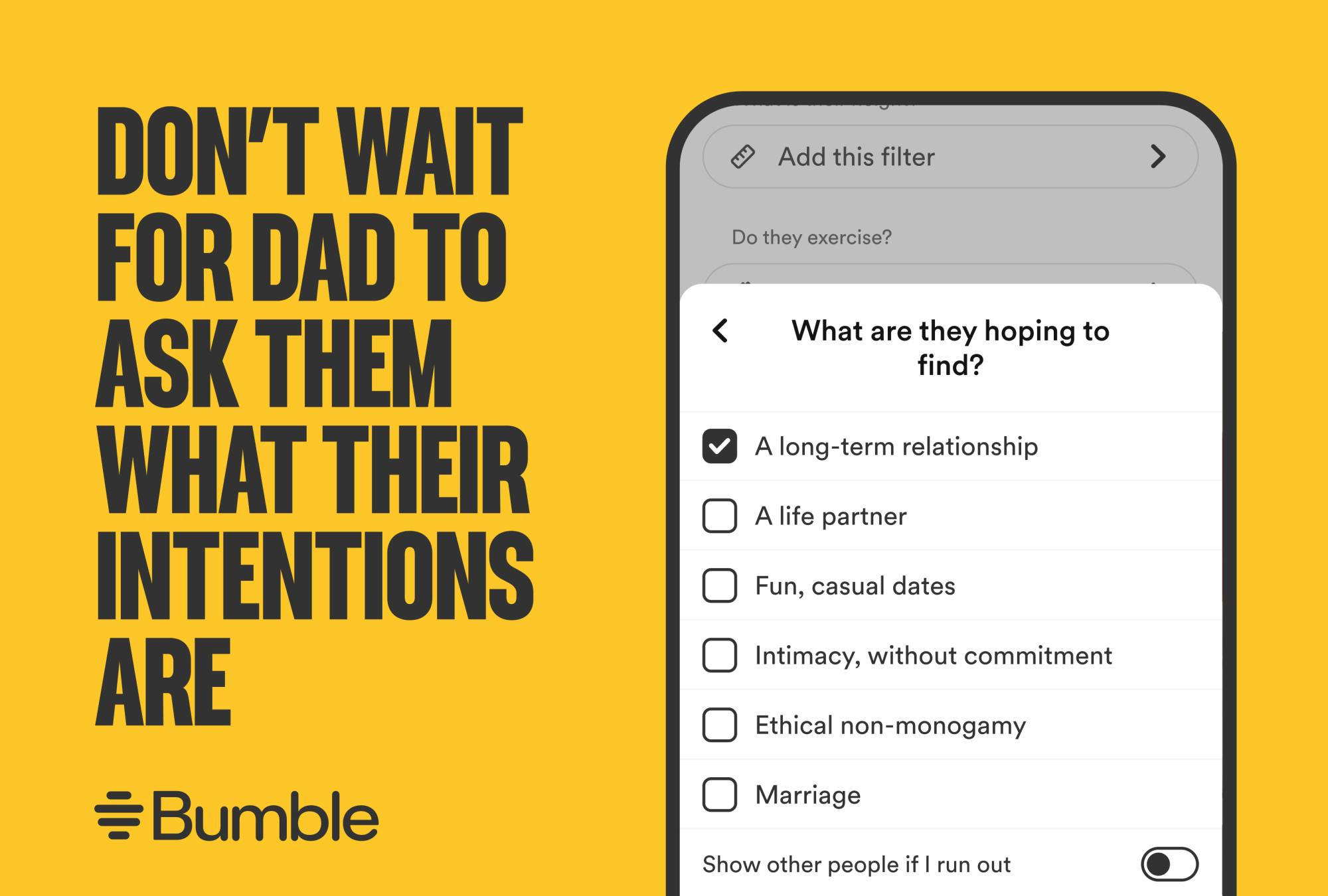
- New Dating Intention Badges: User got more options now to choose "intimacy without commitment" and "ethical non-monogamy” - to keep it real.
- More Pics, Please: User are required to upload up to 4 photos now - show off those angles!🤳🏼👩🏼🦰
- Updated Interface: Your common interest are now front and center on yourprofiles.
- Best Bees Revamp: It’s now "For You" with updated algorithms to help you make connections faster.
Source: Bumble
Source: Bumble
Source: Bumble
Positive Outcomes Amidst the Confusion
Despite the initial backlash, Bumble quickly stepped up and issued a public apology, promising to make things right. This showed they really listen to their community. Plus, they announced new initiatives to support women and marginalized groups, staying true to their core values.
While the rebrand stirred the pot, it definitely raise the awareness about modern dating drawbacks. Bumble's bold strategy underscored their dedication to tackling big issues and taking risks. Despite the hiccups, their global campaign managed to ignite crucial conversations about the pitfalls of online dating, reinforcing their mission to support and empower women.
Lessons Learned
At last, Bumble’s rebranding saga, underlined some of the key points about keeping your brand stay true and clear when delivering your message to avoid misunderstandings. Here are the big takeaways:
Know Your Crowd: Understand your audience’s values and preferences, including cultural sensitivity. Bumble’s user value empowerment and positivity, so the campaign should hit those notes and respect different cultural perceptions.
Seek with Feedback: While Bumble communicated their goal of shaking up the dating scene, they lacked sufficient user feedback on the changes. Actively involving users in the rebranding process can help avoid backlash and make sure changes resonate with the community.
Be Transparent: Clearly explain why you're rebranding to your users and stakeholders to get their buy-in and support. Bumble nailed this by stepping up and apologizing for their campaign misstep, showing they listen and care about their community.
By keeping these in mind, future rebrands can keep user trust intact and keep the brand evolving smoothly.